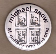
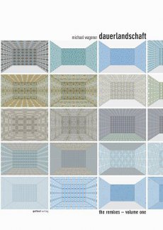
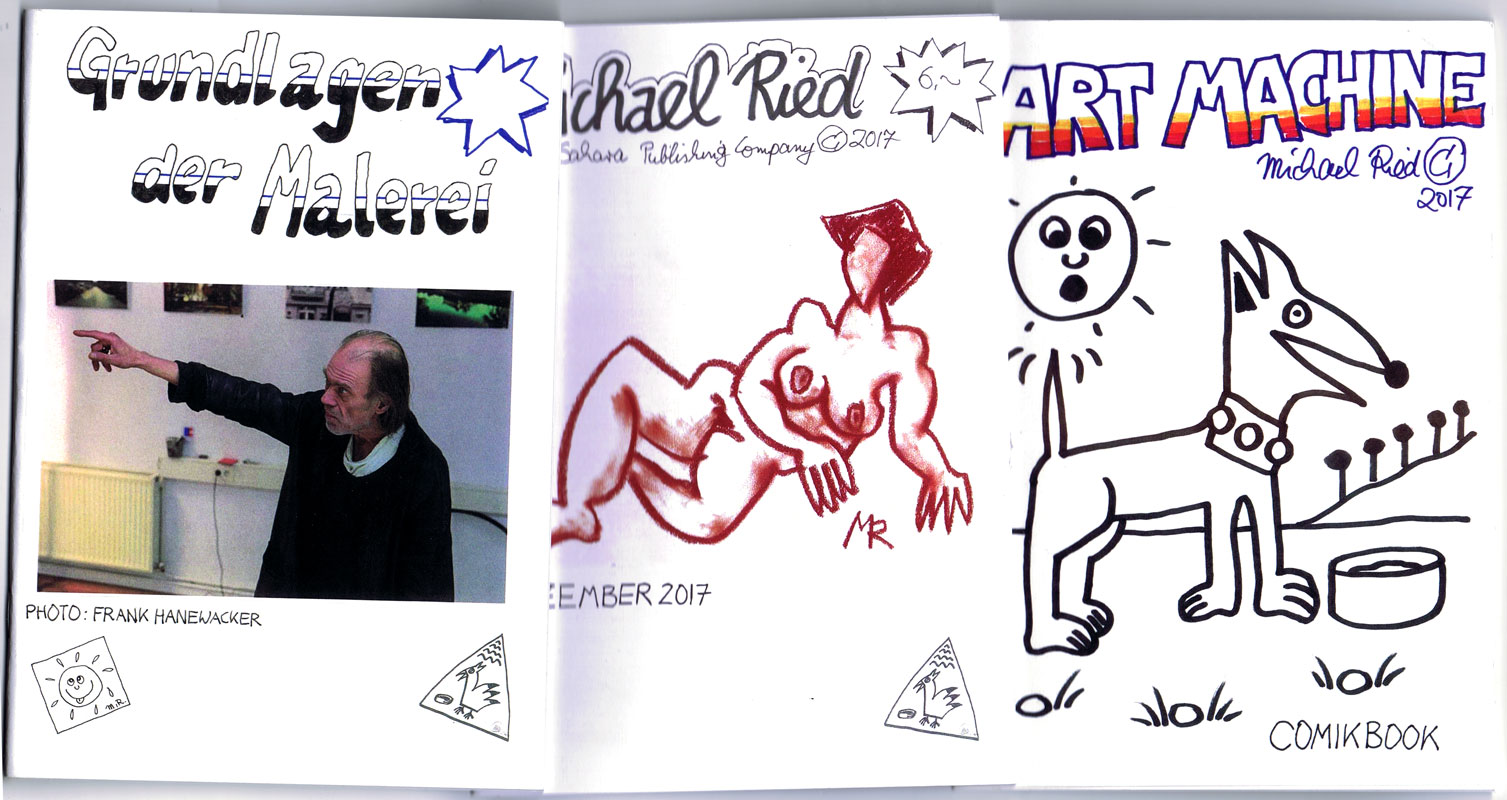
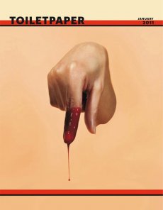
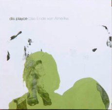
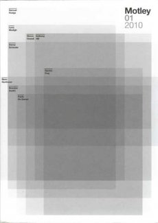
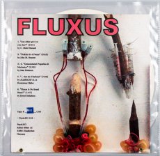
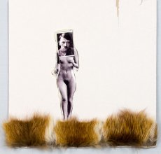
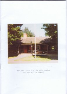
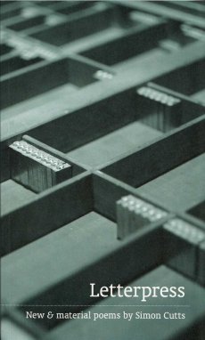
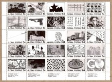
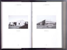
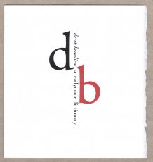
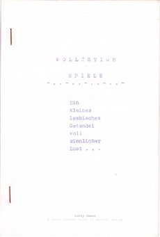
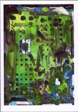
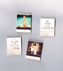
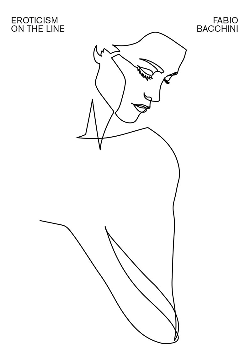
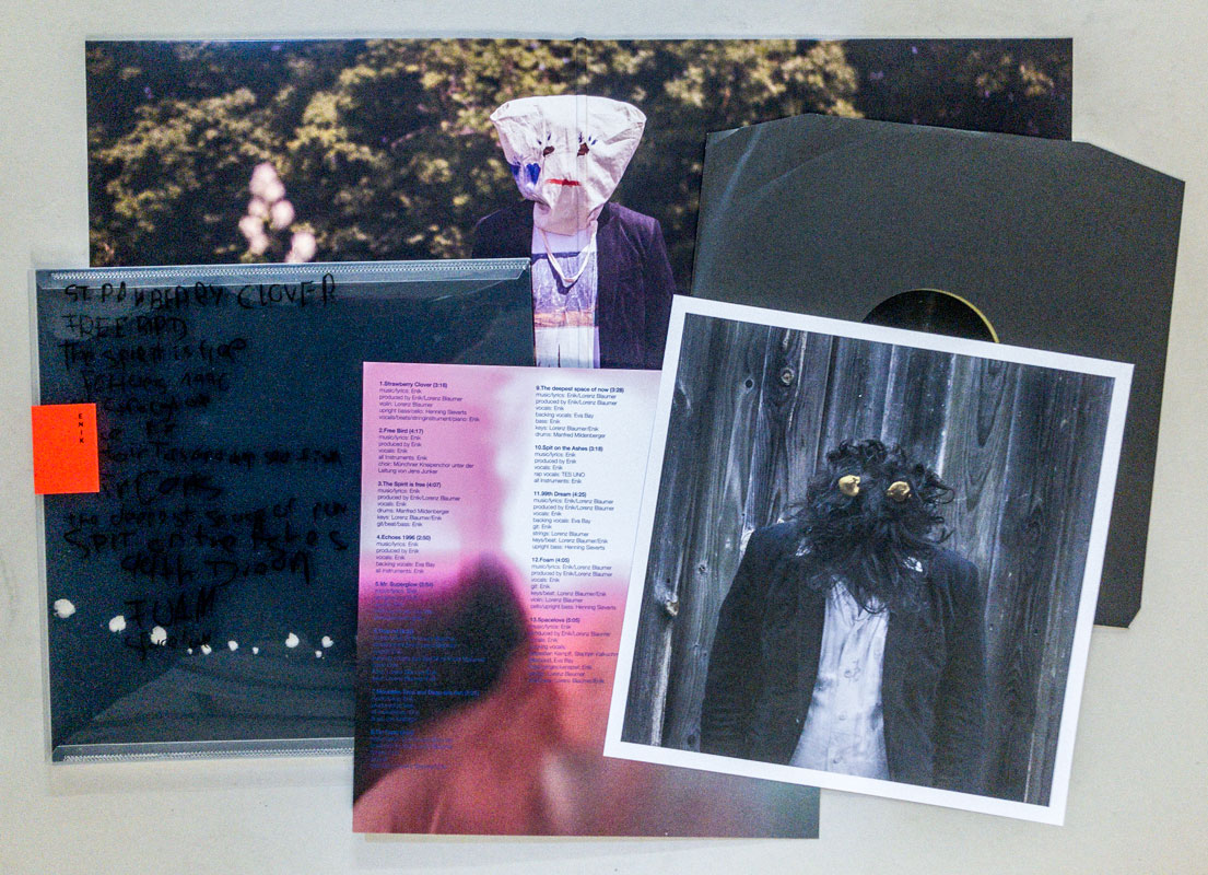
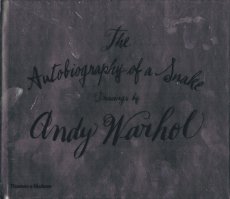
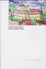
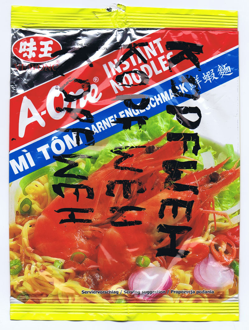
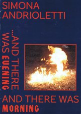
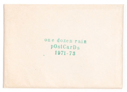
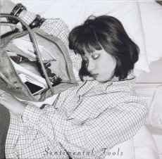
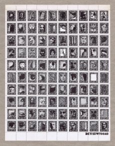
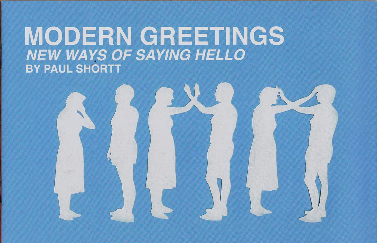
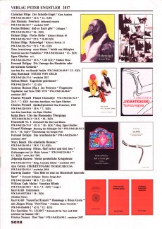
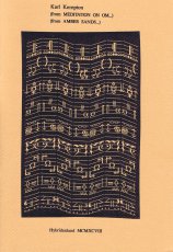
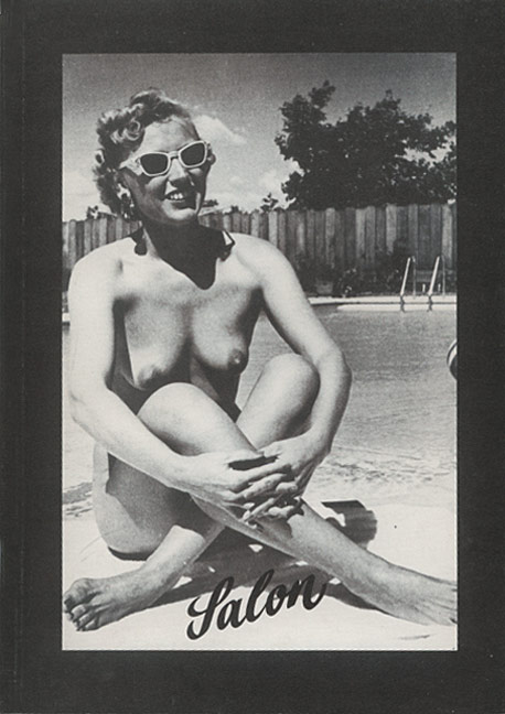
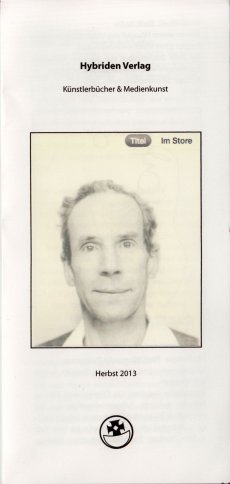
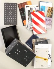
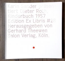
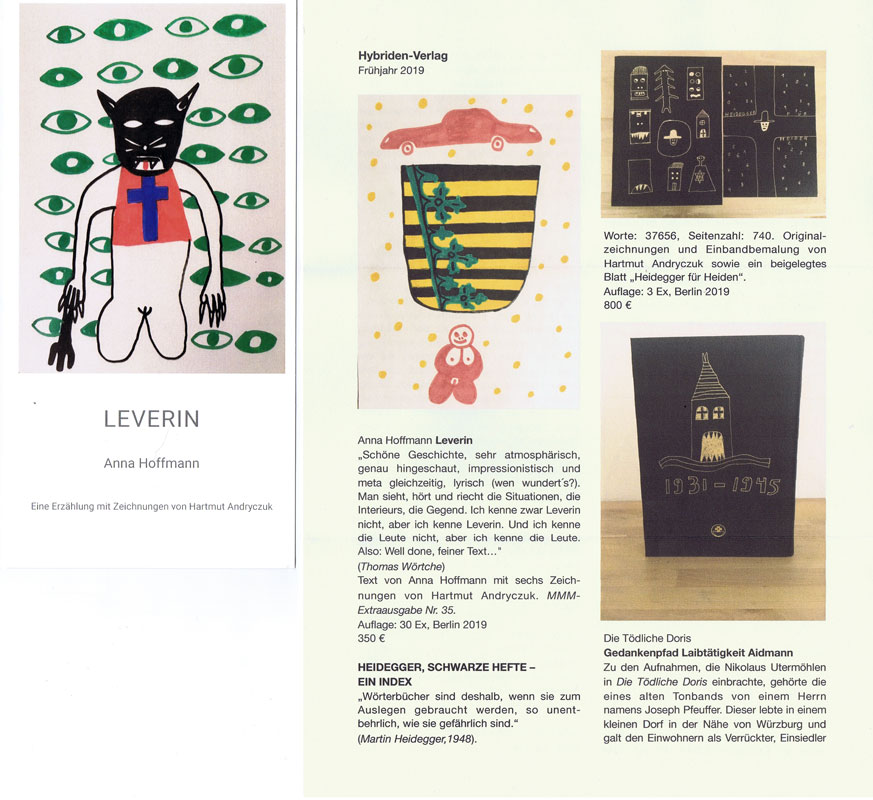
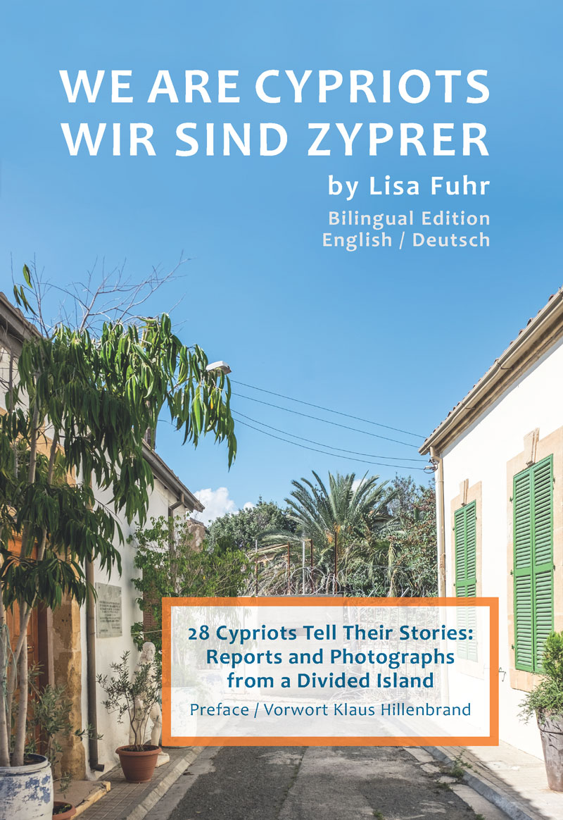
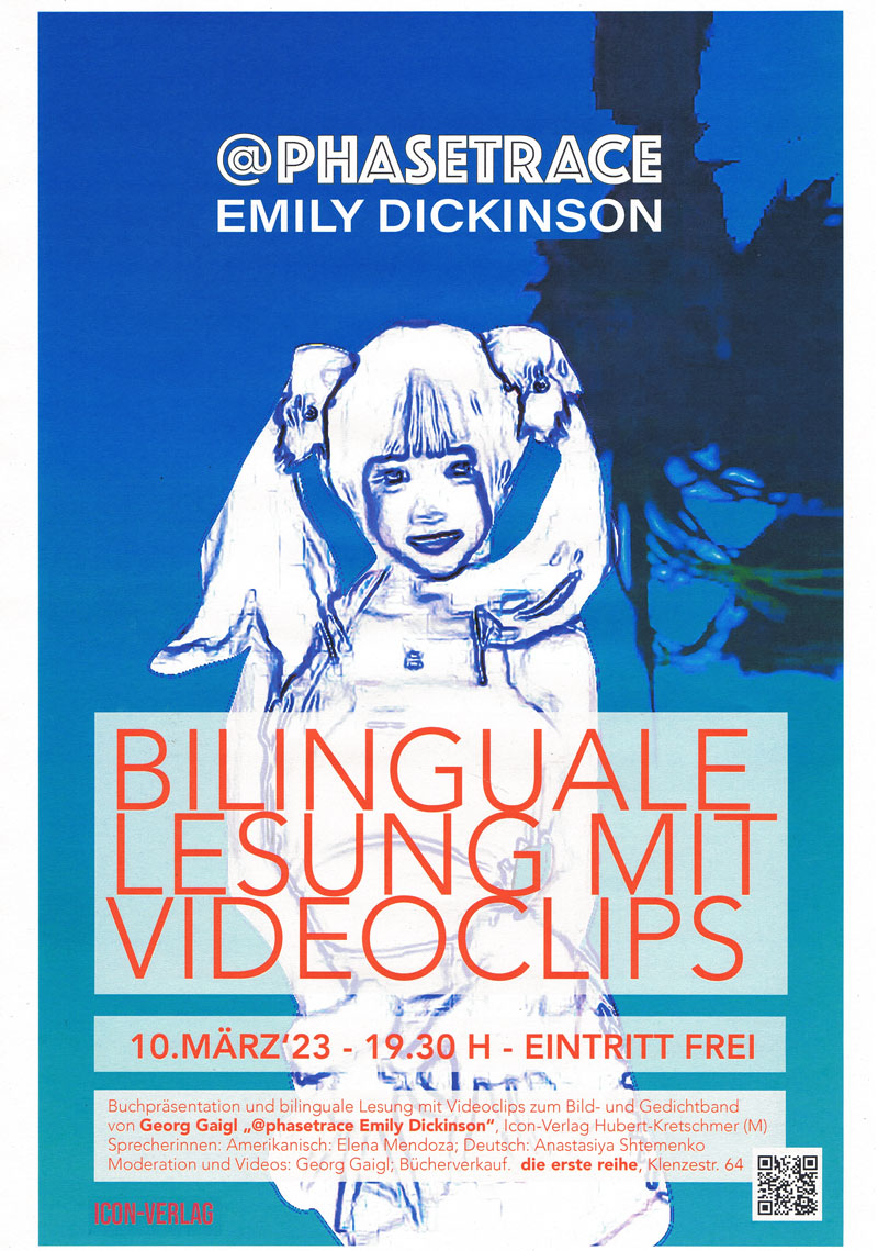
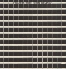
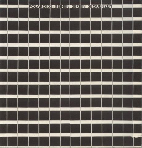
108 S., 14,8x10,5 cm, Auflage: 100, keine weiteren Angaben vorhanden Digitaldruck S/W, Softcover, Fadenheftung
ZusatzInfos
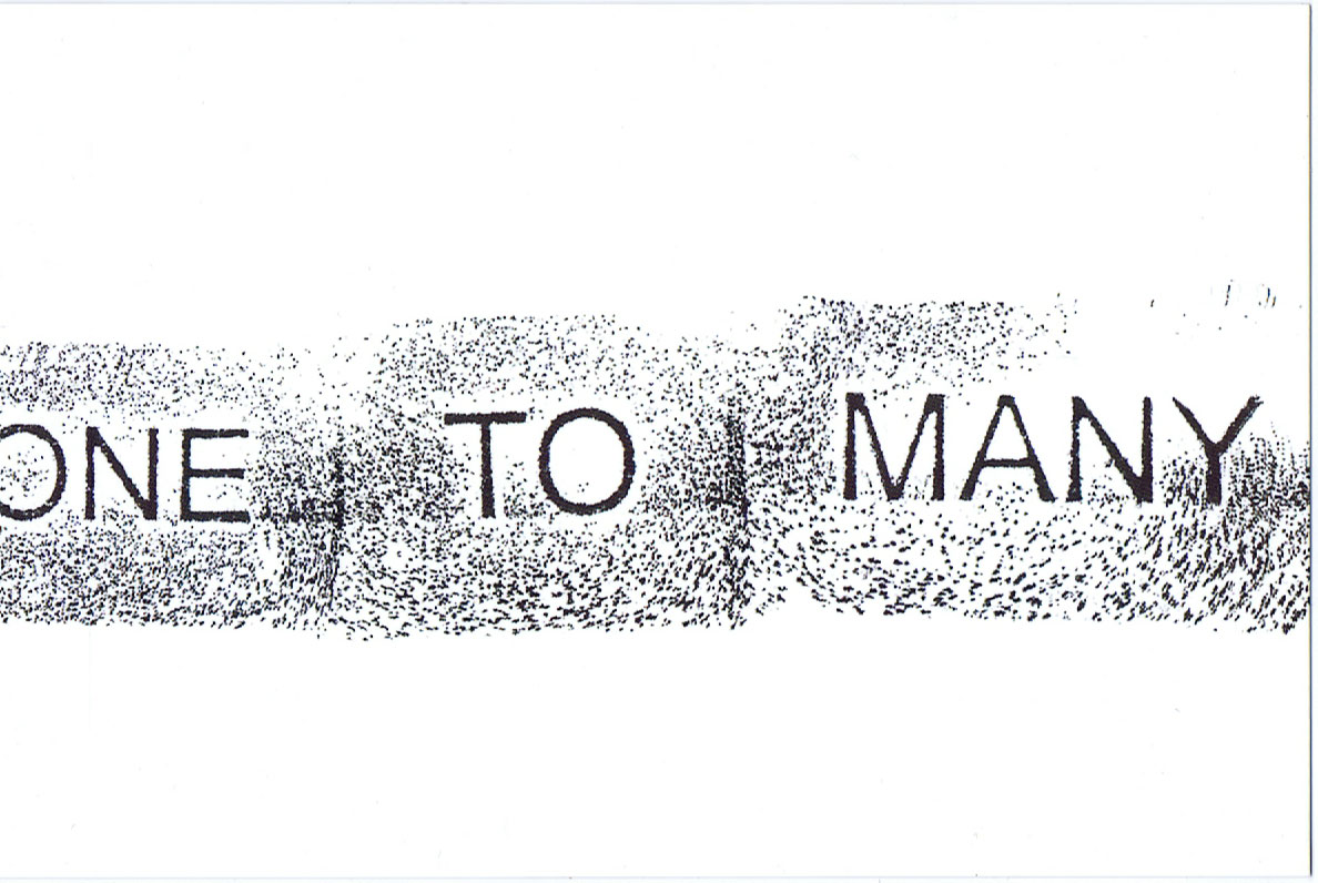
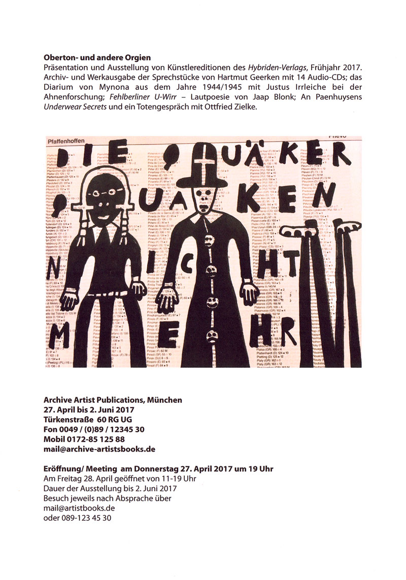
Reproduzierte Illustrationen aus dem Buch "A Key to Better Memory", New York 1959. "One Hundred Things to Remember is based on one book suggesting a visual approach to improving memory. Taken out of context and viewed from a distance of nearly seventy years, the combinations of simple words and drawings turn out to be an absurd selection of random signs, a form of unintentional poetry reminding us of a time when computers with virtually unlimited memory were not even a dream yet."
Text von Webseite
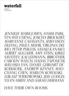
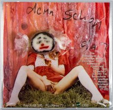
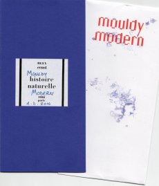
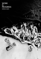
20 S., 28,5x20 cm, keine weiteren Angaben vorhanden Seiten geklammert, Umschlag aus zweifach gefaltetem Papier
ZusatzInfos
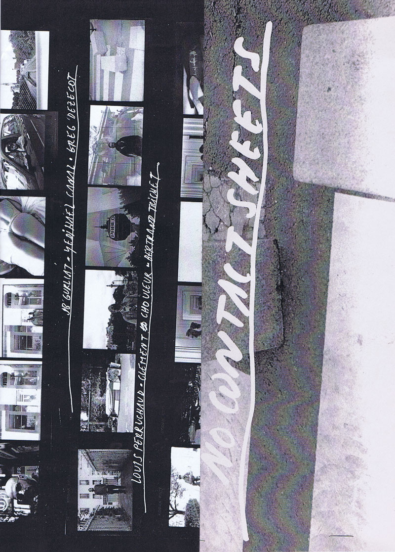
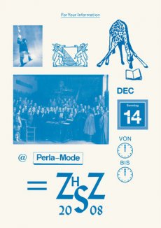
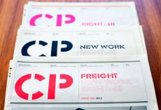
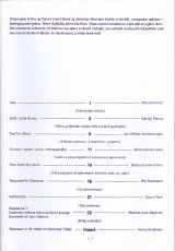
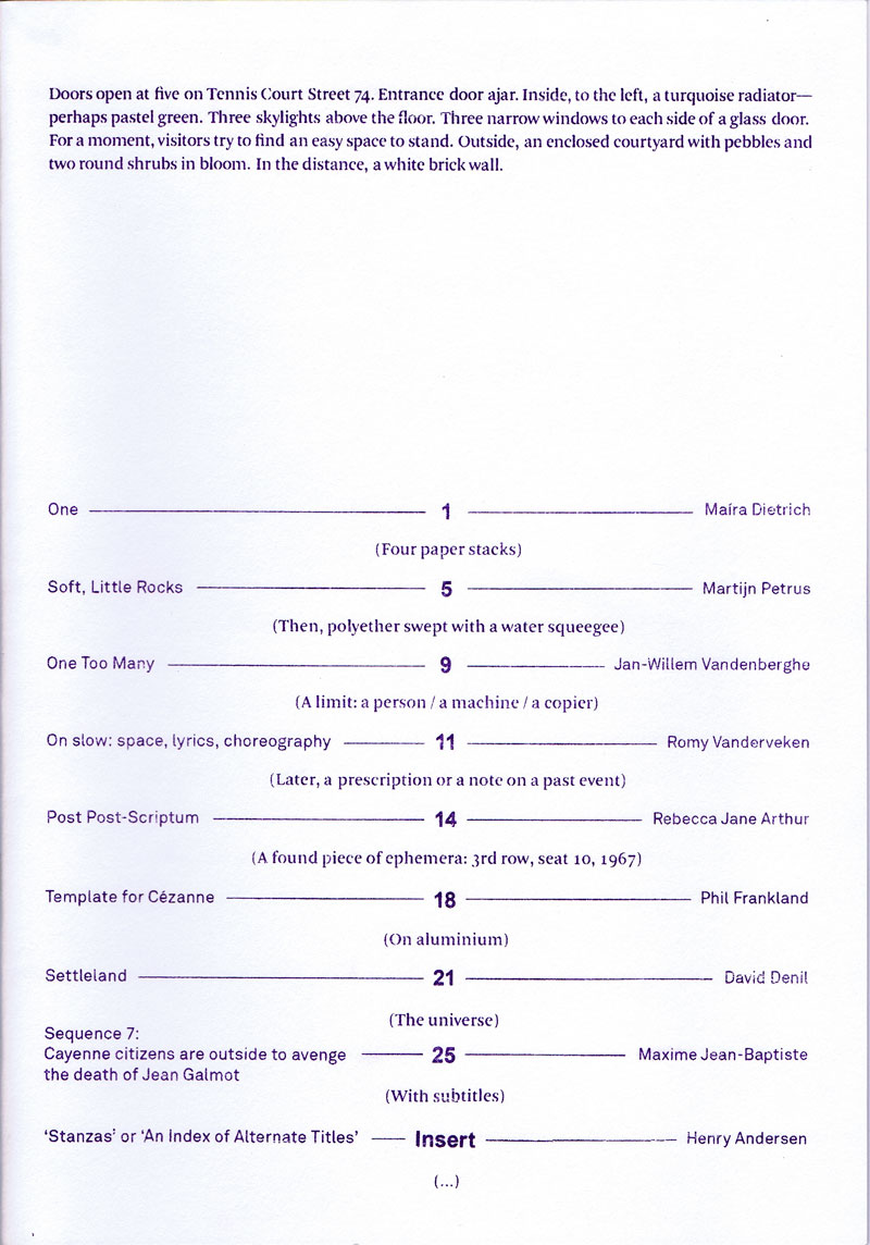
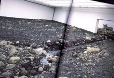
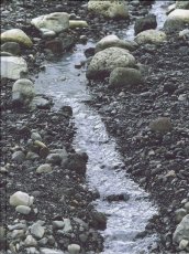
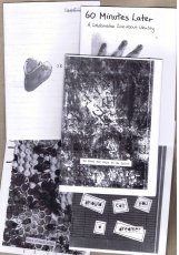
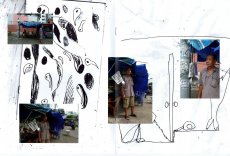
During Paris lockdown, 16 photograhers shared one roll of film, connecting from neighborhood to neighborhood, in frame of one hour and one kilometer freezing one frame.
Während des Pariser Lockdowns teilen sich 16 Fotografen eine Filmrolle, anschließend von Stadtviertel zu Stadtviertel. Im Rahmen von einer Stunde und einem Kilometer hielten sie jeweils ein Bild fest.
Text von Webseite, Übersetzung DeepL
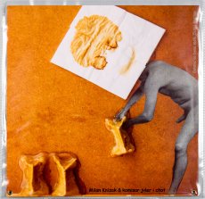
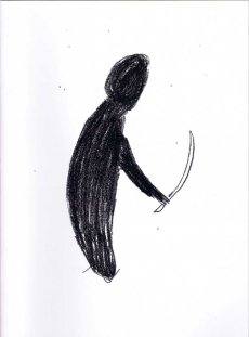
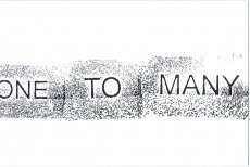
[12-16] S., 20,6x13,5 cm, Auflage: 100, signiert, 12 Teile. keine weiteren Angaben vorhanden 11 Hefte, Schwarz-Weiß-Laserkopien, Drahtheftung, Aufkleber
ZusatzInfos
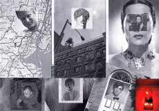
About the series:
The For Everard zine series chronicles the 1977 fire at New York's Everard Baths, combining archival research with imagined narratives to re-focus attention to obscured histories. The series explores the media coverage of the subsequent investigation of the fire, and the lives of the nine men who perished. The zines bring together photographic images with primary news sources, as well as personal anecdotes collected from eyewitness testimonials.
About the individual zines:
For Everard, Vol. 1, 2013, ed. 100 (nr. 65)
This zine chronicles the May 25, 1977 fire at New York's Everard Baths and the media coverage of the subsequent investigation.
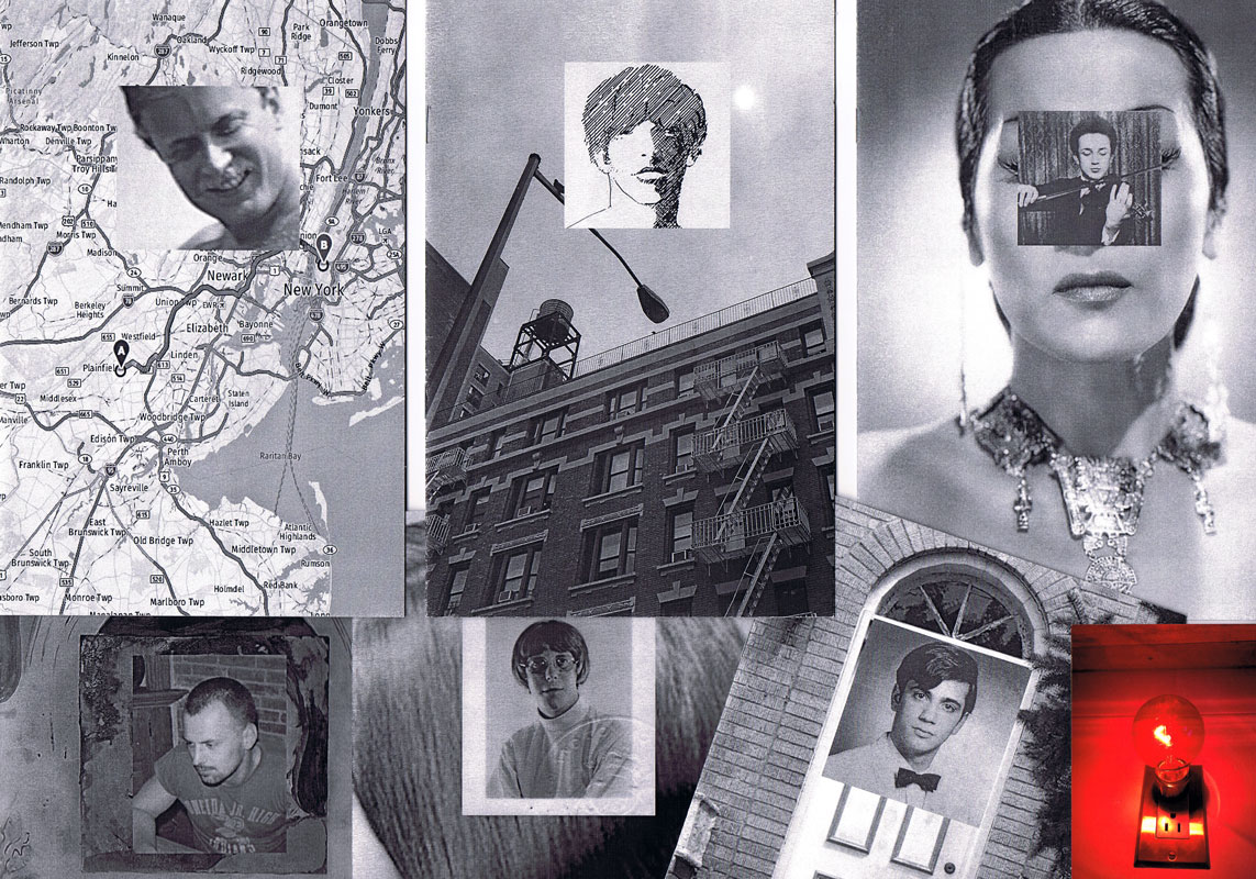
For Everard, Vol. 2 (Bloodbrothers), 2013, ed. 100 (Nr. 81)
In the second volume of his series chronicling the 1977 fire at New York’s Everard Baths, Anthony Malone focuses on Bellevue Hospital’s blood drive for the victims of the great bathhouse tragedy. Malone draws parallels between the 1977 restrictions placed on gay men for donating blood to their “brothers” and current FDA guidelines that indefinitely defer donations from men who have had sex with men since 1977. This black and white photocopied zine (ed 100) juxtaposes archival images, news clippings, and just a touch of fantasy.
For Everard, Vol. 3 (Remembering Jimmy), 2015, ed. 100 (Nr. 94)
Volume 3 of the series, For Everard is dedicated to the memory of Jimmy Stuard, who died in the tragic fire at the Everard Baths in 1977. Stuard was a rising star in the disco music scene. He spun records first at Boston’s 1270 Club, and later at New York’s 12 West, where he inspired an entire generation of musical artists and DJs. In this particular volume, Anthony Malone assembles images and archival texts that serve as a tribute to the great Jimmy Stuard.
For Everard, Vol. 4 (A Lovely Show), 2016, ed. 100 (Nr. 62)
For Everard, Vol. 4 (A Lovely Show) is a tribute to Kenneth Hill, one of the nine men who died in the devastating fire at the Everard Baths in 1977. Kenn played a vital role in the East Village/Lower East side countercultural movement in the late ‘60s and 1970s. He was a hippie, a bar tender at Phebe’s (a watering hole and salon for the experimental theater community in the 1970s), one of the founders of the Old Reliable Theatre Tavern, House Manager at La Mama Experimental Theatre Club, and a photographer. This zine celebrates Kenneth Hill by collaging archival documents with personal artifacts and pictures of Kenn from meaningful moments in his life.
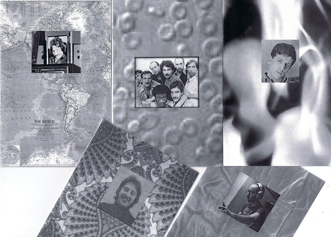
For Everard, Vol. 5 (A Dearly Loved Man), 2017, ed. 100 (Nr. 95)
For Everard, Vol. 5 (A Dearly Loved Man) assembles images and stories from the life of Ira Landau, a gifted and dedicated teacher who died in the tragic fire at the Everard Baths in 1977. Ira left behind a devoted family (his mother, brother, niece, and lover) and is still greatly missed by his loved ones. This zine is a tribute to the life and accomplishments of a remarkable man who served in the Peace Corps and committed himself to educating young minds both abroad (in the Middle East) and at home in the US. It contains family photos and personal images generously contributed by Ira’s niece.
For Everard, Vol. 6 (Yosef’s Song), 2017, ed. 100 (Nr. 94)
Volume 6 of the series For Everard celebrates the life of a remarkable musical prodigy, Yosef Synovec. This zine tells the story of a young man with great aspirations who emigrated to the United States from Czechoslovakia to study classical violin. In 1976, Holly Woodlawn overheard Synovec vocalizing as he was painting the bathroom of his East Village apartment, and determined on the spot that she had discovered an emerging star. As a singer, Synovec used his extreme vocal range to imitate the voice and persona of Peruvian diva Yma Sumac. He performed Sumac’s exotic musical numbers at several New York City cabarets and show venues. Sadly, on May 25, 1977, Yosef perished in the tragic fire at the Everard Baths.
For Everard, Vol. 7 (Tony from the Bronx), 2017, ed. 100 (Nr. 86)
This zine brings together images and stories from the life of Tony Calarco, one of the nine men who died in the fire at the Everard Baths in 1977. Tony was only 26 when he died. He lived with his parents and siblings in a modest house in the Bronx. He had recently graduated from college and was working as a social worker in New York city at the time of his death. Tony had aspirations to become a lawyer and was scheduled to begin law school in September of 1977. This zine celebrates Tony Calarco’s memory through photos of Tony, artifacts from his high school and college years, and recent photographs of his home and final resting place.
For Everard, Vol. 8 (Looking for Amado), 2017, ed. 100 (Nr.84)
Amado Alamo, a young man only 17 years old, lost his life in the fire at the Everard Baths in 1977. In Volume 8 of For Everard, Anthony Malone documents his search for the identity of the youngest victim of the Everard fire. The zine is an abstracted portrait of Alamo that assembles the few extant fragments of his story culled from newspaper articles and documentary sources glued together with the artist’s imagination.
For Everard, Vol. 9 (Last Call), 2017, ed. 100 (Nr.72)
Life was difficult for Hillman Wesley Adams. He was born in Jacksonville FL in 1938. His mother died just a few months after his birth, and by the age of nine, he found himself in an orphanage with his older brother. Fast forward 30 years: Hillman moved to NYC, struggled to make ends meet while working on and off as a bartender, and he met his lover, Ralph, with whom he shared a modest apartment in New Jersey. On May 25, 1977, Hillman died in the fire at the Everard Baths. Vol. 9 of For Everard is an assemblage of newspaper articles and vintage photos chronicling the life and untimely death of Hillman Wesley Adams.
For Everard, Vol. 10 (In Memoriam: Patrick Nott), 2018, ed. 100 (Nr. 64)
Volume 10 of For Everard memorializes the life of Patrick Nott, one of the nine men who died in the fire at the Everard Baths. Nott, a native of Wales with a passion for theater, literature, and music, pursued a successful career in hairdressing. He fell in love with his pen pal (a young woman from Brooklyn) and after their marriage, they moved to New York City, where Nott worked at the Vidal Sassoon Salon. This zine weaves together elements from his story (shared with the artist by Patrick Nott’s wife), with photographs, newspaper clippings, and artifacts. It acts as a humble tribute, an “In Memoriam” for this greatly loved man.
For Everard, Vol. 11 (Thunderbird), 2019, ed. 100 (Nr. 79)
Brian Duffy was an aspiring artist. In 1966 he was accepted to Pratt Institute of Art and although he declined admission to the school, he seized the opportunity to move to NYC and start a new life for himself. In the city, he worked hard at various retail jobs and tried to break into the theater, but everything changed when he met the love of his life, Bradley. The couple moved to a “quieter life” in Boston. They worked in restaurants in the Back Bay area and created a community for themselves amongst their chosen family of friends. Volume 11 of For Everard celebrates the brief life of Brian Duffy, a young man who died in the fire at the Everard Baths in 1977. This zine compiles photographs and stories shared with Malone by Brian’s sister and dear friend.
The pseudonym "Anthony Malone" comes from a novel by Andrew Holleran (Dancer from the Dance). In this novel, Malone is the protagonist and at the end he disappears. Some of his friends believe that he may have committed suicide, others feel that he may have run away from New York, while some say that they saw him at the Everard Baths on the night of the fire. I imagine that Malone survived the fire and he is now making books and zines telling the story of the tragedy.
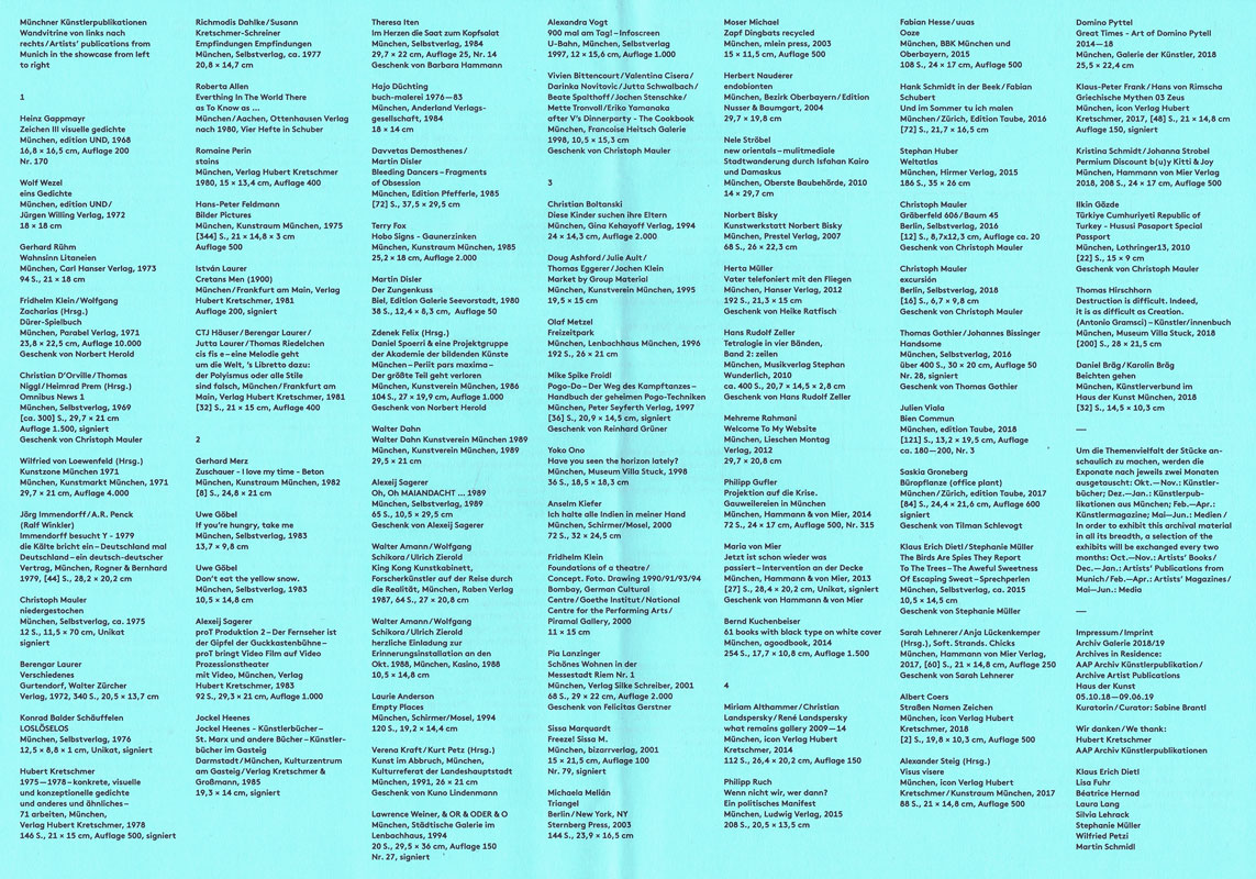
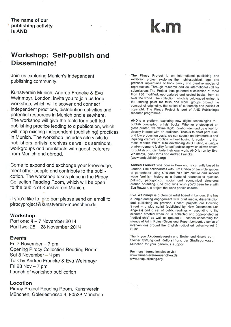
AAP Archiv Künstlerpublikationen / Archive Artist Publications - Haus der Kunst, Archiv Galerie 2018-2019, Archives in Residence - Vitrine 2 Künstlerpublikationen mit Münchenbezug
[2] S., 29,7x42 cm, Auflage: 300, 2 Stück. keine weiteren Angaben vorhanden Techn. Angaben, Infoblatt zur Wandpräsentation und zur 2. Vitrinenausstellung mit Künstlerpublikationen mit Münchenbezug
ZusatzInfos
Listen der Titel zur Vitrine 2, Münchner Künstlerpublikationen, Ausstellung in der Archiv Galerie im Haus der Kunst, ab 18.12.2018, 76 Titel aus den Jahren 1968-2018, kuratiert von Sabine Brantl.
Bücher aus den Verlagen agoodbook, Anderland Verlagsgesellschaft, BBK München und Oberbayern, bizarrverlag, Carl Hanser Verlag, Edition Galerie Seevorstadt, Edition Nusser & Baumgart, Edition Taube, edition UND, Francoise Heitsch Galerie, Galerie der Künstler, Gina Kehayoff Verlag, Goethe Institut, Hammann & von Mier, Hammann von Mier Verlag, Hanser Verlag, Hirmer Verlag, icon Verlag Hubert Kretschmer, Jürgen Willing Verlag, Kasino, Kulturreferat der Landeshauptstadt München, Kulturzentrum am Gasteig, Künstlerverbund im Haus der Kunst München, Kunstraum München, Kunstverein München, Lenbachhaus München, Lothringer13, Ludwig Verlag, mlein press, Museum Villa Stuck, Musikverlag Stephan Wunderlich, National Centre for the Performing Arts, Oberste Baubehörde, Ottenhausen Verlag, Parabel Verlag, Peter Seyferth Verlag, Piramal Gallery, Prestel Verlag, Raben Verlag, Rogner & Bernhard, Schirmer/Mosel, Selbstverlag, Städtische Galerie im Lenbachhaus, Sternberg Press, Verlag Hubert Kretschmer, Verlag Kretschmer & Großmann, Verlag Silke Schreiber, Walter Zürcher Verlag
28,2x19 cm, signiert, 5 Teile. keine weiteren Angaben vorhanden Konvolut aus aufklappbarem Karton, beschrieben, signiert, gestempelt, datiert und mit drei Objekten beklebt (Kindersocke, Haargummi, schwarzer Plastikdeckel). einer Postkarte mit handschriftlichem Gruß. einem ausgedruckten Buchcover. einer Ausgabe "Pirol" in Plastikhülle. alles in original Versandtasche.
ZusatzInfos
Mail Art Projekt "One Day in Berlin" vom 11. Juni 2018, aus der Serie "Lost and Found", die Elke Grundmann seit 2004 betreibt. In der beigelegten Pirol-Ausgabe Nr. 6, September 2017, ist eine Abbildung von "One Day in Berlin" zu sehen. Mit ausgedrucktem Buchcover "Book for Mail Art", Karuizawa New Art Museum.
[124] S., 18x13,5 cm, ISBN/ISSN 9782954197401 Broschur, Buchrücken aufklappbar, gefaltetes Plakat in eingeklebter Papierhülle, Posterformat 85,4x64cm, in Schutzhülle mit Aufkleber
ZusatzInfos
A journal written at the third person that seeks to depict Antoine d’Agata’s quest – the inexorable course from void to void.A literary and photographic experiment where words, sometimes descriptive, sometimes poetic, intersect with images in a narrative continuity. An example of the photographer’s existential choice and form of resistance which leads toward the subject’s disappearance and the ego’s negation within the neutral spectrum of the image while insisting on an intimate involvement with its matter and a perfect superposition of art and life. The pictures have been treated and reduced to the simple black and white contrast, following the main axis of this editorial project: shaplessness and the sense of fading-out. This flattening to a drawing effect releases the image as a shadow, a border between a recognizable sign and a blurry, ambiguous one, so that the photograph is both “trace” and “other”. The book, whose main language is English, also foresees a separate and folded poster, including texts in French on one side and, for the first time, in Italian on the other printed on a background colour image. The two languages allow to include texts in their original version, but allude as well to the artist’s double origins. In line with the book, the poster also reflects d’Agata’s search direction towards the interlacing of word and image and it finally refers to the idea of a topographic description of passions. Member of the Magnum agency, Antoine d’Agata (1961) is one of the most influential photographers of his generation. He lives in both Paris and Marseilles and he works around the world. He is represented by the gallery Les Filles du Calvaire, Paris.
Text von der Webseite.
44 S., 20x15 cm, ISBN/ISSN 18617085 Drahtheftung, gedruckt auf verschieden farbigen Papieren
ZusatzInfos
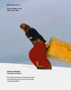
Chances are that you will be far more familiar with Brian Eno and his work than you might realise. Whether you know him as a founding member of the gloriously influential 1970s art-rock outfit Roxy Music, or as the inventor of ambient music, in one breathless career Eno has actually released no less than 25 solo albums and contributed to countless projects and collaborations, but also left his fingerprints on dozens of seminal albums as a producer – think U2, Talking Heads or Coldplay, to name but a few – composed several film scores not to mention the start-up theme for Microsoft’s Windows 95. All of which is to say that it is hard to not be in earshot of his musical influence in one way or another. With mono.kultur, Brian Eno talked about the impact of technology on culture, the similarities between producing music and parenting, and why they called Elvis ‘The Pelvis’. Given Brian Eno’s interest in how art can affect moods and emotions, our new issue turned into somewhat of an experiment in chromatics, with the pages gradually traveling the entire colour spectrum from yellow to blue and back again, which not only affects the optical perception of the yellow text, but also how one responds to the content of the interview. Suffice to say: this must certainly rank as the most colourful mono.kultur to date.
Text von der Website.
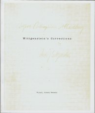
Basiert auf einem Faximile von Ludwig Wittgensteins Manuskript für den Traktacus Logico-Philosophicus mit faksimilierten handschriftlichen Texten.
The book’s point is an ethical one. I once meant to include in the preface a sentence which is not in fact there now but which I will write out for you here. … What I meant to write, then, was this: My work consists of two parts, the one presented here plus all that I have not written. And it is precisely this second part that is the important one. My book draws limits to the sphere of the ethical from the inside as it were, and I am convinced that this is the only rigorous way of drawing those limits.
Text von der Webseite
240 ca. S., 12,5x10 cm, Auflage: 2.000, ISBN/ISSN 0894390139 Umschlag aus Karton mit Leinenstreifen, ca. 120 Seiten gestanzt
ZusatzInfos
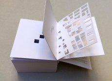
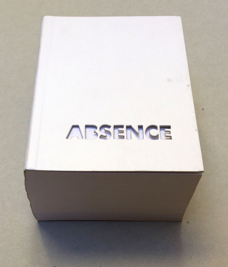
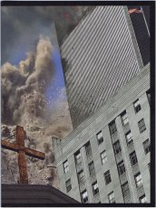
2004 winner of I.D. Magazine's Design Distinction award, Absence is the third book to come out of Printed Matter’s Publishing Program for Emerging Artists, a program made possible through the generous support of New York City's Department of Cultural Affairs, The Andy Warhol Foundation for the Visual Arts, the Elizabeth Firestone Graham Foundation, and the Heyday Foundation. The generosity of Whitney trustees Melva Bucksbaum and Raymond J. Learsy was instrumental to the Museum’s participation in the publication of this exciting new work.
Both a book and a sculptural object, Absence is a memorial to the twin towers of the World Trade Center. Yoon, an architect and designer who is currently an Assistant Professor of Architecture at the Massachusetts Institute of Technology, chose not to produce a traditional design proposal for the World Trade Center Memorial Competition. Instead she created a non-architectural, non site-specific space of remembrance: a portable personal memorial in the form of book.
At almost two pounds, Absence has a considerable physical presence, but it is in every way the ghost of a presence, and it is this ghostliness that gives it its particular emotional weight. A solid white block of thick stock cardboard pages, the book’s only "text" consists of one pinhole and two identical squares die-cut into each of its one-hundred-and-twenty pages – one for each story of the towers including the antenna mast. These removed elements lead the reader floor by floor through the missing buildings towards the final page where the footprint of the entire site of the World Trade Center is die-cut into a delicate lattice of absent structures.
Of all of the proposed monuments and grand designs for the twin towers to emerge in the last two years, Absence is remarkable for its employment of an under-used strategy: restraint. The simplicity of Yoon’s materials and her use of repetition speak, without words, about unspeakable loss. Quiet, respectful, mournful, the book does not aim to represent the magnitude of the disaster. Instead it appeals to the vastness of the reader’s imagination and capacity to grieve. The human scale of her memorial operates on a personal level – it delivers the memory of lives lost into the reader’s hands. At the same time, as a scale model of a vanished architectural site, it operates on a larger cultural level by commemorating the site itself.
Text von der Webseite. Fotos Xenia Fumbarev
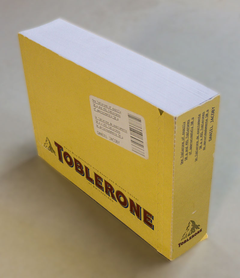
1448 S., 28x27x8,5 cm, Auflage: 100, signiert, ISBN/ISSN 3922760058 Broschur, Softcover, 2 Bücher in Schuber
ZusatzInfos
Volume one contains very many pages with incredibly many dots on each page. We are to understand that each of these dots represents one second of the time it takes the earth to once orbit the sun. The second volume contains again very many pages with each incredibly many parallel lines. The length of all those lines together represents the true distance covered by the earth each second on its way to orbit the sun.
2. Auflage
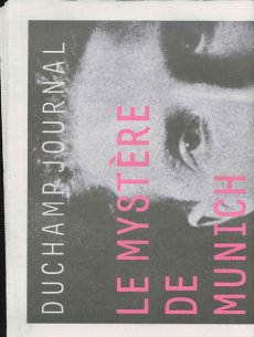
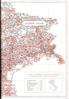
[32] S., 47x32 cm, 2 Stück. keine weiteren Angaben vorhanden Druck auf Zeitungspapier, Blätter lose ineinander gelegt
ZusatzInfos
Hundert Jahre nach Marcel Duchamps dreimonatigem Besuch in München (1912) wird ... eine ... Lücke ("le mystère") im kunsthistorischen Wissen zu füllen versucht. ... mit einer Ausstellung, gut organisiert vom Lenbachhaus, zwei beachtlichen Publikationen, einem Duchamp Journal und einem seltsam gekippten Wohnungsmodell neben der Alten Pinakothek, das dem Betrachter mit 'kalten' Wänden in etwa Duchamps ehemalige Wohnsituation in der (später ausgebombten) Barerstr. 65 vorführt. Dieses Modell ist das Werk des Bildhauers und promovierten Kunsthistorikers Rudolf Herz, der auch eines der beiden Veröffentlichungen und das Journal verantwortet ...
Text von der Webseite: www.sehepunkte.de
On June 21, 2012, precisely one hundred years will have passed since Marcel Duchamp arrived in Munich. He spent three months in the city, three months that were to radically change his art and turn him into one of the most influential artist of modernism. He is regarded as pioneer of conceptual art influencing numerous artists from Sol LeWitt to Ai Weiwei and still today continuously inspires new generations of artists.
On the anniversary of the French artist’s arrival, Munich’s Architecture Museum is presenting Rudolf Herz’s latest art project “Marcel Duchamp – Le mystère de Munich”, in which the artist investigates the background story of his predecessor’s stay in the Bavarian capital. The project includes a sculpture as well as a new book.
Text von der Webseite duchamp-munich.org
456 S., 27x20,3 cm, ISBN/ISSN 978-3-865607638 Klappbroschur mit Banderole (gestanzte Formen und Texte)
ZusatzInfos
erschienen zur Ausstellung 30.04.-25.07.2010
Mit Essays von Benjamin H.D. Buchloh und Birgit Pelzer sowie einem Text von Herman und Nicole Daled.
The Brussels-based collectors Herman Daled and Nicole Daled refuse to perceive art as decoration and to, thereby, exploit it. They approach art in a fundamentally different way: Basis for their activities are their relationships and conversations with artists.
In keeping with the aim of Conceptual Art that places the intellectual content of a work above its realisation, they consider themselves not collectors but communicators and producers: They provide artists with the opportunity to also realise works outside of established market mechanisms. Their intense engagement with Conceptual Art, one of the most important movements in recent art history, goes far beyond usual collecting practices. This is not only apparent in the actual works, but also in the meticulously archived documents containing actions and works. One of the most important influences for Herman and Nicole Daled was Marcel Broodthaers, more than 80 of his works are in their collection. Moreover, the collection holds several works by Daniel Buren, Dan Graham, On Kawara, Sol Lewitt, Niele Toroni, Lawrence Weiner, Cy Twombly and many more.
Text von der Webseite
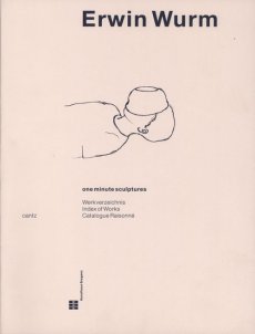
128 S., 27,5x23,5 cm, ISBN/ISSN 978-3-791355450 Hardcover, Bauchbinde
ZusatzInfos
Buch erschien anlässlich der Ausstellung, in der Berlinischen Galerie, 15.04.–22.08.2016.
Der österreichische Künstler Erwin Wurm (*1954) war 1987 als Stipendiat des DAAD-Künstlerprogramms in Berlin. In diese prägende Phase fällt eine grundlegende Veränderung seiner Arbeitsweise: Er beginnt, die Grenzen zwischen Skulptur, Objekt und Performance auszuloten. Erwin Wurm wird nun erstmals in einer monografischen Ausstellung in einem Berliner Museum präsentiert. Die Berlinische Galerie zeigt zentrale Werkbereiche, darunter jüngst entstandene Arbeiten. Im Mittelpunkt steht der menschliche Körper und Wurms partizipatorischer Ansatz, den Betrachter zu einem Teil seines Kunstwerkes werden zu lassen. Ausgangspunkt ist das Narrow House, ein detailgetreuer, begehbarer Nachbau von Wurms Elternhaus, gestaucht auf die Breite von 1,10 Meter. Die Enge der Provinz wird so sprichwörtlich für den Besucher physisch erfahrbar. Ergänzt wird dieses Werk durch die One Minute Sculptures. Mithilfe alltäglicher Objekte soll der Besucher ungewöhnliche Posen einnehmen. Folgt er den Handlungsanweisungen des Künstlers, wird er für eine Minute zur lebenden Skulptur. Die Ausstellung widmet sich mit rund 80 Arbeiten außerdem erstmals ausführlich dem zeichnerischen Werk und zeigt auch jüngst entstandene, skulpturale Arbeiten: Nachgebildete verbeulte Kühlschränke, riesige deformierte Telefone und eingeknickte Sideboards.
Text von der Webseite
Produced for following exhibitions at the Archtectural Association PhotoLibrary, London, and the Urbanissue Gallery, Berlin.
Over a period of twenty-eight minutes and thirty-eight seconds, the artists photographed pedestrians with a camera "adapted so that it had an open slot of one millimetre as its aperture. Behind this the film is run in a single exposure over a set time, that is at a set speed, usually about fifteen to forty seconds. the camera is still, only the film moves. How should one describe the results?" asks Mark Cousins in the essay included in this paperback book of unusual black and white photographs. 29 June 2009 (printedmatter.org)
15,5x10,5x3,2 cm, signiert, keine weiteren Angaben vorhanden zwei Bücher in Schuber, Leinengebundene Kartons mit original maschinenengeschriebenen Texten und Stempeln
21x15 cm, ISBN/ISSN 8496540170 Grafic Tourism Since Two Thousand And Three, The Collection of Volumes One Through Five, 5 Hefte zusammengebunden in mehrfach gefalteten farbigen Umschlag mit Dokumentation
752 S., 19,8x12,6 cm, Auflage: 1.000, signiert, 2 Stück. ISBN/ISSN 0953676587 Softcover, Taschenbuch. Translated by a Lingo algorithm, programmed by Christine Morris
ZusatzInfos
For this book work, Re-Writing Freud the artist Simon Morris has re-written Sigmund Freud’s The Interpretation of Dreams. A computer programme (designed by Christine Morris) randomly selects words, one at a time from Freud’s 222,704 word text and begins to reconstruct the entire book, word by word, making a new book with the same words, every time the programme is re-started. This book is one instantiation of that process, scrupulously typeset according to the dimensions, fonts, chapter divisions and paragraph lengths of the 1976 Penguin paperback edition of Freud’s work, and printed on equivalent paper stocks.
Text von der Webseite
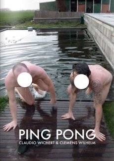
The artists Claudio Wichert & Clemens Wilhelm spend 90 days in a house to make a book. Each day they produce one page. Like in a match of ping-pong, each page is a reaction to the other artist's work from the day before. The two resulting storylines are presented in this book full of duels and duets. The media mix and only one thing is for certain: it's all or nothing.
Text von der Webseite
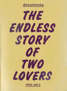
This publication contains a selection of 60 photographs from the documenta Archive, one of the oldest and most esteemed exhibition of contemporary art in the world. The photographs — belonging to different ages — depict the two elements that make art history possible: artwork and spectator. This amazing journey through time not only concerns the history of one of the most important exhibitions in the world, but also traces the evolution, customs, and traditions of the society that created it. The book portrays a love story between two subjects — a human being and an inanimate element — that are capable of a relationship even if they speak a different language. The photographs capture the moment of these encounters, and this is what their distinctive feature consists in. Of course we are not able to listen to the dialogues, but we can still imagine them.
Text von der Verlagswebseite
[28] S., 30x20 cm, Auflage: 300, 2 Stück. keine weiteren Angaben vorhanden Blätter lose ineinander gelegt, Risographie, in transparenter Kunststoffhülle
ZusatzInfos
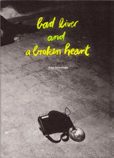
The origin of this work of self-fiction can be found in one of São Trindade’s sketchbooks, this one entirely devoted to the subject of loss or decadence. With references to the aesthetics of crime scenes and nightlife photographed by Weegee in New York in the 1930 and 1940’s, the device is simple: in a "real décor," São Trindade’s body, abandonned and unconscious, is photographed. The body is always the same but differently ‘prepared’ and ‘composed’ with new dresses, new gestures, new signs of a recent activity or a different personality. Each image has its particular story and each space is a sounding board for each of these performative states of body.
Text von der Webseite
45x30,6 cm, Auflage: 15.000, keine weiteren Angaben vorhanden Blätter lose zusammengelegt, farbiger Druck auf Zeitungspapier. Mit der Beilage des Metrolit Magazin Nr. 2
23x18,5 cm, keine weiteren Angaben vorhanden Drahtheftung, Pappumschlag, bestehend aus drei ausklappbaren Teilen, verschiedene Papiere, perforiert, metallverstärkte Ecken, in transparenter Kunststoffhülle, mit angebrachten Aufklebern
ZusatzInfos
"RRRUIDOSSS" is a handmade publication divided in three parts that wants to take in the noises that has been established like the most annoying, noxious including the ultrasonics and infrasonics. This damaging sounds, written in paper using onomatopoeias, are reduced and convert into harmless ones. In addition, this is a very special edition as you can unfold and streap through the micro holes! So you have the possibility to get three books in one or an unfold one.
Text von der Webseite
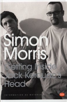
324 S., 19,8x12,8 cm, Auflage: 500, ISBN/ISSN 978-1-907468216 Softcover, Taschenbuch
ZusatzInfos
Getting Inside Simon Morris’ Head is a performative retyping of Simon Morris’ conceptual bookwork Getting Inside Jack Kerouac’s Head. Like Morris’ original performance of retyping the scroll edition of Jack Kerouac’s On the Road, Joe Hale’s project first appeared as a blog. At the rate of one page per day, like Morris retyping Kerouac before him, Hale retyped Morris’ entire book and in doing so re-retraces Kerouac’s famous adventure. Morris gave us all of Kerouac’s pages in reverse order: each blog post presented one page and the default settings of the blog platform organised his posts in reverse order, from the newest to the oldest. Now inverted again, as a double negative, Hale has restored the direction of travel to the story and produced a wholly (un)original new text. This first printed edition takes the imitative gesture to a new extreme. It features an introductory essay by poet Kenneth Goldsmith and reuses Morris’ paratext. From the cover design to the choice of paper, Hale tests the limits of conceptual extension.
Text von der Webseite
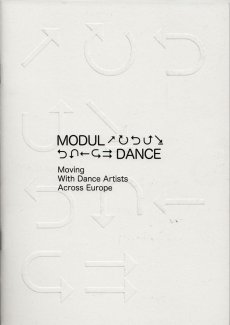
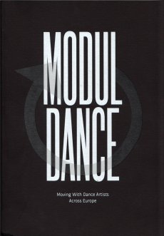
20,8x14,8x4 cm, 2 Stück. keine weiteren Angaben vorhanden 10 Hefte, Broschur und Drahtheftung, Softcover, mit Gummiband zusammen gehalten, Druck auf farbige Papiere
ZusatzInfos
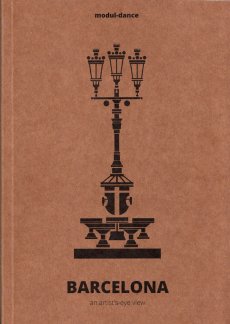
One of the modul-dance project key elements is the promotion of mobility, so that artists receiving its support follow itineraries across Europe to develop their creative work and present it to different audiences.
Modul-dance presents a collection of modul-dance city guides. Each of the guides in this collection shows a city from the viewpoint of a local artist, who proposes his or her own particular route to artists in transit, seeking to put them in connection with their host city. While these city routes share some basic features, each one is different and in their differences lies a wealth of gazes, aesthetics, approximations to the local and much more. In a word, they form a mirror of the diversity that modul-dance has always fostered. Athens, Barcelona, Bassano del Grappa, Dresden, London, Stockholm, Vienna, Toulouse, Paris and Poznań, ready to be discovered.
Text von der Webseite
[20] S., 18x14 cm, Auflage: 3.000, ISBN/ISSN 978-3-868740080 Drahtheftung
ZusatzInfos
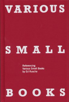
Ruscha der Fischotter aka: Printed Matter And Other Visible Things On Paper Not Necessarily Meant To Be Viewed As After Ruscha aka: One Hundred Views Of One Hundred Views Of Mount Fuji, If Someone Says So aka: SIX HANDS AND A CHEESE SANDWICH is a book about books, a catalogue and an art/bookwork in its own right.
Content: By now the appropriation and paraphrasing of Ed Ruscha constitutes a genre of its own. The first were 1968 Bruce Nauman with 'Burning Small Fires' and 1971 'Ed Ruscha' (actually Joel Fisher) with 'Six Hands and a Cheese Sandwich', with further appropriations or hommages over the decades, and in the last years it almost became fashionable, the evidence is massive.
Text von der Webseite
36 S., 21x14,8 cm, ISBN/ISSN 978-3-865882509 Drahtheftung
ZusatzInfos
As time doesn't stop, we are proud to devote this second edition of BEK to EVIL's newest project: his alter-ego SUPER A. EVIL will be in Langenhagen (Germany) in March and April to give us guys an insight into his personal well being. SUPER A of course, is just one little facet, but as you will hopefully discover, a more than eye-popping one. Therefore we are especially happy to feature both an extensive interview with EVIL KNIEVEL on his alter-ego and a mind-blowing photo story of SUPER A himself. Also we are introducing a new column at the end of the mag that tries to show a wider perspective of our so beloved EVIL KNIEVEL." (Peter Hush)
Mit Textbeiträgen von Peter Hush und Andy Reid sowie einem Interview mit Evil Knievel von Ken T. Evans.
Text von der Webseite
4 S., 21x14,9 cm, 2 Stück. keine weiteren Angaben vorhanden Einladungsflyer, beiliegend ein beidseitig bedrucktes Informationsschreiben zur Ausstellung
ZusatzInfos
zur Ausstellung vom 21.05.-04.06.2016 im Neo Toum - Neoterismoi Toumazou, Nikosia, Zypern.
He was dancing steadily. He could see the backs of people’s heads moving in the darkness and was aware of the shifting spaces between their bodies. He did not register the music except as a sort of vibration. He felt as if he was dancing in perfect silence. He saw the already dim room growing ever darker around him. He became less conscious of his surroundings and more aware of himself. His introspection grew but his body was now moving automatically, softly cycling through a short loop of set motions. He noticed dust under his feet, and soon the realisation reached him that he was slowly wearing a shallow hole in the wooden floor. His body was locked in an efficient cycle. Before too long he was six inches below floor level, his head parallel with some of the shorter dancers. Yet he could not stop. Gradually he sank deeper into the ground until his face was level with people’s waists. No one noticed, below the eye level of the crowd, he was almost invisible. Presently his eyes came level with the soles of dancing shoes. He could see shards of coloured light flashing through a forest of legs casting jagged shapes across the floor. There were points where soft reflected light shone through looming figures like sunlight into a clearing. Eventually he was entirely submerged. He could look up through the hole and see foreshortened bodies moving above him oblivious to his plight. Still his feet moved, wearing away damp, pungent earth. The vibrations from the music lessened until the dull thump of the kick drum was all that he could feel. When it stopped he realised he too was still, and looking up he saw the sphere of light was gone.
Text von der Webseite
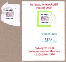
14,5x10,6 cm, 2 Teile. keine weiteren Angaben vorhanden Postkarte, beidseitig bedruckt mit Künstlerbriefmarke, gestempelt und eine lose Künstlerbriefmarke
ZusatzInfos
2000 artist postcards in 2000 days, one by one handmade in a rich variety of themes and techniques by Angela and Peter Netmail, and mailed out during the last 2000 days of this millenium.
Text von Postkarte.
4 S., 42,5x29 cm, keine weiteren Angaben vorhanden mehrfach gefaltetes Blatt
ZusatzInfos
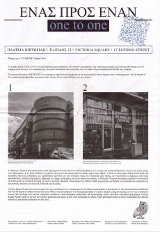
The publication is an attempt to map the local businesses in the area around Victoria Square, and a “meeting point" for the people of the neighborhood where they can narrate their stories. Every issue will host two new stories. Ausgabe vom 21.04.2017
106 S., 21x14,8 cm, Auflage: Print on Demand, 2 Stück. keine weiteren Angaben vorhanden Broschur
ZusatzInfos
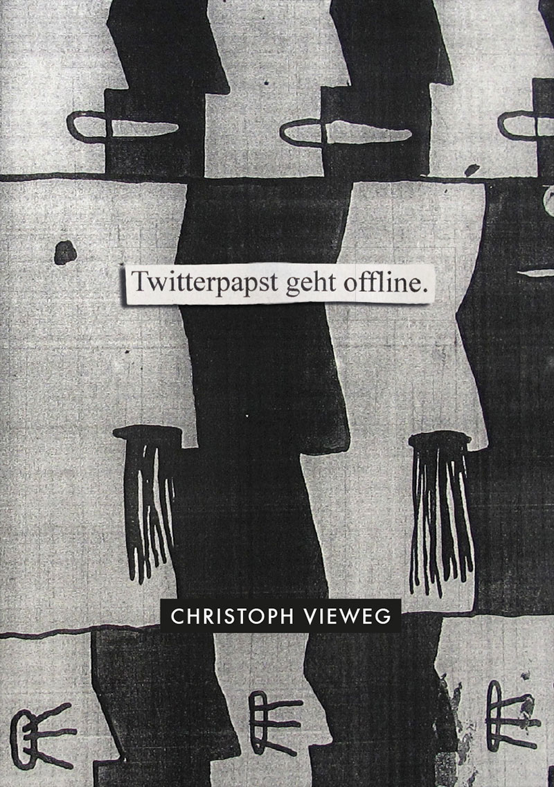
Schwarz-Weiß-Drucke, Nr. 029 aus der Reihe 100for10.
Christoph Vieweg is a drawer and illustrator, based in Berlin. He realizes his art mainly through drawings which focus on everyday observations. Most recently, Vieweg was engaged in the project SOWEIT DIE MELDUNGEN in which he attempts to artistically explore daily news delivered through radio podcasts. The challenge of the project is to keep up the artistic output of at least one drawing per day, each of it representing one received news item. Vieweg’s work presents itself in complex serial blocks which again and again aim to visualize and capture the undertone of the society we live in.
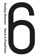
106 S., 21x14,8 cm, Auflage: Print on Demand, keine weiteren Angaben vorhanden Broschur
ZusatzInfos
Schwarz-Weiß-Drucke
Internationally renowned photographer, Horst A. Friedrichs was born in Frankfurt in 1966. He studied photography in Munich and has worked as a freelance photojournalist for numerous magazines including The New York Times, Geo and Stern. In 2008, he received the prestigious Lead Award for Best Reportage Photography. He has published a number of books including the best-selling I’m One: 21st Century Mods (Prestel). He lives in London. The Six Days of Bremen is a six-day track cycling race held annually in Bremen, Germany. The event was first held in 1910 as a one-off event and as a regular event since 1965. It is held at the ÖVB Arena.
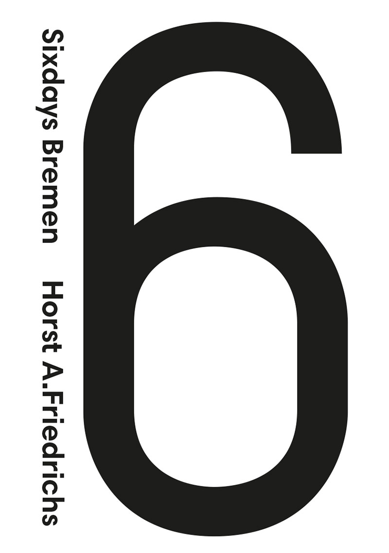
106 S., 21x14,8 cm, Auflage: Print on Demand, keine weiteren Angaben vorhanden Broschur
ZusatzInfos
Schwarz-Weiß-Drucke
Monoperro can be considered a self-taught artist, given his almost non-academic experience. At age 33 he suffers a major crisis that transforms all the important aspects of his life. From that moment on, a personal journey begins which takes him to explore into various fields such as shamanism, alchemy, tarot, reiki, etc… (always from an unorthodox position). Since a few years back all his production is being guided by a Spiritual Entity. As a result of this, his first book “Great End” (jekyllandjill.com) was published in Spain in Autumn 2015 and today he also offers a monthly workshop “Unleashing your inner creativity” in his studio, and one-to-one skype sessions. Urban Animism is the term monoperro uses to encompass all his artistic and vital experience.
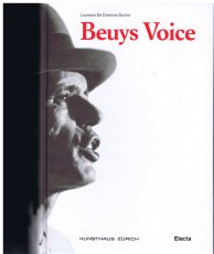
968 S., 24x17 cm, ISBN/ISSN 9788837085667 Hardcover, Titel mit partieller Lackierung
ZusatzInfos
Erscheint anlässlich der Ausstellung “Joseph Beuys – Difesa della Natura”, 13.05.-14.08.2011, Kunsthaus Zürich, herausgegeben von der Züricher Kunstgesellschaft/ Kunsthaus Zürich. 3 Ausgaben, italienisch, deutsch, englisch.
12 May 2011 is the 90th anniversary of the birth of Joseph Beuys (1921-1986), one of the key figures in the artistic scenario of the last century. The Kunsthaus in Zurich is paying tribute to the German master by staging an important international event that forms an integral part of the exhibition entitled “Joseph Beuys – Difesa della Natura” (Joseph Beuys – Defense of Nature), curated by Lucrezia De Domizio Durini and Tobia Bezzola. This book marking the birthday of this German painter and sculptor, who was one of the most authoritative and innovative voices of post-war society, is also being published in English and German. The book, about 1,000 pages long, containing more than 200 illustrations from the historical archive of De Domizio Durini, describes the Living Sculpture which made Beuys famous, together with the historical background that is fundamental to comprehending his thinking and work.
Text von der Webseite
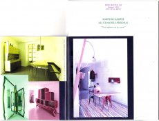
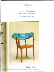
56 S., 20x15 cm, ISBN/ISSN 18617085 Drei Hefte in verschiedener Größe broschiert, mit Drahtheftung
ZusatzInfos
Martino Gamper is the kind of product designer we all have been waiting for: Brimming with ideas, energy and humour, his designs are disarmingly irreverent and irresistibly fun, and unlike anything one will see in the puristic galleries of contemporary design. Crossing over from studying sculpture to completing an MA in product design at the prestigious Royal College of Art under Ron Arad, Gamper has had little time to worry over the theoretical do’s and don’t’s of his profession – instead, he has followed a simple rule of learning by doing, meaning: the more you do, the more you learn. With mono.kultur, Martino Gamper talked about his idea of fun, why a chair is the ultimate challenge and what design has in common with cooking. Visually, the issue is bursting with references and ideas, reclaiming image material from left and right, while unveiling the structure of a book with three booklets of different sizes all lovingly assembled into one – and manually at that, which makes for some rough edges or rather what we like to call extra personality.
Text von der Website.
We are heading into a future where our choices will be shaped – if not outright determined – by algorithms and artificial intelligence. This coming state has been labelled “the new dark age” (James Bridle, 2018).
It remains to be seen what this brings to photography, and vice versa. One thing, however, seems clear: photography, which has already changed significantly in the 21st century, is affected by – and in some important ways is part of – this development. This issue of “Fotografija” explores how programmes, apps and AI-related technologies shape and change the discourse of photography, challenging traditional boundaries of the medium.
Various programmes and services – Google, Photoshop, Flickr, Snapchat, visual recognition, etc. – provide new tools to conceive image-making and think photographically. Technological interfaces not only deliver instruments for making work but can become the very logic for creating photographic series.
The presented artists offer perspectives to raise questions and discuss these technological shifts. From dealing with traumatic events (Indrė Šerpytytė) and inaccessible sites (James Bridle) through technological mediation to playing with our expectations of an all-pervasive Photoshop manipulation (Erin E’Keefe). From exploring so-called smart surveillance systems (Esther Hovers) and censoring politically sensitive sites (Mishka Henner) to everyday glitches (Mantas Grigaitis). From playing with the copyrights of such collective websites as Flickr (Penelope Umbrico) to exploring the shared language of being in some of the most photographed places on earth (Thomas Albdorf). And from using Photoshop to create images (Aaron Hegert) to an image that is barely photographic (Zachary Dean Norman). The four essays (Kate Palmer Albers, Roksana Filipowska and Marijana Rayl, Ilaria Speri, Alise Tifentale) map out the works in broader social, historical and art contexts.
In short, the works deal with our technologized world. They talk about being in the middle of changes that few have envisioned. Being so immersed, one can feel it (almost) hurts.
Text von Paul Paper.
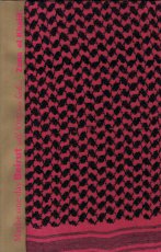
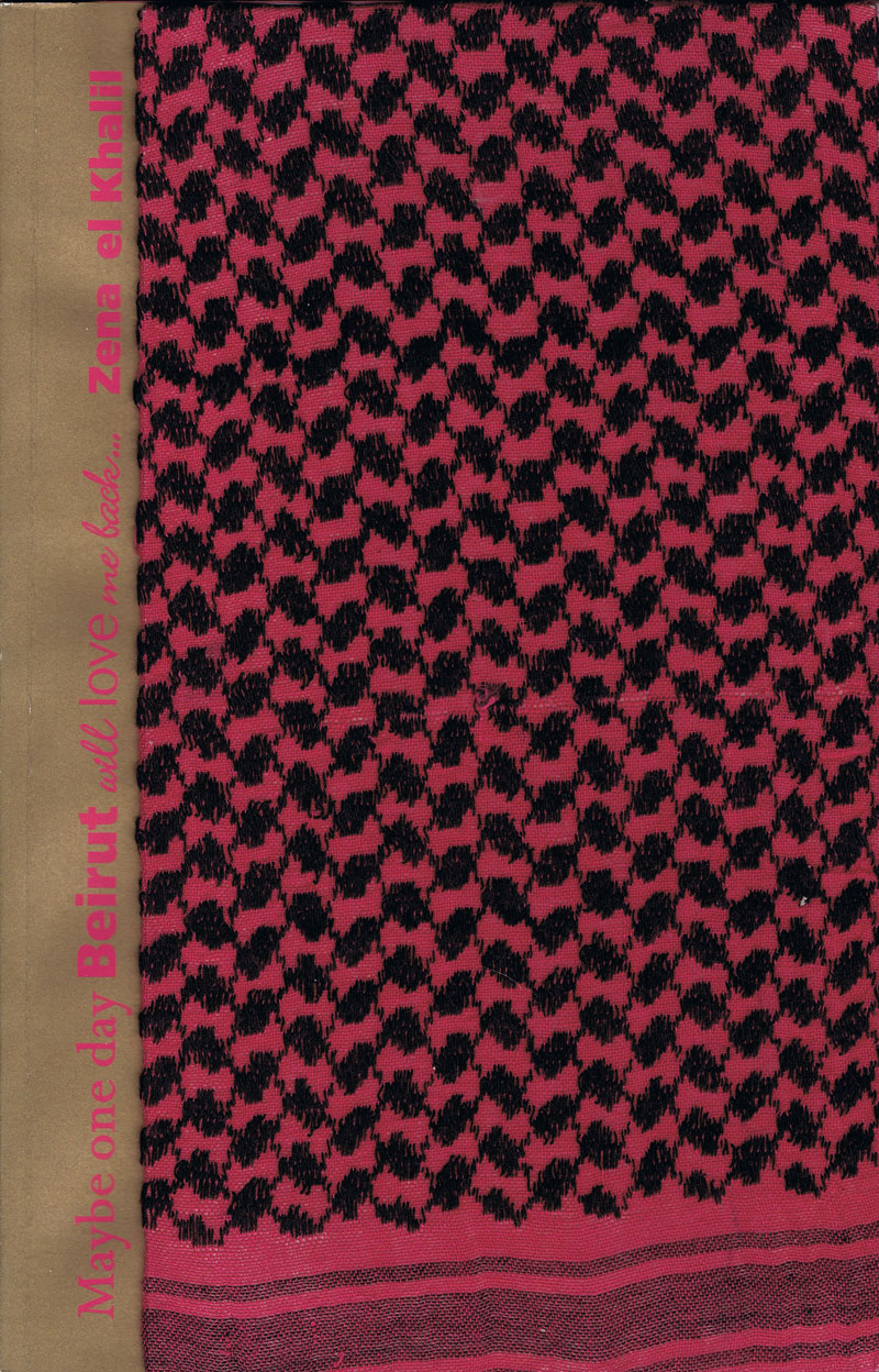
[56] S., 33,3x21,5 cm, keine weiteren Angaben vorhanden Klebebindung, Umschlag mit Palästinenser Tuch umbunden, eine Seite mit Ausstanzung in Form einer MP
ZusatzInfos
Die Publikation erschien anlässlich der Ausstellung "Maybe One Day Beirut Will Love Me Back.", 04.-19.10.2008, in The Flawless Gallery, London.
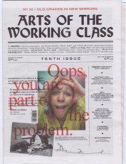
64 S., 35,2x25,8 cm, keine weiteren Angaben vorhanden Lose ineinander gelegte Blätter, Druck auf Zeitungspapier.
ZusatzInfos
Ausgabe Februar 2020. „Arts of the Working Class“ ist eine Straßenzeitung für Armut, Reichtum und Kunst. Sie erscheint alle zwei Monate und enthält Beiträge von Künstlern und Denkern aus verschiedenen Feldern und in verschiedenen Sprachen. Sie richtet sich an die Arbeiterklasse, also an alle, und es geht um alles, das allen gehört. Jeder, der sie verkauft, verdient mit. Jeder Künstler, dessen Arbeit beworben wird, gestaltet mit.
Century-old lore holds fast to the idea that a mirror is not only a reflection but a window from the facade of appearance into one's soul. For the superstitious, breaking a mirror tempts malignant forces, soul-splintering demons and seven years of bad luck. But what of the cracks at the edges of ancient mirrors or the spider web splintering across the screen in your pocket? We have yet to devise a reflection of ourselves that can weather time or violence. For what spills forth from cracks? What use is the time you spend looking in the mirror? For the survival of our souls we need to reflect one another and cultivate solidarity. To turn away from capitalist hegemony we must abandon our reflection and turn towards the other humans, and pull each other up through the cracks.
Text von der Webseite.
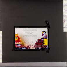
12,3x14,2 cm, keine weiteren Angaben vorhanden CD in Jewelcase
ZusatzInfos
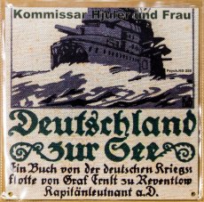
aufgenommen am 12.09.2018, ist Teil von Psych.KG 231 von Kommissar Hjuler.
Richard Franecki - guitar, electronics. James Warchol - guitar. Lars Kvam - saxophone. Rusty (7) - drums, percussions. Mitglieder: James Warchol
von Discogs
[36] S., 20,8x14,7 cm, 2 Stück. ISBN/ISSN 978-3-943819007 Drahtheftung
ZusatzInfos
Erschienen als Nummer 1 der Serie X1 Editions, Mehr als 30 Abbildungen der Werke von Brendan Danielsson.
Der Künstler stellt außerdem seine Werke im Rahmen der Don't Wake Daddy Ausstellungen von Feinkunst Krüger in Hamburg aus. Diese Serie nahm in der Hamburger Galerie 2006 ihren Anfang und präsentiert die sogenannte Lowbrow-Szene.
Feinkunst Krüger beschreibt diese Kunstrichtung auf ihrer Webseite:
Lowbrow (oder auch Pop Surrealism) ist als Kunstrichtung langsam aus den amerikanischen Subkulturen der 50er Jahre bis heute hervorgegangen. Sucht man die Ursprünge von Low Brow, so fängt man am besten bei den mittlerweile altehrwürdigen Surf- und Hot Rod-Bewegungen an und schaut dann was der Stein alles mitgenommen hat, sobald er ins Rollen geraten ist: Science Fiction-Fernsehserien, psychedelische Rockmusik, Softpornos, Animes usw. Wer billige Monsterfilme aus den Sechzigern kennt, Cartoons von Robert Crumb gelesen oder sich einmal mit amerikanischen Werbeplakaten aus den letzten 20-30 Jahren beschäftigt hat, dem dürften die Low Brow-Welten einigermaßen vertraut vorkommen. Das war praktisch der Anfang einer Emanzipation der Illustrative, die dadurch ihren Weg in die Galerien und Museen fand.
[32] S., 20,8x14,7 cm, 2 Stück. ISBN/ISSN 978-3-943819021 Drahtheftung
ZusatzInfos
... Lock arbeitet meist mit feinen Stiften auf pastellfarbenem Papier in kleinen bis mittleren Formaten. Diese sind gerade groß genug um die aufwendigen Details der Zeichnung zu erkennen. Gerade in letzter Zeit und speziell für diese Ausstellung arbeitet er aber auch an größeren Formaten in denen er mit Acrylfarben und Wasserfarben experimentiert und sich so neue Universen erschafft. Diese sind inspiriert von Science Fiction, postapokalytischen Vorhersagen, Death Metal, ... Der 25 jährige Künstler lebt und arbeitet in Massachusetts. In den letzten Jahren hat er weltweit an vielen großen Gruppenausstellungen teilgenommen und seine Arbeiten sind in unzähligen Publikationen erschienen. ... Angefangen aber hat alles schon in seiner Kindheit, als der junge Matt, fasziniert von jeder Art Comicfiguren und Charakteren aus X-Men und Star Wars, seine Lieblingshelden zu kopieren versuchte. Als Vorlagen dienten Buchcover, Comics, Poster und die Packungen von Actionfiguren. Das Ergebnis war dann eine bunte Mischung aus fantasievollen Comiczeichnungen und eigenen Kreationen. ...
Text von der Webseite
Erschienen als Nummer 3 der Serie X1 Editions.
[36] S., 20,8x14,7 cm, 2 Stück. ISBN/ISSN 978-3-943819052 Drahtheftung, schwarz-weiß
ZusatzInfos
Erschienen als Nummer 6 der Serie X1 Editions zur Vernissage von 08.06.-29.06.2013. Das Zine X1 #007 Use your Illusions II erschien ebenfalls im Rahmen dieser Ausstellung.
[252] S., 21x15 cm, Auflage: 300, ISBN/ISSN 9788439387671 Fadenheftung, Schutzumschlag. Gefalteter DIN A5 Karton zwischen den Seiten angeheftet.
ZusatzInfos
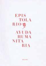
I had been in Cuba for almost a year studying in the Behavior Art School. One night, when my parents and I were having dinner at a tourist restaurant during one of their visits, I observed that most of the tables were occupied by couples made up of middle-aged tourists and Cuban girls. At the time (2008) the only option Cubans had to leave the country legally was to make a tourist man or woman fall in love with them and marry him or her. Love had become a kind of passport to freedom—or to the illusion of freedom, and winning someone’s heart and seducing them allowed Cubans to dream with a new life, a better—or different—life, regardless of it being real or unreal. That very day I decided to marry a Cuban man in order to understand and draw attention to what was happening in the country, that exchange of interests, that market of dreams, sex and company. My plan was to follow the same pattern. I would marry a Cuban man; I would give him the means to obtain the coveted papers and permits to leave the country in exchange of being able to use him in a work of art. I would use love to fool Cuban and Spanish bureaucracy. This is how the project Humanitarian Help was born. With that in mind, I organised a kind of public open call in which I offered to marry the Cuban man who wrote me “the most beautiful love letter in the world”, offering also to pay for the wedding expenses, his ticket to Spain and all the formalities to obtain Spanish nationality. This offer was aimed at those Cuban men who were interested in emigrating. A jury made up of three Cuban prostitutes would pick the winning letter and, therefore, my future husband. Mirroring the interested conditions that are usually applied in humanitarian aid, I required in the terms that the selected man be at my disposal for any request for the duration of the marriage. Once he acquired the Spanish citizenship, we divorced in accordance with the agreed terms and conditions. In the event that the work is sold, the profits will be shared out in equal parts.
Text von der Website
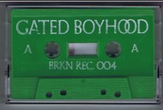
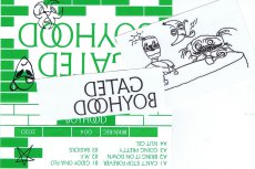
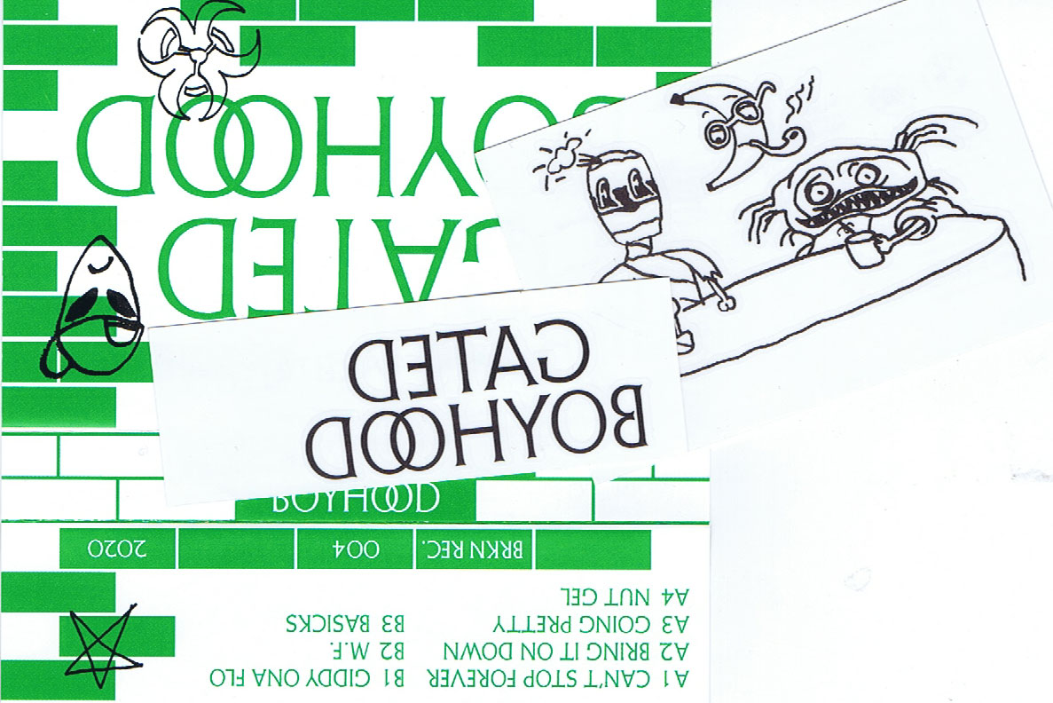
10,8x6,8 cm, Auflage: 80, keine weiteren Angaben vorhanden MusikKassette in durchsichtiger Hülle, mit Tattostickern und Downloadcode bei bandcamp.com
ZusatzInfos
Wir sind begeistert, die Debüt-EP des Schweizer Duos Gated Boyhood, auch bekannt als Mr. Peña und Dizco Joe, zu präsentieren. Die Musik ist eine Hommage an die alten Tage, als wir zusammen in der Rave-Höhle getanzt haben, übertragen auf die Gegenwart und bereit, dieses Gefühl sowohl alten Kennern als auch der neuen Generation zu vermitteln. Wir hoffen, dass es euch gefällt, denn es ist eines der am tiefsten verwurzelten Projekte unseres Labels, an dem viele liebe Menschen beteiligt sind.
We are hyped to present the debut EP of the Swiss duo Gated Boyhood, already known as Mr.Peña and Dizco Joe. The music is a tribute to the old days when we used to dance together down in the rave cave, transferred to the present and ready to provide this feeling to both old connoisseurs as well as the new generation. We hope you enjoy this one, it’s one of the most Deeply rooted projects of our label, involving many lovely people.
Text von der Webseite, Übersetzt mit DeepL
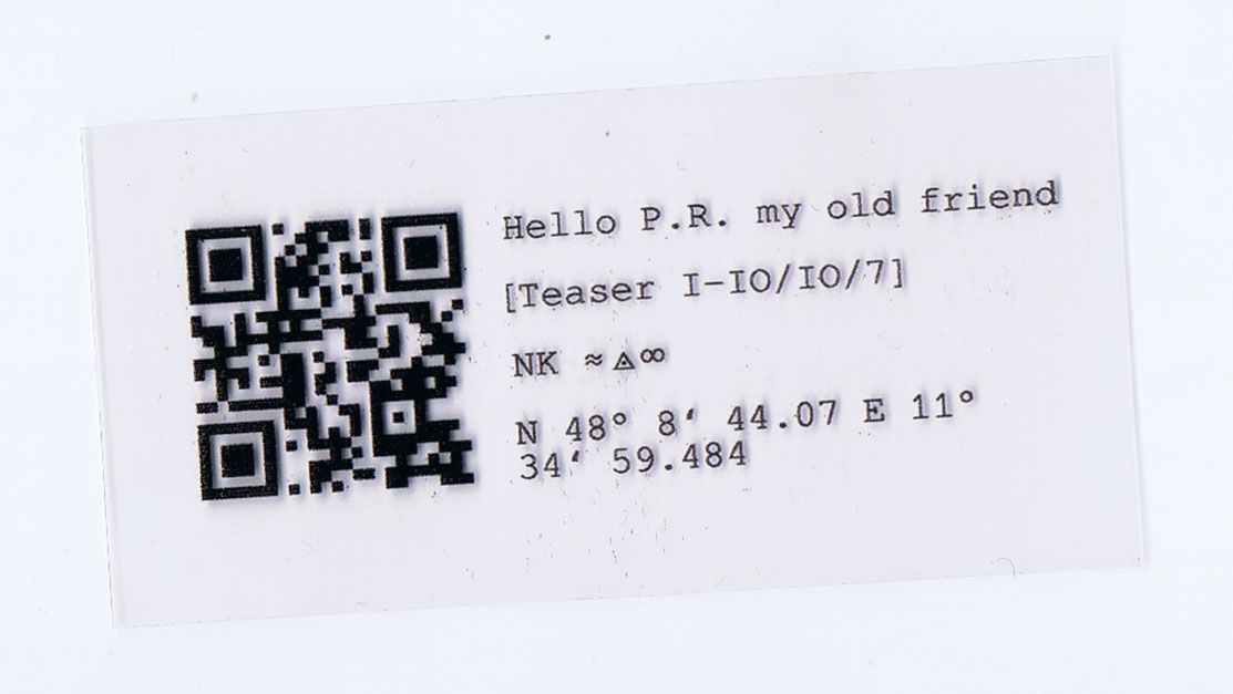
3,8x8 cm, keine weiteren Angaben vorhanden Laserkopie auf transparente Folie
ZusatzInfos
QR-Code zur Wandinstallation mit alten Perry Rhodan Heften in der Galerie Apartment der Kunst in München, in der Ausstellung A Room for One´s Own kuratiert von Hanna Banholzer 22.04.-17.05.2023
14,5x10,2 cm, keine weiteren Angaben vorhanden Postkarte/ Flyer, Rückseite bedruckt
ZusatzInfos
"No one is an island". Für dieses Projekt werden Künstler:innen aus China, Guadeloupe, Israel, Kamerun, Senegal, Serbien und der Ukraine für jeweils drei Monate nach München eingeladen, um über globale Abgrenzungstendenzen zu diskutieren, sich zu vernetzen und den Austausch bei Symposien und Residenzen zu vertiefen.
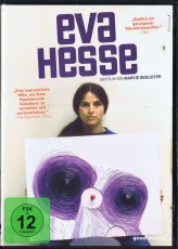
19x13,5 cm, keine weiteren Angaben vorhanden DVD in Kunststoffhülle
ZusatzInfos
104 Minuten, DVD 9.
Der Film erzählt die Geschichte einer leidenschaftlichen, schönen und talentierten Frau – ein jüdisches Flüchtlingskind aus Hamburg, das sich an die Spitze der Der Film erzählt die Geschichte einer leidenschaftlichen, schönen und talentierten Frau – ein jüdisches Flüchtlingskind aus Hamburg, die sich an die Spitze der US-Kunstszene kämpfte und bis zu ihrem frühen Tod 1970 mit 34 Jahren die Kunstgeschichte verändert hat. Anlässlich der Ausstellung "Eva Hesse - One More than One" in der Hamburger Kunsthalle (29. November 2013 bis 2. März 2014) entstand der Dokumentarfilm über Leben, Werk und Wirkung von Eva Hesse. Die Ausstellung bot einen passenden Rahmen, um erstmals viele ihrer komplexen Werke filmisch dokumentieren zu können. „Eva Hesse ist eine extrem relevante Künstlerin, die für einen Übergang und eine Verwandlung der Kunst der 1960er steht.” Nicholas Serota, Director Tate Museums, 2013 Eva Hesse, die als Kind vor den Nazis in die USA fliehen konnte, hatte ihre künstlerische Erweckung 1964/65 während eines Deutschland-Aufenthaltes. Sie starb 1970 in New York an einem Hirntumor und schuf in dieser kurzen Zeit ein Werk, das die Geschichte der Kunst veränderte.
Text von der Webseite
Begleitpublikation zur Installation in der Rotunde der Pinakothek der Moderne in München, 29.03.-27.08. 2023
Am 28. März wurde „One Million German Passports“, eine Installation des Künstlers Alfredo Jaar in der Rotunde der Pinakothek der Moderne eröffnet. Eine Million deutsche Pässe sind hier dicht an dicht zu einem Kubus von 6m x 6m x 80cm gestapelt, hinter einer gläsernen Hochsicherheitswand zu sehen. Die Zahl referiert, laut Alfredo Jaar, auf die Zahl der Menschen, die die ehemalige Bundeskanzlerin Angela Merkel 2015 in Deutschland willkommen hieß. Sie soll aber auch an die Zahl der Menschen erinnern, die sich später von ihr und ihrer Partei, der CDU, distanzierten und 2017 die rechtsextreme Partei AfD wählten. Alfredo Jaar bezieht sich in diesem polarisierenden Werk über die Situation in Deutschland und Europa hinaus auch ganz allgemein auf die globale Migration und berührt damit grundsätzliche Fragen zu Flucht, Einwanderung und Staatsbürger:innenschaft.
Eine solch politisch und gesellschaftlich herausforderndes Werk kann als engagierte Concept Art verstanden werden und erfordert in seiner minimalistischen Ästhetik nach einer Kontextualisierung. Dazu veröffentlicht das Architekturmuseum der TUM eine 20 Seiten starke Zeitung mit 15 Beiträgen von internationalen Expert:innen, Wissenschaftler:innen und Schriftsteller:innen
Text von der Webseite
323 S., 36,4x26x3,5 cm, keine weiteren Angaben vorhanden Ota-Bindung mit aufklappbarem Schutzumschlag
ZusatzInfos
Katalog zur gleichnamigen Ausstellung in der Fondadtion Cartier pour l'Art Contemporain, Paris, 30.03.-10.06.2018.
In Freeing Architecture, Ishigami elaborates upon his most recent research into function, form, scale and the environment in architecture, thereby revealing his vision for the future of the field. Through over 40 models, as well as numerous films and drawings, the exhibition presents twenty projects from their genesis to the complex process of their realization. Far from being tools prior to construction, the models assembled in the exhibition were made specifically for the occasion. As viewers contemplate these hand-crafted works, assembled in the architect’s studio over the course of one year, one can see the many steps and the painstaking work that led to the development of their final form. All different in terms of their material, size and level of detail, they offer a glimpse of the slow maturation process, necessary for the creation of Ishigami’s architectural works. Works infused by a poetics that is achieved as much through experimentation, as it is by theory, knowledge, and technology.
Text von der Webseite
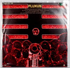
36 S., 14,5x15 cm, Auflage: 100, keine weiteren Angaben vorhanden Drahtheftung, im Umschlag vorne 3 Booklets und 1 gefaltetes Poster (Klang! Suoni Contemporeani) in Einschubtasche, rückseitig eine selbstgebrannte und -gestempelte Multimedia CD, Heftseiten Schwarz-Weiss Kopien mit 4 eingeklebten Farbbildern, auf dem Cover das Klang! Logo ebenfalls aufgeklebt
ZusatzInfos
ARTE POSTALE! (1979-2009) One of the best known and probably the most long-live mail art magazine on the planet, Arte Postale! has assembled original works or published materials by hundreds of international networkers. The project is considered concluded with issue n.100 (december 2009).
Text von mailartprojects.blogspot.com
When, just over twenty, I was assembling the first issue of the magazine Arte Postale!, joining with brass rings a dozen of sheets printed in one hundred copies on pink paper, I would never have imagined that thirty years later I would have been still busy putting together with scissors and glue the very same publication. Instead, this issue n. 100, intentionally produced in the homemade cut-and-paste style typical of mail art, even shares the musical theme with that first experiment, in which I already rubberstamped and glued leaflats on the pages or I stapled on them a piece of magnetic tape.
Introduction by Vittore Baroni
Issue no. 100 of Vittore Baroni's Arte Postale! magazine dedicated to the Klang! exhibition/sonic arts festival held in Viareggio, Italy, august 7-9 2009.
36 pp. booklet with attached cd-r, published in 100 copies (standard edition, in the AAP) plus 100 copies with additional plastic pouch including 30 original cd-size works by 30 artists (Joel S. Cohen, David Dellafiora, Mike Dickau, Carol Stetser, Ruggero Maggi, Emilio Morandi, Jan-Willem Doornenbal, Ever Arts, Luc Fierens, Richard Kostelanetz, Jurgen O. Olbrich, Gianni Simone, Rod Summers, Bruno Cassaglia, Ruggero Maggi, Serse Luigetti, etc.
Among them comes a CD mini-album by Jarmo Sermilä: Mechanical Partnership, a complimentary copy of the official Jase 2000 release - see Jarmo Sermilä - Mechanical Partnership.
Text von discogs Webseite
Audio
1. Mike Dickau - Arte Postale!: Pax Vobiscum (2’54”)
2. Günther Ruch - Musica 123456 (2’09”)
3. Reid Wood - Future Sound (0’27”)
4. Krell - Bzzzoing! (5’00”)
5. Franco Piri Focardi - Concerto Per Bozuffo (3’41”)
6. Jan Willem Doornenbal - Lake Crocodile (2’16”)
7. Bruno De Angelis - 100: Game Over! (4’ 30”)
8. Joel Cohen - Last Song Reverse (2’17”)
Tempo Totale | Total Time: 23’54”
3 S., 29,7x21 cm, signiert, 4 Teile. keine weiteren Angaben vorhanden Briefumschlag, beschrieben und beklebt, mit drei Blättern, Inkjetdrucke, handschriftlicher Gruß und ausgedruckter Visitenkarte,
ZusatzInfos
Ausschreibung zum Mail Art Projekt "we history wonderful make (one-man strategy)", Erinnerungsblatt an den 100. Geburtstag von Cavellini am 11. Sept. 2014, 1 Blatt Mail Art
185 Blatt S., 28x21,5 cm, Auflage: 1.000, keine weiteren Angaben vorhanden Offsetdruck nach original Fotokopierarbeiten, je Künstler 25 Seiten, First Edition
ZusatzInfos
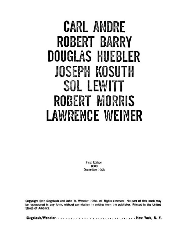
Siegelaub in einem Interview: The Xerox book - I now would prefer to call it the Photocopy book, so that no one gets the mistaken impression that the project has something to do with Xerox – was perhaps one of the most interesting because it was the first where I proposed a series of requirements for the project, concerning the use of a standard size paper and the amount of pages the container within which the artist was asked to work.
Das Buch ist/war die Ausstellung
[52] S., 26,2x21,1 cm, Auflage: 500, numeriert, ISBN/ISSN 978-1-590052464 Hardcover mit Leineneinband und transparentem Schutzumschlag, bedruckt. Seiten jeweils linksseitig beklebt
ZusatzInfos
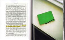
Copied pages from Jean-Paul Sartre’s philosophical main work "Being and Nothingness", are glued into John Divola’s new book, references are highlighted by a marker, their content is respectively visualized by a photography by Divola. The pictures do not seem to add something, they simply show a visual translation of the things described in words – ONE translation. If one only reads, the pink cake can take shapes in diverse forms. Now it has the form, which is visible in the photograph.
Alle Fotografien wurden zwischen 1995 und 1999 angefertigt.
Text von der Webseite.
Patti Smith: Camera Solo, on view at the Wadsworth Atheneum from 21.10.2011-19.02.2012, was the first museum exhibition of Patti Smith’s photography in the United States and included seventy photographs, one multimedia installation, and one video work.
The pioneering artist, musician, and poet, Smith has made her mark on the American cultural landscape throughout her 40-year career, from her earliest explorations of artistic expression with friend and vanguard photographer Robert Mapplethorpe in the 1960s and 70s to her profound influence on the nascent punk rock scene in the late 1970s and 80s.
Text von der Website.
[196] S., 26x26 cm, ISBN/ISSN 978-1-452142760 Hardcover, fadengeheftet
ZusatzInfos
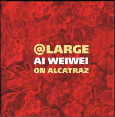
Erschienen zur Ausstellung bei der FOR-SITE Foundation, San Francisco 27.09.2014-26.04.2015.
Internationally renowned Chinese artist and activist Ai Weiwei is one of contemporary art's most newsworthy figures, noted for both his groundbreaking work and his outspoken stance on human rights, which ultimately resulted in his controversial 2011 detainment. In an astonishing new large-scale project, he turns his attention to Alcatraz—a place he could not visit because he was not permitted to leave China, but that stands as a world-famous symbol of both incarceration and protest. This book showcases the major exhibition presented by FOR-SITE Foundation of site-specific, multimedia installations and sculptures Ai Weiwei create for the island, on view from the fall of 2014 through the spring of 2015. Featuring beautiful photographs and thought-provoking text, At Large is the essential document of this remarkable happening from one of today's most celebrated artists.
Text von der Website.
66 S., 27,9x21,6 cm, Auflage: Print on Demand, keine weiteren Angaben vorhanden Broschur, Digitaldruck, Umschlag glänzend laminiert. Schwarz-Weiß
ZusatzInfos
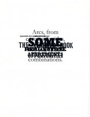
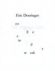
Collected Works compiles eight of my books into one convenient volume. The books are combined together, so that page one of Collected Works is a "sandwich" of the first page of all eight books, page two contains the second page of each book, page three the third page, etc. Collected Works reproduces Squares With Sides And Corners Torn Off, Some Los Angeles Apartments, Real Estate Opportunities, The Location of Lines, and Records in their entirety, plus excerpts from 60 Years Later, Arcs Circles & Grids, and The Xeroxed Book. - Eric Doeringer
Text von der Webseite
[42] S., 28,9x22,2 cm, Auflage: 200, numeriert, signiert, keine weiteren Angaben vorhanden Fadenheftung, sechsfarbiger Risographie, letzte Seite ausklappbar
ZusatzInfos
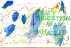
Rage, Heal, Root, Grow is a celebration of the chaos and complexity of life and one person’s process of adapting to it. Johnson’s postpartum years were challenging. She was fearful of what she saw happening—that she was disappearing as her male partner was becoming more visible. She struggled to find the time and space necessary to heal her body, and to reconcile the intense inequity of a child-rearing partnership when one partner (her) was nursing. A unique postpartum tale that refuses the female body as its central character. In its place: that body’s voice, and the bespoke flotsam of daily life.
Rage, Heal, Root, Grow was created on a shared Risograph duplicator over many months while Johnson’s child slept in a stroller nearby. She scanned and printed drawings they had made together with markers, watercolors, crayons, pencils, and lots of stamps into symphonic six-color prints. A narrative text describes her experience of raging, healing, rooting herself, and subsequently growing in a new direction.
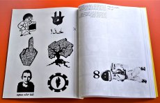
[50] S., 28x21,5 cm, Auflage: 100 ca., signiert, keine weiteren Angaben vorhanden geklammerte Fotokopien, ein Blatt als Sticker eingebunden. Kopiert im August 2019
ZusatzInfos
... If you know me at all, then you know I like to operate where I see vacuums in the culture. Zine El-Arab came about precisely for that reason. This was 2011, a time of great revolutionary upheaval that started in Tunisia, spilled over into Egypt, and kind of spread from there not just in the region but halfway across the world.
By late 2011, there was really no denying the ripples of change pulsating through Cairo. It was evident on the streets, in music, conversations, at art galleries, on television, it was everywhere. But I was growing frustrated that there didn’t seem to be any regular publication that featured the voices of dissent that were otherwise all around you. It felt like there was a rift between everyday voices and what was being published, and how cool would it be if there were at least one? Especially if it were a crude one. ...
... Die Formel war scheinbar ganz einfach. Das Titelbild (von mir erstellt) wurde auf Social Media veröffentlicht und lud Mitwirkende aus dem arabischsprachigen Raum ein, darauf entweder mit Text oder Bild zu antworten (nur S/W). Entsprechende Einreichungen werden ausgewählt und zu einem digitalen Zine zusammengestellt, der als PDF mit detaillierten Anweisungen für Druck und Montage hochgeladen wird. Die Idee war, nicht nur den Inhalt, sondern auch die physische Produktion des Zine zu dezentralisieren, wodurch Mitwirkende und Leser ihre eigenen Kopien drucken und organisch unter ihren Gemeinschaften verbreiten konnten. In Wirklichkeit hatten beide Ausgaben ihre "Launchparties", Ausgabe eins in Makan in Jordanien und Ausgabe zwei in der Townhouse Gallery in Kairo, was bedeutete, dass für jeden Start etwa 100 Exemplare gedruckt und zusammengestellt werden mussten.
Eine Sache, die ich tun wollte, war, die Tatsache zu nutzen, dass jedes Exemplar technisch individuell gedruckt und gebunden wurde. So gab es beispielsweise für die Ausgabe #1 Anweisungen, den Blutfleck manuell auf das Cover zu malen, und im Inneren befand sich eine Seite (mit mehreren Bildern verziert), die für den Druck auf Klebepapier bestimmt war, auf der die Leser ausschneiden und als Aufkleber verwenden konnten.
Es sollte beachtet werden, dass es im Namen der Zine ein kleines Wortspiel gibt. Das Wort "zine" in arabischer Sprache ist die gleiche genaue Schreibweise wie das Wort "zain", was in etwa "das Beste" bedeutet. So schlägt Zine El-Arab nicht nur "die Zine des Arabers" vor, sondern wird gleichzeitig als "das Beste vom Araber" gelesen. ...
Übersetzt mit DeepL
Text von der Webseite
Foto Innenteil von Ganzeer
720 S., 21x15x4.5 cm, Auflage: Print on demand, keine weiteren Angaben vorhanden Softcover, Schwarz-Druck auf Papiere, Titel und Autor in weißer Schrift auf dem Buchrücken. Gedruckt bei Lulu
ZusatzInfos
Ink used for digital printing is one of the most precious substances in the world. A single gallon of ink costs over four thousand dollars and this is one reason why digitally printed books are so expensive.
However, the price of a book is not calculated according to the amount of ink used in its production. For example, a Lulu book of blank pages costs an artist as much to produce as a book filled with text or large photographs. Furthermore, as the number of pages increases, the price of each page decreases. A book containing the maximum number of pages printed entirely in black ink therefore results in the lowest cost and maximum value for the artist.
Combining these two features, buyers of The Black Book can do so with the guarantee that they are getting the best possible value for their money.
Text von der Webseite
136 S., 21x23 cm, Auflage: 600, 2 Stück. ISBN/ISSN 3923205031 geschraubt bzw. gelocht, mit Musterbeutelklammern
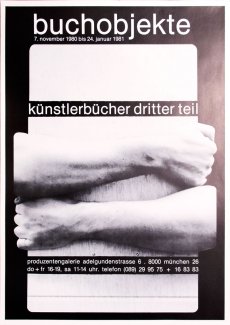
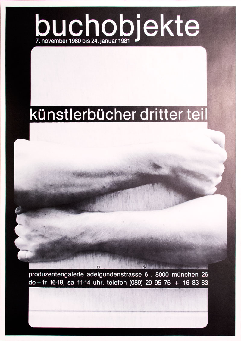
ZusatzInfos
Zur Ausstellung 07.11.1980-24.01.1981. Ausstellungskatalog zur Ausstellung Buchobjekte in der Produzentengalerie Adelgundenstraße, Künstlerbücher 3. Teil, München, mit Index zu allen drei Katalogen, mit einem Nachtrag zu Künstlerbücher 2. Teil Objektbücher.
Gezeigt wurden 128 Arbeiten von 74 Künstlern.
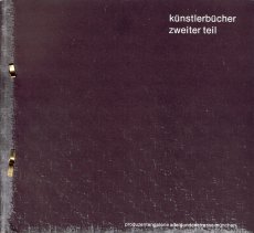
56 S., 29,7x21 cm, signiert, ISBN/ISSN 978-3-936826814 Drahtheftung, einige Seiten zum Ausklappen, mit Schutzumschlag, eingelegt ein beidseitig bedrucktes Poster, Aus der Reihe A 4 Band 12, mit Widmung
Zur Ausstellung Objektbücher in der Produzentengalerie Adelgundenstraße München, Künstlerbücher 2. Teil vom 16.05.-26.07.1980. Prüfexemplar für den Schweizer Zoll, mit Stempel 31.8.1981.
Gezeigt wurden 175 Arbeiten von 94 Künstlern.
Leihgeber: Rolf Dittmar, Wiesbaden. Edition Staeck, Heidelberg. Galerie Am Promenadeplatz, München. Hubert Kretschmer, München. Susann Kretschmer, München. Ulrich Otto, München. Konrad B. Schäuffelen, München. Klaus Staeck, Heidelberg. Galerie Walter Storms, Manchen. Galerie Tanit, München
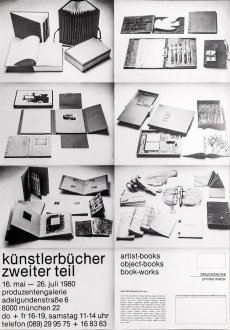
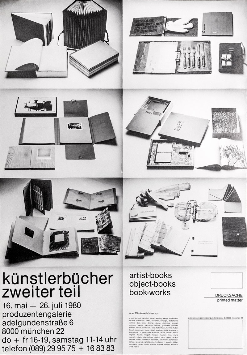
1 S., 60x42 cm, 2 Stück. keine weiteren Angaben vorhanden Ausstellungsplakat
ZusatzInfos
Zur Ausstellung mit über 200 Objektbüchern, in der Produzentengalerie Adelgundenstraße München, Künstlerbücher 2. Teil vom 16.05.-26.07.1980.
Leihgeber: Rolf Dittmar, Wiesbaden. Edition Staeck, Heidelberg. Galerie Am Promenadeplatz, München. Hubert Kretschmer, München. Susann Kretschmer, München. Ulrich Otto, München. Konrad Balder Schäuffelen, München. Klaus Staeck, Heidelberg. Galerie Walter Storms, München. Galerie Tanit, München
[20] S., 21x13 cm, Auflage: 500, 2 Stück. keine weiteren Angaben vorhanden Drahtheftung, Laserkopie Schwarz-Weiß
ZusatzInfos
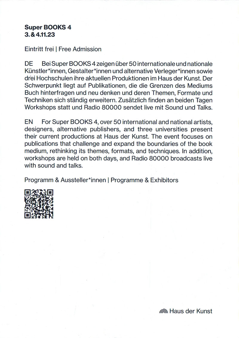
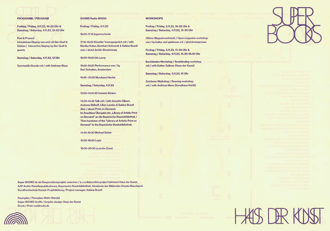
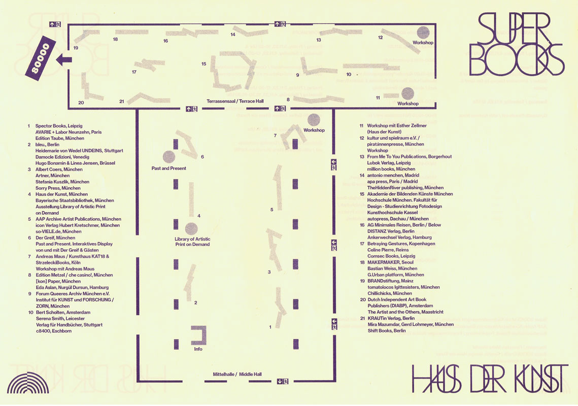
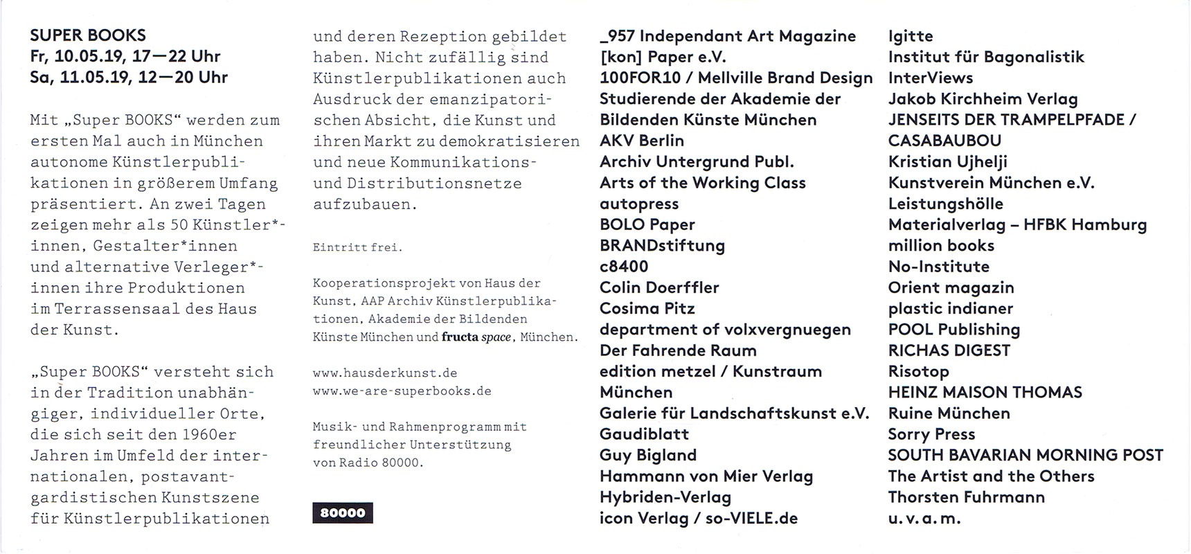
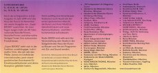
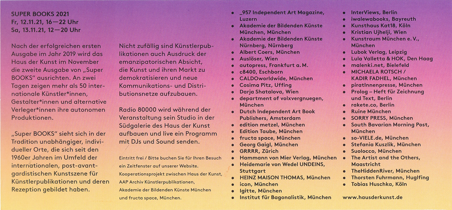
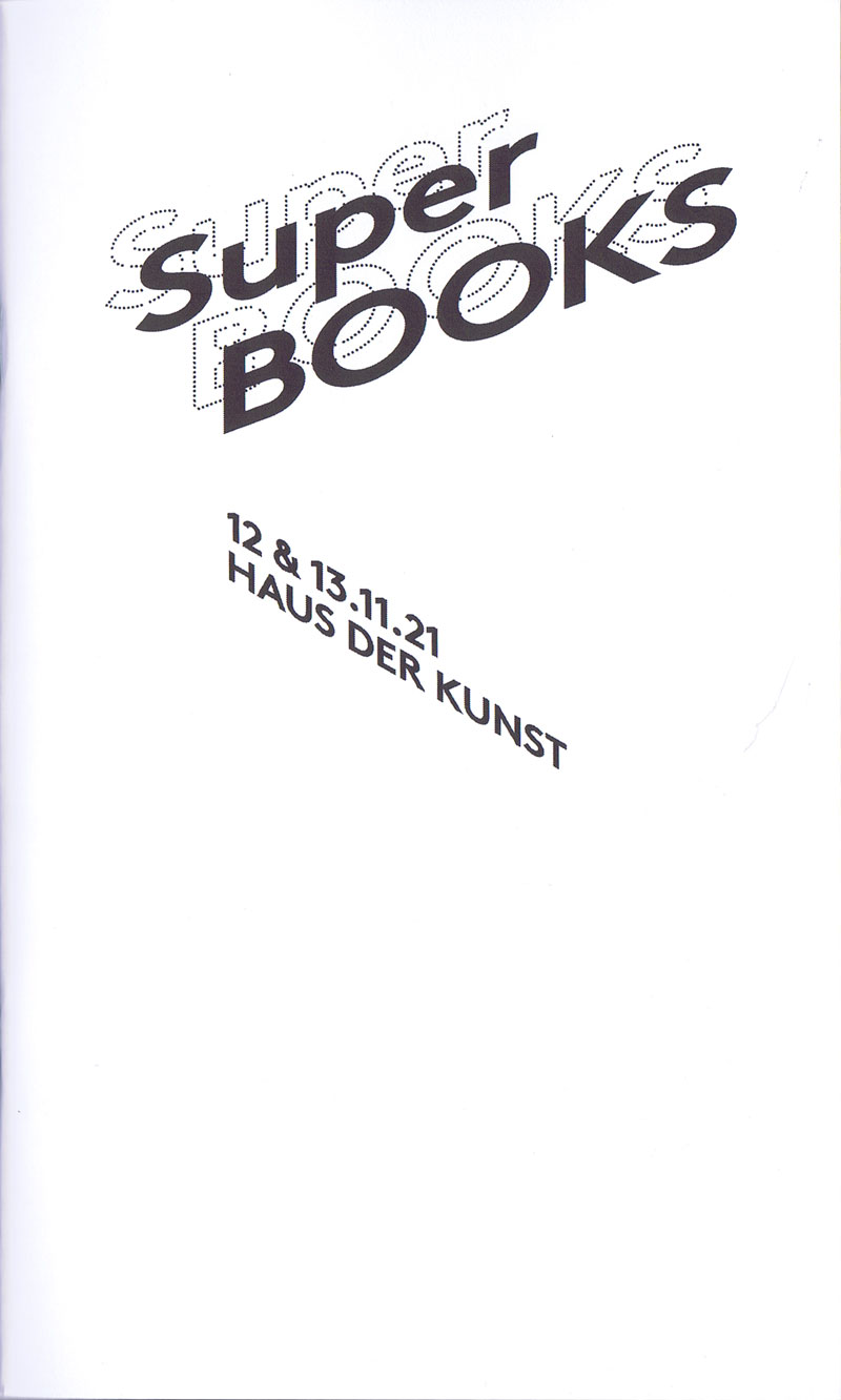
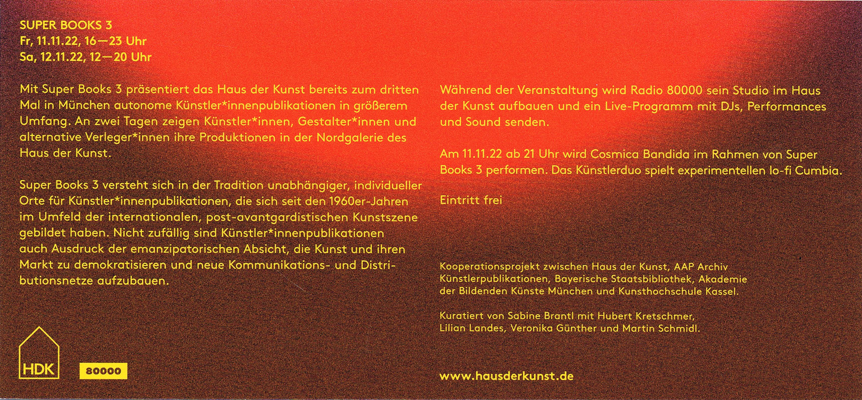
Mit der diesjährigen Ausgabe von Super BOOKS leitet das Haus der Kunst den Münchner Bücherherbst 2023 ein. Seit dem Auftakt im Jahr 2019 erhält die sehr lebendige und aktive Künstler*innenbuchszene zum vierten Mal die Fläche für einen gemeinsamen Auftritt.
Am 3. und 4. November zeigen über 50 Künstler*innen, Gestalter*innen und alternative Verleger*innen sowie drei Hochschulen ihre aktuellen Produktionen im Haus der Kunst. Neben Produzent*innen aus Deutschland sind in diesem Jahr auch Aussteller*innen aus Spanien, Italien, Frankreich, Österreich, England, Belgien, den Niederlanden und Südkorea vertreten. Die Teilnehmenden sehen sich in der Tradition der 1960er Jahre, als sich im Umfeld der postavantgardistischen Kunstszene neue Kommunikations- und Distributionsnetze bildeten. Ihre Produkte wie Künstler*innenbücher, Magazine oder Zines sind autonome Kunstwerke.
Der Schwerpunkt von Super BOOKS liegt auf Publikationen, die die Grenzen des Mediums Buch hinterfragen, neu denken und deren Themen, Formate und Techniken sich ständig erweitern. Mit ihrer Ethik der Zugänglichkeit, die in Preisgestaltung und der Direktheit von Vertriebswegen zum Ausdruck kommt, bilden sie ein Gegengewicht zu den gängigen Spielregeln des Kunstmarkts. ...
... Super BOOKS ist ein Kooperationsprojekt zwischen Haus der Kunst, AAP Archiv Künstlerpublikationen, Bayerischer Staatsbibliothek, Akademie der Bildenden Künste München und Kunsthochschule Kassel. Projektleitung: Sabine Brantl (Haus der Kunst)
Text von der Webseite
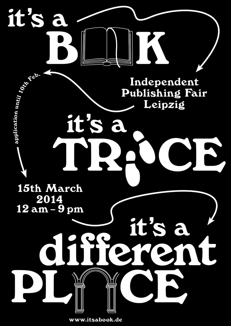
7 S., 29,7x21 cm, keine weiteren Angaben vorhanden Schwarz-Weiß-Laserdruck nach Webseite, Drahtheftung
ZusatzInfos
Independent Publishing Fair Leipzig, 15th of March 2014
Event: "It’s a Book…” is an independent publishing fair taking place on 15th of March 2014 at the Academy of Visual Arts Leipzig, in correspondence to the Leipzig Book Fair. Entrepreneurs of the international independent publishing-scene are looking forward to meeting interested visitors and exchanging books and ideas.
Organisation: students of the graphic design department, Academy of Visual Arts, Leipzig.
200 S., 24,1x16,7 cm, ISBN/ISSN 978-3-775729796 Broschur
ZusatzInfos
Edited by Gabriele Wix, By Gabriele Wix, graphic design by Lawrence Weiner, Anja Lutz.
Most of his oeuvre, which comprises more than a thousand language-related works, has already been presented in the German-speaking world—some of it either translated by Weiner himself or conceived using German as a basis. Featuring over 350 works, this is the first list of the English/German works. The artist assumed responsibility for the typography and cover design, as if the publication were one of his own works. Accompanying text and visual documents shed light on the creative process, in-situ installations, and Weiner’s way to work with text.
Text von der Webseite
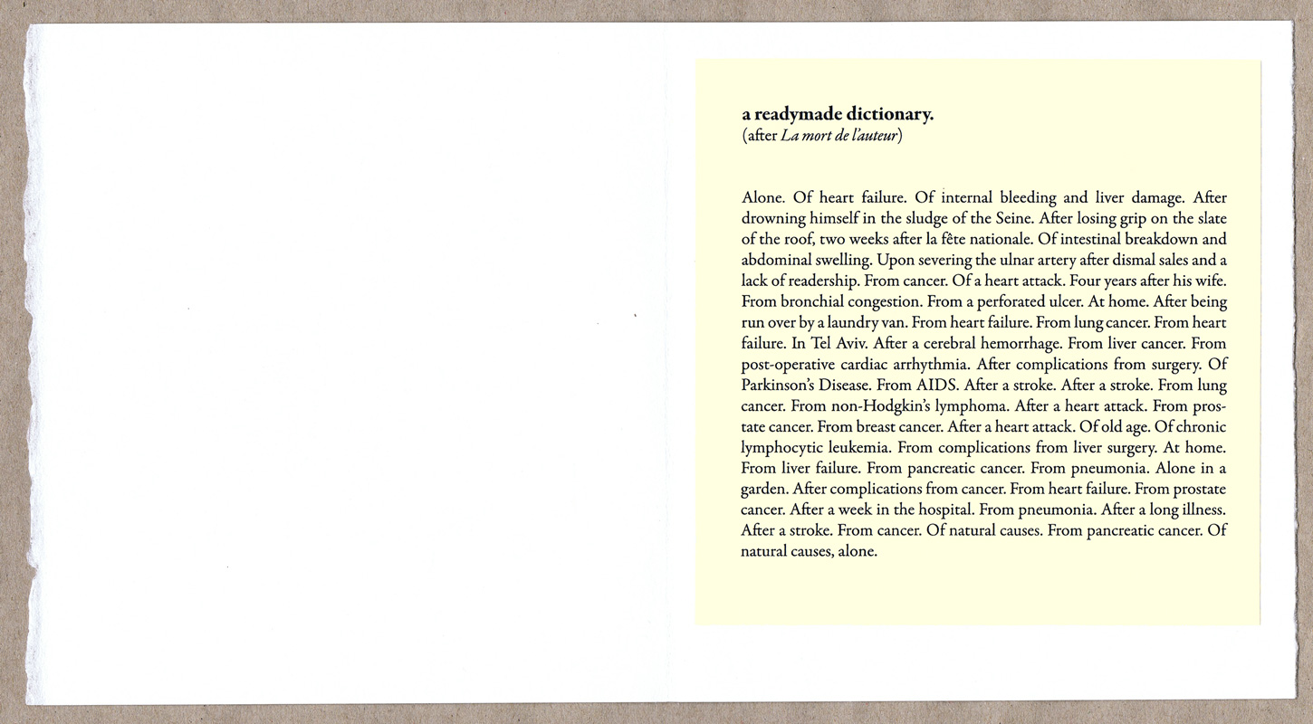
DER PFEIL conceives itself as a fictional space, which by means of a series of publications, spreads transportable works and positions. Each issue is devoted to the connotation of a term and accompanying questions as: to what extend are diversified agendas and significances triggered through one word, and how can they later be traced back? As a fragmented, ongoing dictionary, various artistic approaches are gathered in what we call "Edizin", with all the unique contributions released in an edition of 100 - in order to un-tighten the terms from their tasks.
Text von der Webseite
152 S., 44,7x32,5 cm, ISBN/ISSN 978-3-865211057 Hardcover, Leineneinband im Schuber,
ZusatzInfos
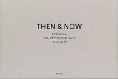
One of the most well-known of Ruscha's books from his early period is Every Building on The Sunset Strip, showing a famous stretch of real estate along Sunset Boulevard in Los Angeles, published in 1966. In July, 1973 he followed the same procedure while documenting Hollywood Boulevard.
Loading a continuous strip of 33 feet of Ilford FP-4 black & white 35mm film into his motor-drive Nikon F2 and then mounting it on a tripod in the bed of a pickup truck, he drove back and forth across the 12 miles of the street shooting, frame-by-frame, both the north and south sides of its entire length. The negatives were developed, contact sheets were made, and the materials were placed in storage.
Thirty years later, in 2003, a digital record of Hollywood Boulevard was created and it served as a reference guide for the traditional film/still documentary of 2004. For this shoot, the same type of camera equipment was used to re-photograph the street on 35mm color-negative film.
The resulting material of both shoots — 4500 black & white and 13,000 color images — have been scanned and digitally composed into four panoramics of the complete 12 miles. In THEN & NOW, the original 1973 North side view is shown along the top of the page and juxtaposed with its 2004 version underneath. Along the bottom of the page, you find the original 1973 South side view shown upside down, also juxtaposed with its 2004 version. The panoramics face each other and they are aligned.
Text von der Webseite
Katalogheft zur Ausstellung vom 15.04.-29.05.2015 in der Alfred-Kubin-Galerie des Kulturforum im Sudetendeutschen Haus in München. Gestaltung Hubert Kretschmer
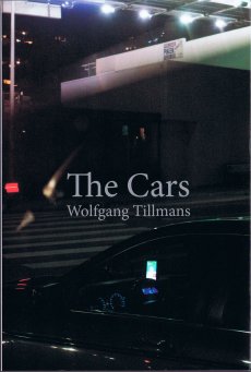
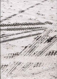
128 S., 24x16,2 cm, ISBN/ISSN 978-3-863357528 Broschur mit Klappumschlag
ZusatzInfos
I wanted to show how cars appear in typical street view, which is rarely the subject of photographs. Cars are usually avoided in photography - one waits until a car has exited a view. The ordinary presence of cars is rarely worthy of representation. It's always the special car, or the extreme traffic jam or, of course, the exciting crash that is being pictured. The Cars pays tribute to the shapes and forms we look at every day. How much time we spend with them, sitting inside them, the endless hours we stare at a dashboard. Even if we don't own a car ourselves, their presence is unavoidable. Cars are everywhere. Their sheer number is the most crazy thing about them. They appear in our lives with excessive omnipresence. In their volume cars intrude upon public space, and the way they occupy streets and open areas is rarely challenged.
Text von der Webseite
76 S., 32,5x25 cm, ISBN/ISSN 978-3-863357993 Leinen
ZusatzInfos
Erschienen zur Ausstellung vom 16.01.-15.03.2015 in der Galleri Susanne Ottensen Kobenhagen. (Anm. Im Katalog werden drei verschiedene Daten für die Dauer der Ausstellung angegeben).
Text von Magnus Thorø Clausen. Interviews von Hans Ulrich Obrist.
Per Kirkeby and Lawrence Weiner have known each other for many years. The idea of making a collaborative work and an exhibition together already evolved in the mid eighties, but due to practical reasons the project was not realized back then. Last year during the fall, the idea returned to us in a new form, and we decided together with the artists that now was the time to make it happen. Per Kirkeby shows two brick works built directly within the gallery space. One work is a tall stele with a deep niche, a black line or a "metaphysical shadow" running vertically through it. The other piece is a monumental quadrangular block, an open/closed building or, if you will, a hollow slightly rotten tree. This new installation is made in collaboration with Lawrence Weiner, who has contributed with texts across the inner and outer brick walls, so that words, matter and space overlap and transform the whole. Lawrence Weiner is also showing two other textbased sculptures made site specifically for the gallery space.
Text von der Webseite
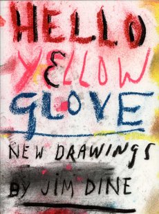
[142] S., 28x21 cm, ISBN/ISSN 978-3-869304847 Broschur
ZusatzInfos
Zur Ausstellung 23.02.-07.04.2012 in Paris. Hello Yellow Glove opens with one of Dine’s most treasured motifs, Pinocchio. Using dense charcoal and dripping washes, Dine depicts the sinister edge to Carlo Collodi’s story and Pinocchio’s isolation in his quest to become a real boy. In addition to these bodies of work, Hello Yellow Glove presents Dine’s portrait of Gerhard Steidl, an ambitious suite of nine drawings made by the artist in his Göttingen studio.
Text von der Webseite
[88] S., 32,5x21,5 cm, ISBN/ISSN 978-3-869306537 Hardcover, fadengeheftet
ZusatzInfos
The pictures in Ether, Sheikh’s first project in color, were made as a way to honor the experience of death and to try to comprehend its significance. Benares (Varanasi) is one of India’s sacred cities, where many Hindus come to die in the belief that they will find salvation. As he walked its streets by night, Sheikh observed sleeping figures, shrouded in blankets, lost to an oblivion that seemed, in that holy city, to offer a simulacrum of death.
Text von Website
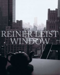
[42] S., 25,5x20,5 cm, ISBN/ISSN 978-3-927533585 Leporello
ZusatzInfos
Seit März 1995 fotografiert Reiner Leist mit einer antiken Großformakamera die tägliche Aussicht aus einem Fenster seines New Yorker Apartments, das im 26. Stock eines Hauses in der 8th Avenue liegt. Er blickte dabei auf bekannte Gebäude wie das One Penn Plaza, Madison Square Garden, das World Trade Center und das ehrwürdige New Yorker Hotel. Der Fall des World Trade Centers markiert eine Zäsur.
Obwohl der Blickwinkel immer gleich ist, variieren Leists Fotos durch die Betriebsamkeit auf der 8th Avenue, veränderte Wetterverhältnisse und Lichtstimmungen. Sie lassen uns am Leben der Metropole teilhaben. Allein bis 2006 entstanden über 2000 Bilder, die als Buch publiziert wurden. Auch danach entstanden weitere Aufnahmen, z.B. jeweils am 14. September eines Jahres, bis hin zur ganz aktuellen Aufnahme aus dem Jahr 2016.
Bei dieser Publikation handelt es sich um ein Extrakt aus "Window fourteen2. In einem langen Leporello entfaltet sich - auf einen Tag im Jahr konzentriert - wiederum die ganze Vielfalt der Fensterbilder über zwei Dekaden.
Text aus mehreren Quellen
21x14,8 cm, 44 Teile. keine weiteren Angaben vorhanden 18 Hefte, Drahtheftung, 20 Postkarten im Block, sechs Ausstellungseinladungen
ZusatzInfos
Monats-Hefte Januar und April - Dezember 2017: Lucky One (6x), Hauptbahnhof, Modern Art, The Prayer, Same old Story, Auf den Spuren Don Quixote, Miki Ridi, bizzare, Michael Ried - Dezember 2017. Sowie die Hefte: Art Machine, Grundlagen der Malerei und Venedig. Dazu 20 schwarz-weiß Postkarte von Spanien, zu der Reihe "Auf den SPuren Don Quixote" und sechs Ausstellungseinladungen der gleichnamigen Ausstellung in München-Ramersdorf, 01.08.-28.09.2017.
132 S., 20,9x14,7 cm, Auflage: 400, signiert, ISBN/ISSN 978-3-903269767 Broschur, Rückseite als Klappe
ZusatzInfos
Artist Gabriel Hensche and curator Ashlee Conery have compiled a catalogue of the work Hensche produced while in residence at Cité Internationale des Arts in Paris, in 2017. The publication includes witness reports that are formally based on actual incident report forms. Adopting the posture of an onlooker, while at the same time acknowledging his role as instigator, Hensche recounts observations of his works as incidents by taking into account the involvement of people and circumstances that led to the events. These protocols are concluded with a final report by Conery in which she adopts the conditions of a mother, a partner and a particle for considering one’s own perspective when acting as a witness, a curator or a bystander.
Text von der Webseite
In der Arbeit verwendet der Künstler Formulare, wie sie im Krankenhaus für einen Unfallbericht verwendet werden, um den ganzen Prozess der Ausstellung detailliert von Anfang an zu dokumentieren. Das Buch = die Berichtsmappe enthält 5 Berichte, die jeweils vom Künstler original abgezeichnet = signiert wurden.
284 S., 53x37x7 cm, 10 Teile. ISBN/ISSN 978-3-836562096 Portfolio, Sammelmappe mit 7 Faksimiles und 56-seitigem Begleitheft (Drahtheftung), in einem Karton mit Tragegriff
1. Buch "A Gold Book by Andy Warhol", Hardcover Pappband mit goldenem Bezug / 2. Buch "LOVE IS A PINK CAKE by corkie + andy", Broschur mit transparentem Schutzumschlag mit Aufkleber / 3. Buch "a is an alphabet by corkie & andy", Broschur mit transparentem Schutzumschlag mit / 4. Buch "25 Cats name Sam and one Blue Pussy", bezogener Pappband, Hardcover / 5. Buch "A La Recherche de Shoe Perdu", bezogener Pappband, Hardcover / 6. Buch "In the Bottom of my garden by andy Warhol", bezogener Pappband, Hardcover / 7. Buch "Wild Raspberries by andy Warhol and suzie Frankfurt", bezogener Pappband, Hardcover
ZusatzInfos
Andy Warhols handgefertigte Portfolios, die er zu seiner Zeit als Gebrauchsgrafiker in Kleinstauflage schuf, um potenzielle Kunden und Freunde damit zu beschenken, sind heute begehrte Sammlerstücke. Voller Kreativität und Witz, lassen sie an der Schnittstelle von Gebrauchsgrafik und Kunst bereits die charakteristische Handschrift des späteren Stars der Pop-Art erkennen. Dieses Portfolio enthält Nachdrucke aller sieben Bücher, die so getreu wie möglich im ursprünglichen Format und auf dem ursprünglichen Papier reproduziert wurden, sowie ein erklärendes Begleitheft.
Im New York der Fünfzigerjahre, bevor er zu einem der bekanntesten Künstler des 20. Jahrhunderts wurde, war Andy Warhol ein geschätzter und erfolgreicher Gebrauchsgrafiker. In dieser Zeit schuf er, um Kunden zu gewinnen, Kontakte zu pflegen und Freundschaften aufzubauen, sieben handgefertigte Bücher mit eigenen Zeichnungen und skurrilen Texten, die u. a. sein Faible für Katzen, Essen, Schuhe, hübsche Jungs und hinreißende Mädchen verrieten.
Die in Kleinstauflage erstellten Bücher sind heute unerschwingliche Sammlerstücke. TASCHENs Reprint von sieben dieser Bücher im Portfolio gleicht Warhols Originalen im Detail, bis hin zu Format und Papier. Mit Titeln wie Love Is a Pink Cake, 25 Cats Named Sam und À la recherche du shoe perdu offenbaren die Bände Warhols vollendete Zeichenkunst, seine grenzenlose Kreativität und seinen mit zahlreichen Anspielungen gespickten Humor.
Die Bücher sind ein reizvolles Spiel mit Stilen und Gattungen, aber auch mit Design, Materialien und Formaten. Das Steindruckalbum A Is for Alphabet widmet jedem Buchstaben des Alphabets eine eigene Seite, während die Illustrationen von holprigen Dreizeilern über merkwürdige Begegnungen zwischen Mensch und Tier begleitet werden. In the Bottom of My Garden ist Warhols Version eines Kinderbuchs und zugleich ein Bekenntnis zur homoerotischen Liebe. Bei Wild Raspberries hingegen parodiert er mit einem Füllhorn abenteuerlicher Rezepte ein Kochbuch.
Dieses farbenfrohe Portfolio wird von einem 56-seitigen Begleitband im XL-Format ergänzt, in dem Warhols Illustrationen erläutert werden. Mit selten gesehenen Fotografien des Künstlers und Bildern seiner kommerziellen Auftragsarbeiten ordnet er Warhols Kunst aus den fünfziger Jahren in einen größeren Zusammenhang ein und bietet Einblicke in seine frühe schöpferische Vorgehensweise. ...
Diese wenig bekannten, aber sehr begehrten Frühwerke Warhols wirken heute noch ebenso anregend und originell wie in den seligen Zeiten der 1950er. Mit einem einführenden Essay der Warhol-Expertin Nina Schleif sowie zeitgenössischen Bildern und Fotos von Warhol zeigt dieser sorgfältige Nachdruck Warhol in dem Moment, in dem aus dem Gebrauchsgrafiker ein Künstler wird. ...
Text von der Website
29,7x21 cm, signiert, 28 Teile. keine weiteren Angaben vorhanden Sieben Fotografie-Collagen, neun Postkarten, mehrere Blätter, geklammert, fünf Flyer, mehrfach gefaltet, fünf lose Blätter, mehrfach gefaltet, ein Plakat, mehrfach gefaltet, ein Briefumschlag, beklebt und gestempelt.
ZusatzInfos
Mail Art Postkarten u.a. aus dem Verlag Lutz Wohlrab, mit Motiven von Helmut Zielke und Robert Rehfeldt, ein Flyer "How Important Was Ray Johnson For Mail Art?" von Lutz Wohlrab. Mail Art Fotocollagen und Informations-Text von Horst Tress. Postkarten-Einladung zu "Meisterwerke zu Gast: Gerhard Richter - Himmel" ab 10.11.2020 im Museum Folkwang Essen. Postkarten zu den Veranstaltungen Alexandra Bircken "Top Down, Bottom Up" und Trisha Baga "Hope" November 2020 im Fridericianum, Kassel. Einladung zum Medienrundgang "Hauptsache Malerei: Werke aus der Hilti Art Foundation" November 2020 im Kunstmuseum Liechtenstein. Flyer des Kunstmuseum Krefeld zu den Ausstellungen Marcel Odenbach - "plötzlich konnte eins wie das andere sein, suddenly, one could be just like the other" und Ignacio Uriarte - "Den Zufall ordnen, Structuring chance". Flyer zur Ausstellung "A Darker Shade Of Black" im Kunstmuseum Bochum 25.10.2020-10.01.2021 mit Werken von Frank Gerritz, Apostolos Palavrakis, Bruno Querci und Kasimir Malewitsch.
[2] S., 14,8x10,85 cm, 2 Stück. keine weiteren Angaben vorhanden Postkarte
ZusatzInfos
Mit der diesjährigen Ausgabe von Super BOOKS leitet das Haus der Kunst den Münchner Bücherherbst 2023 ein. Seit dem Auftakt im Jahr 2019 erhält die sehr lebendige und aktive Künstler*innenbuchszene zum vierten Mal die Fläche für einen gemeinsamen Auftritt.
Am 3. und 4. November zeigen über 50 Künstler*innen, Gestalter*innen und alternative Verleger*innen sowie drei Hochschulen ihre aktuellen Produktionen im Haus der Kunst. Neben Produzent*innen aus Deutschland sind in diesem Jahr auch Aussteller*innen aus Spanien, Italien, Frankreich, Österreich, England, Belgien, den Niederlanden und Südkorea vertreten. Die Teilnehmenden sehen sich in der Tradition der 1960er Jahre, als sich im Umfeld der postavantgardistischen Kunstszene neue Kommunikations- und Distributionsnetze bildeten. Ihre Produkte wie Künstler*innenbücher, Magazine oder Zines sind autonome Kunstwerke.
Der Schwerpunkt von Super BOOKS liegt auf Publikationen, die die Grenzen des Mediums Buch hinterfragen, neu denken und deren Themen, Formate und Techniken sich ständig erweitern. Mit ihrer Ethik der Zugänglichkeit, die in Preisgestaltung und der Direktheit von Vertriebswegen zum Ausdruck kommt, bilden sie ein Gegengewicht zu den gängigen Spielregeln des Kunstmarkts. ...
... Super BOOKS ist ein Kooperationsprojekt zwischen Haus der Kunst, AAP Archiv Künstlerpublikationen, Bayerischer Staatsbibliothek, Akademie der Bildenden Künste München und Kunsthochschule Kassel. Projektleitung: Sabine Brantl (Haus der Kunst)
Text von der Webseite
[2] S., 29,7x42 cm, 2 Stück. keine weiteren Angaben vorhanden Risodruck auf gelbem Papier
ZusatzInfos
Druck von rosidruckt.de, Raumplan von Malte Wandel.
Mit der diesjährigen Ausgabe von Super BOOKS leitet das Haus der Kunst den Münchner Bücherherbst 2023 ein. Seit dem Auftakt im Jahr 2019 erhält die sehr lebendige und aktive Künstler*innenbuchszene zum vierten Mal die Fläche für einen gemeinsamen Auftritt.
Am 3. und 4. November zeigen über 50 Künstler*innen, Gestalter*innen und alternative Verleger*innen sowie drei Hochschulen ihre aktuellen Produktionen im Haus der Kunst. Neben Produzent*innen aus Deutschland sind in diesem Jahr auch Aussteller*innen aus Spanien, Italien, Frankreich, Österreich, England, Belgien, den Niederlanden und Südkorea vertreten. Die Teilnehmenden sehen sich in der Tradition der 1960er Jahre, als sich im Umfeld der postavantgardistischen Kunstszene neue Kommunikations- und Distributionsnetze bildeten. Ihre Produkte wie Künstler*innenbücher, Magazine oder Zines sind autonome Kunstwerke.
Der Schwerpunkt von Super BOOKS liegt auf Publikationen, die die Grenzen des Mediums Buch hinterfragen, neu denken und deren Themen, Formate und Techniken sich ständig erweitern. Mit ihrer Ethik der Zugänglichkeit, die in Preisgestaltung und der Direktheit von Vertriebswegen zum Ausdruck kommt, bilden sie ein Gegengewicht zu den gängigen Spielregeln des Kunstmarkts. ...
... Super BOOKS ist ein Kooperationsprojekt zwischen Haus der Kunst, AAP Archiv Künstlerpublikationen, Bayerischer Staatsbibliothek, Akademie der Bildenden Künste München und Kunsthochschule Kassel. Projektleitung: Sabine Brantl (Haus der Kunst)
Text von der Webseite
[26] S., 29,6x21 cm, keine weiteren Angaben vorhanden Drahtheftung, Schwarz-Weiß-Fotokopien, zwei Seiten mit original Filz- und Kugelschreiberzeichnungen
174 S., 22x29 cm, keine weiteren Angaben vorhanden Broschur
ZusatzInfos
Farsi von M. Serdani und S. Bastani.
"Seltener Ausstellungskatalog mit etwa 200 Exponaten der Documenta VI aus dem Jahr 1977 für das Museum für zeitgenössische Kunst in Teheran, 1977 eröffnet und durch die iranische Revolution 1979 geschlossen und komplett vernichtet.
Addenda: Just between you and me. There was no other. Who does our past belong to tonight? We understand at last. And while we slept, we vanished. The walls of the world fell in on us. We claimed always to abide by terms. Shattered mirrors and sliding panels. Always. Except when we choose not to. One must keep alert to all possibilities. The old Indian pearl diver clambered onto the dock, grinning and shaking the water from our body. At night we could hear our mind ticking like some cheap alarm clock. Radio broadcasts played on tribal feelings. Our voice trailed off. Truth was delay. A heavy splash followed many ripples. Food, batteries and water-purifying chemicals arrived over the week-end.
Text von der Webseite
29,7x19 cm, keine weiteren Angaben vorhanden Faltprospekt als Zeitungsbeilage in der SZ zum All-In-One PC/Entertainment Center mit Multitouch Full HD Display von Medion
192 S., 20x15 cm, ISBN/ISSN 978-1-564660923 softcover
ZusatzInfos
Charley is a contemporary art publication series edited by Maurizio Cattelan, Massimiliano Gioni and Ali Subotnick. A do-it-yourself magazine, Charley is an inclusive publication relying on assimilation, rather than on selection : Charley is a machine for redistribution, a mechanism for spreading and exploiting information, rumors, and communication. Like most information, it is partial, unstable, and untrustworthy. There are no hierarchies and no favorites in Charley : it flirts equally with celebrity and failure. Charley is a multiform creature, bound to transform with each issue. Charley is a pre-digested combine, with pages assembled from catalogues, brochures, press clips, postcards, and other visuals. But what is Charley really? Charley is a new publication on emerging artists. Prominent curators, writers, artists, and other arts professionals from around the world were asked to suggest up to 10 up-and-coming artists and/or submit materials on the artists for inclusion in Charley. 400 art makers from around the globe responded, and each of them is represented by one page of Charley
56 S., keine weiteren Angaben vorhanden Umschlag hinten und vorne mit Teilen eines roten Palästinensertuches (Kufiya) überzogen. Seiten teilweise mit transparentem Lack bedruckt, eine Seite mit cut-out
160 S., 20.5x13 cm, 2 Stück. keine weiteren Angaben vorhanden Broschur, schwarz-weiß Drucke
ZusatzInfos
Arriving in China, most visitors turn into illiterate fools the moment they step off the airplane. Surrounded by signs written in an incomprehensible code, messages meant to guide, to inform, to convince or to sell become little more than abstract pictures. The photographs in this book were produced by one such illiterate as he wandered through a world of signs oblivious to their meaning. Selected from the thousands of pictures made while traveling through China, these pictures reflect the author’s interest in the transformation of image to text and back again.
Text von der Webseite
44 S., 29x22,5 cm, ISBN/ISSN 978-1-935202592 Drahtheftung
ZusatzInfos
Brought to you by the aberrant, animated mind of Italian-born provocateur, mischief-maker, and macabre witness to our times Maurizio Cattelan, Toilet Paper 2 follows closely on the heels of the inaugural issue of Cattelan's most recent print extravaganza. "The magazine springs from a passion/obsession that Maurizio and I have in common," collaborator photographer Pierpaolo Ferrari said in an interview in Vogue Italia. "Each picture springs from an idea, even a simple one, and then becomes a complex orchestration of people who build tableaux vivants. This project is also a sort of mental outburst." Published by Deste, this part magazine, part artist's book blends commercial photography with warped narratives and surrealistic imagery, creating a series of powerful images that are as appropriate for the coffee table as they are for the WC
18x9 cm, Auflage: 100, numeriert, keine weiteren Angaben vorhanden gefaltetes Poster in Hardcover Ledereinband mit Goldprägung
ZusatzInfos
Where have you been when you knew that Michael Jackson had died? This book of condolences contains a fold out poster with 100 Tweets from the hour when Michael Jackson's dead was announced. Within 140 characters pop-cultural news overlap with political happenings, trivia and gossip. The pointilistic map allows both revealing interconnections and absurd cross references
32 S., 28,5x19 cm, Auflage: 2.000, 2 Stück. keine weiteren Angaben vorhanden Drahtheftung
ZusatzInfos
This one-issue-magazine released in april 2011 features infographics based on art market data. As an example the data was taken from all 44 galleries taking part at the gallery weekend 2011 in berlin. Combined are comments about the art market by artists, critics and gallerists. 44 galleries was released as part of an exhibition at NOTE ON
28 S., 14,8x14,8 cm, ISBN/ISSN 978-3-940548306 Buch 011, Drahtheftung, in Transparenthülle
ZusatzInfos
Macro visions, abstract objects, alien and utopian worlds, every day material, densed and loose structures, dots and lines, as well as the drawing process in itself make one bounce back and forth between a narrative coherence and a journey into the unknow
28 S., 14,8x14,8 cm, ISBN/ISSN 978-3-940548276 Buch 009, Drahtheftung, in Transparenthülle
ZusatzInfos
The colorful and almost symbolic forms are scratched out of a black vibrating surface reminding one of spaceships, architecture, prehistoric and indian symbolism seamlessly blending a contemporary or even futuristic pictographic language with the most basic forms
16 S., 14,8x14,8 cm, ISBN/ISSN 978-3-940548092 Buch 003, Drahtheftung, in Transparenthülle
ZusatzInfos
´TREES´ is a series of tree drawings from 2008 and 2009 by the german artist Stephane Leonard.
Different trees without any leaves captured at their most naked, most fragile moment right in between life and death. The pencil describes sceleton like structures giving the trees an airy transparency leading one towards their momentary state of existence
13x13 cm, keine weiteren Angaben vorhanden naivsuper Nr 012, Musik-CD in gefalteter Papphülle und transparenter Kunststoffhülle
ZusatzInfos
"My compositions have no concept. That's my concept. I just see them as a tool that stirs up the minds or consciousness of the people listening. I've never felt that a performer did injustice to my pieces, for a composition only comes to life in the particular context, the combination of the performer and the atmosphere of the public. I like to compose not only for instruments, but for "things" as well. Sound of things can be surprising, especially their artificial sound. For example, without looking, one would never guess that my tapping and dragging fingers across the surface of a cigar box that is connected to a laptop for what it is." (Tetsuya Hori)
13x13 cm, keine weiteren Angaben vorhanden naivsuper Nr 010, Musik-CD in Papphülle und transparenter Kunststoffhülle, cover art: Stephane Leonard & Martin Eichhorn
ZusatzInfos
recorded in 2006, mastered at ICEM in 2007.
We are very proud to announce our 10th release !!! and what makes it even better is that it´s a new dis.playce album!
The EP is called ´Das Ende von Amerika´ (The End of America) and it´s dis.playce´s second release on naivsuper. The title refers to the book ´Amerika´ by Franz Kafka and should not be interpretated in the wrong way)
´Amerika´, also known as ´Der Verschollene´ or ´The Man Who Disappeared´, was the incomplete first novel by Franz Kafka, published posthumously in 1927.
The story describes the bizarre wanderings of a sixteen-year-old European emigrant named Karl Rossmann in the United States, who was forced to go to New York to escape the scandal of his seduction by a housemaid.
Hope originates when something else is absent and holes need to be filled again. The purpose of hope is to make itself vanish again and to reach a state of mind where Utopia or the promised land of North America won´t be needed anymore.
Kafka puts his hero Karl Rossmann over and over again in situations where he is lacking something only to discover that he is lacking even more. The spiral of hope, disappointment and reproaches seems to be endless. With ´Amerika´ Kafka finishes a series of America-fiction from the 19. Century which glorified the United States as the land of boundless possibilities. For Kafka America is not the solution of our problems anymore, it is almost like a second Europe - a land where the problems stay the same.
´Das Ende von Amerika´ is one 24 minute piece published on high quality CDRs
13x13 cm, Auflage: 200, keine weiteren Angaben vorhanden naivsuper Nr 009, Musik-CD mit 6 Blättern aus Transparentpapier in transparenter Kunststoffhülle, cover art: Olaf Hochherzd
ZusatzInfos
recorded in 2004 - 2007.
Pets EP is the first record by Olaf Hochherz. Four extraordinary and rich compositions and one spoken word piece.
Sculpted with self-coded computer programs and lots of love for detail.
2004 wurde Olaf von einer Hochschule für Musik vor die Tür gesetzt: Die Ansichten der Lehrenden wirkten seinen Vorstellungen von dem was elektroakustische Musik sein könnte ungut entgegen. Just am gleichen Tag traf er einen Teamangehörigen von naivsuper, und man beschloss dass er seine Musik dort veröffentlichen sollte, da sich hier Ideen von elektroakustischer Musik produktiv begegneten.
"Pets sind 5 Stücke einer CD oder der Versuch eine geräuschbasierte Lebensform zu beschreiben. Eine die sich in die Nische zwischen Natur und Kultur zu klemmen scheint. pets sind die akustischen Bewohner von ´nature-culture´, haarige Staubknäul, die erst ohne Grund hin und her eilen und sich dann ganz plötzlich tot stellen. Überlebende also. Überlebende die angeschoben werden, sich aber manchmal selbst bewegen, mal schnell mal langsam, die unerwartet sprechen und unsanft verstummen. Es sind Klangkreaturen aus der Welt der Kleinstrobotik, die uns ihre akustischen Zustände und ihre kommunikationslose Sprache überbringen, durch Lautsprecher und Sprecher, letztlich nur um doch ihre Vergänglichkeit willkommen zu heissen.
Die Klänge enstehen mit Hilfe eines selbstgeschriebenen Programms, welches eine technische Analyse des Ausgangsmaterials (Sprechen, Geklapper und Geschmatze) durchführt. Diese computergestützte Analyse findet aber in einem andern Verständnis von dem was wesentlich an den Klängen sei, statt: Nicht dass, was man hört ist für den Computer entscheidend, sondern die Struktur, die von ihm erzeugt wird. Es kommt also zu einer Verschiebung zwischen dem Ausgangsmaterial und seiner Darstellung durch den Computer. Dennoch bleicht ein gebrochener Bezug zum Ausgangsmaterial erfahrbar. Die Bearbeitung fÜhrt so zu Ergebnissen die willkürlich erscheinen, die aber bisweilen Regelmässigkeiten aufweisen, welche Verständnis vermitteln.
Entscheidend ist, dass aus dieser Methode der Klangerzeugung, Klänge und Sequenzen entstehen, die ihre eigenen Regeln mitbringen. Dies ist auch der Schnittpunkt zwischen den elektronischen Kompositionen und dem Stück, welches den Klang der Sprache herausstellt. Hier zeigt sich Sprache als Klangereigniss losgelösst von Grammatik und Inhalt. Die Grammatik die die klangliche Bewegung in eine Struktur zwängt wird ausgeschaltet und übrig bleibt der Spass einer klanglichen "Willkür".
Anders formuliert ist pets eine Antwort auf die Frage, was die Dinge und Gegenstände unseres Lebensraums, nach der Emanzipation von ihrer Funktionalität für Geräusche und Klänge von sich geben würden
13x13 cm, keine weiteren Angaben vorhanden naivsuper Nr 001, Musik-CD in KlappPapphülle, transparenter Kunststoff, mit Infoblatt in transparenter Kunststoffhülle, cover art: Stephane Leonard
ZusatzInfos
written.produced.performed.recorded by Stephane Leonard between 2002 - 2003 in Berlin and Bremen, Germany.
nr 1.1 - 1.8 originally released on Sinnbus in 2003.
nr 2 ´maintain´ (Bonustrack) recorded in 2004 is filmmusic for ´Die Begegnung´- a short film by Claudio Pfeifer and Stephane Leonard.
´Schmalfilmer´ is the first official album (ep) by Stephane Leonard. Tracks 1.1 to 1.8 belong together and can be seen as one song. ´Schmalfilmer´ shows early experiments including beats, rhythm and loop based music. Most parts of this EP were build with an old 8 track cassette recorder. Some beats were created on a neighbour´s PC and Fruity Loops, the rest of the sounds are guitar noise, found objects, filter and loop machine
13x13 cm, keine weiteren Angaben vorhanden naivsuper Nr 007, Musik-CD in gefalteter Papphülle mit Beiblatt in transparenter Kunststoffhülle, cover art: Stephane Leonard
ZusatzInfos
music by Daniel Lopatin aka Dania Shapes.
Soundsystem Pastoral was recorded by Daniel Lopatin aka Dania Shapes during the winter of 2004 using synthesizers, a first generation digital sequencer, and a freeware sound editor. It was remixed in 2006 for the release on naivsuper.
Celebrating the potential of amateurishness, decadence and romance in the realm of digital audio arts, Lopatin looks to marry the aesthetic sensibilities of experimental electronics with his allegiance to the classic 'beauty' in music. 'Glitch' is less a process for Lopatin -- rather it is an aesthetic impression which Lopatin emulates by hand. Pairing the residual effects of romantic, heart string melodies with steroidal, detailed, maximalist noise, Dania Shapes' audible bricolage is a tribute to both the beautiful and the broken all at once.
Working with simple tools such as handheld tape recorders, retro synthesizers, and a personal computer, Lopatin creates conceptual systems and processes to create a solo music that's beautiful and inventive, with interesting textures and unexpected sonic interventions. The music has a lush, ambient quality, but an edge as well. Throughout the CD, one finds a subtle use of repetition. The pieces are formally well-conceived and never contrived. The music is clearly indebted to heroes of electronica such as Christian Fennesz, William Basinski, and Brian Eno. and it has links to classic experimentalists such as David Tudor and David Behrman. Yet Lopatin maintains a more song-based musical position that results in an accessible product that will attract fans of ambient, post-rock, and experimental music
16 S., 21,7x21 cm, 2 Stück. keine weiteren Angaben vorhanden Farbkopien nach PDF, nach free download, in drei verschiedenen Größen ausgedruckt
ZusatzInfos
Sarah Bodman made her first artist’s book tribute to Kurt Johannessen after Tanya Peixoto introduced her to his books at bookartbookshop.
She produced ‘An Exercise for Kurt Johannessen’ in 2010, in tribute to his book ‘Exercises’. The titles of the 100 short stories she wrote and buried for her exercise, have since been taken up by BookArtObject an international book arts group, founded in Australia by Sara Bowen, with 84 artists currently making a book using one of Sarah’s short story titles.
As it is now the 10th anniversary of bookartbookshop in February 2012, and the celebrations are based on theme of: x or what is to be done? Sarah asked Kurt Johannessen if she could select a further 10 (x) exercises from his artist’s book to carry out.
The result is ‘X Exercises for Kurt Johannessen’ an image only artist’s book, published as a free download, DIY self-assembly book on 21.02.2012. The exercises can be identified through reading the texts in Kurt Johannessen’s ‘Exercises’. Sarah has made her book as a free PDF download for you to print out and assemble yourself, you will need 4 sheets of A4 paper and a stapler
44 S., 29x22,5 cm, ISBN/ISSN 978-1-935202783 Softcover Drahtheftung
ZusatzInfos
Specially created by Maurizio Cattelan in collaboration with fellow countryman Pierpaolo Ferrari for Cattelan's major retrospective at the Guggenheim Museum in New York City, Toilet Paper 4 is a brilliant new creation from the aberrant, animated mind of the Italian-born provocateur, mischief-maker and macabre witness to our times. Published by Deste, this part artist's book, part magazine contains no text. only full spreads of color photographs with imagery that often appropriates the slick production values of commercial photography to deliver dreamlike (or nightmarish) images that are as appropriate for the coffee table as they are for the WC. In an interview with Vogue Italia, Ferrari said that "the magazine springs from a passion/obsession that Maurizio and I have in common. Each picture springs from an idea, even a simple one, and then becomes a complex orchestration of people who build tableaux vivants. This project is also a sort of mental outburst."
44 S., 29x22,5 cm, ISBN/ISSN 978-1-935202608 Drahtheftung
ZusatzInfos
Brought to you by the aberrant, animated mind of Italian-born provocateur, mischief-maker, and macabre witness to our times Maurizio Cattelan, Toilet Paper 2 follows closely on the heels of the inaugural issue of Cattelan's most recent print extravaganza. "The magazine springs from a passion/obsession that Maurizio and I have in common," collaborator photographer Pierpaolo Ferrari said in an interview in Vogue Italia. "Each picture springs from an idea, even a simple one, and then becomes a complex orchestration of people who build tableaux vivants. This project is also a sort of mental outburst." Published by Deste, this part magazine, part artist's book blends commercial photography with warped narratives and surrealistic imagery, creating a series of powerful images that are as appropriate for the coffee table as they are for the WC
44 S., 29x22,5 cm, ISBN/ISSN 978-2-840665311 Softcover Drahtheftung
ZusatzInfos
Made by Maurizio Cattelan in collaboration with fellow countryman Pierpaolo Ferrari, Toilet Paper 5 is a brilliant new creation from the aberrant, animated mind of the Italian-born provocateur, mischief-maker and macabre witness to our times. Published by Le Dictateur, this part artist's book, part magazine contains no text. only full spreads of color photographs with imagery that often appropriates the slick production values of commercial photography to deliver dreamlike (or nightmarish) images that are as appropriate for the coffee table as they are for the WC. In an interview with Vogue Italia, Ferrari said that "the magazine is born of a passion/obsession that Maurizio and I have in common. Each picture springs from an idea, often a simple one, and through a complex orchestration of people becomes the materialization of the artists' mental outburst."
1 S., 29,7x21 cm, keine weiteren Angaben vorhanden Presseinfo zur Ausstellung und Perormance ind der Emily Carr University of Art u. Design, Ausdruck
ZusatzInfos
The Ecart Group published artists’ books, presented exhibitions and performances, and opened a bookstore/gallery that is considered to be “one of the most important alternative spaces in Europe in the 1970s” (Ken Friedman). Ecart worked with many artists. The exhibition features artworks made by Armleder and Ecart and includes a complete set of Ecart publications, works on paper, mail art projects, films, and sound works created for Paul McCarthy’s Close Radio.
Text von der Webseite
44 S., 29,7x21 cm, keine weiteren Angaben vorhanden Verkaufsprospekt zu einer Sammlung von Zeitschriften, Farbloserkopien nach PDF, Blätter lose ineinander gelegt
ZusatzInfos
This catalogue describes more than 450 graphzines that represents 30 years of «post-punk» graphic movement. The collection gathers major works of most of the artists that were involved in this movement. One or several titles as well as collective works represent them. Many periodicals are included, especially a very important run of Elles sont de Sortie. This emblematic publication directed by Pascal Doury and Bruno Richard also welcomed the most original publishers linked to this movement. Exhibition catalogues and numerous invitation cards completes the collection
14,8x21 cm, keine weiteren Angaben vorhanden Postkarte, Einladung zur Ausstellungseröffnung
ZusatzInfos
Karaoke – spoken not sung!
Speech Karaoke – as the name suggests – works in a similar way as a traditional karaoke. Instead of choosing between songs from a booklet, the user chooses between speeches. Within a relaxed atmosphere one can listen to speeches delivered by other karaoke bar guests – or try out how it feels to interpret someone´s speech.
Speech Karaoke is a constantly expanding project by The Speech Karaoke Action Group. When the Speech Karaoke-project arrives to a new city, local speeches are added to the Karaoke archive.
The project was created in Finland, the promised land of karaoke bars.
Text von der Webseite
92 S., 24x17 cm, Auflage: 500, keine weiteren Angaben vorhanden Display Nummer
ZusatzInfos
MOTLEY is a publication created to inspire, to present creative imagery in an innovative and unorthodox way. We have no set production schedule, it is created when the mood feels correct. Each new issue of Motley will be unique in design and feature the work of new and established artists, Worldwide. The premier issue launched in Summer 2010. Graphic Design by Umlaut.
Issue one features the work of nine international photographers and a graphic code, printed on the cover, allows the reader to identify the work of each featured photographer.
Featured photographers: Brendan Austin, Paola De Grenet, Sandra Freij, Anthony Hill, Samuel Hodge, Simon Howell, Lena Modigh, Benn Northover, Danny Schissler
The official monthly student magazine of University College Cork
[16] S., 37x30,2 cm, keine weiteren Angaben vorhanden Blätter lose ineinander gelegt
ZusatzInfos
We promote the work of comic artists and writers in Britain at fairs, festivals, club nights and workshops, alongside our quarterly Paper Science anthology
144 S., 23x17,2 cm, ISBN/ISSN 16474198 Eingelegt ein gefaltetes Blatt von Luisa Alpalhao (Telling of). Eingeklebt ein Leporello von Tiago Patricio (Twenty fingers on a piano)
ZusatzInfos
Cine Qua Non is an arts magazine of the University of ULICES built up by movements in written form that freely crisscross reflections, reviews or essays, movements that relate music to visual arts, dance to theatre, cinema to literature. This publication intends to submit its readers to a unique editorial approach that gathers artists, researchers and teaching staff, Portuguese or foreign, proposing texts of different nature about diverse artistic expressions. Cine Qua Non is, since its first printed issue, an entirely bilingual publication (Portuguese/English) that is presented in both versions: an online edition and a printed one.
Text von der Webseite
[16] S., 19,9x14,3 cm, Auflage: 20, keine weiteren Angaben vorhanden Drahtheftung, mit Banderole
ZusatzInfos
Park Guell is Gaudi's failed utopia of a peaceful housing site. Now one of the main tourist attraction in Barcelona. The zine collects photos taken during last Winter, when daylight was almost gone and so were all the visitors of the park. This book is a journey through the sunset of a men's dream.
Text von der Webseite
[8] S., 9,7x14,2 cm, Auflage: 150, numeriert, keine weiteren Angaben vorhanden Leporello, zweifarbiger Risographie, Storyzine, in transparenter Kunststoffhülle
[20] S., 14,7x10,3 cm, Auflage: 100, keine weiteren Angaben vorhanden Drahtheftung
ZusatzInfos
Illustrated zine about the russian mathematician Grigori Perelman, who in 2002 solved one of the most difficult problems of our time.
Text von der Webseite
56 S., 40,1x29 cm, ISBN/ISSN 20442726 eine Ausgabe bestehend aus 3 Zeitungen, Blätter lose zusammengelegt in transparenter Kunststoffhülle
ZusatzInfos
Eight:48's ninth issue has been renamed Counter-Print, now consists of three papers and runs to 56 pages.
Paper #01 focuses on the art and design of freight, Paper #02 entitled, new work, offers a snap shot of some of the best work out there and Paper #03 is a brief montage of new and old articles, drawn from issues one to eight offers a timely look back on all eight themes that have shaped the papers so far.
Text von der Webseite
240 S., 29,5x20 cm, ISBN/ISSN 1881616363 Hardcover Leineneinband mit Schutzumschlag, eingelegte Bestellkarte
ZusatzInfos
Book title is drawn from the various genres found in video stores. Many sources list Adult Comedy Action Drama as one of the best books by Richard Prince
[32] S., 22,3x14,9 cm, ISBN/ISSN 9788494070105 Drahtheftung,
ZusatzInfos
"For me press images are an endless source of material with which to work in one way or another. A long time ago, I realised that, almost unconsciously, I was collecting groups of photographs in a folder without a specific theme. Later on, going through them, I noticed that the female figure was a recurrent subject. I selected them because they caught my attention, they talked to me, or they simply attracted my attention. When I understood that there was that link between them, I felt that maybe there were more images of women than men in the media, so I decided to pick up several newspapers and count their photographs. However, the surprise came when I found that it wasn't like that at all."
Text von der Webseite
2 S., 29,7x21 cm, keine weiteren Angaben vorhanden 2 Blätter aus rotem und blauem Papier, gefaltet
ZusatzInfos
Eine Ausstellung des Instituts für Kunstgeschichte der LMU in Kooperation mit dem Zentralinstitut für Kunstgeschichte, Studienzentrum zur Moderne - Bibliothek Herzog Franz von Bayern.
Die Rezeption US-amerikanischer Künstler in Deutschland nach dem Zweiten Weltkrieg trug wesentlich zur weltweiten Erfolgsgeschichte der amerikanischen Kunst bei. Das Projekt wird exemplarisch untersuchen, wie sich in München einflussreiche Galerien, Verleger und Editeure, aber auch private Sammler und Institutionen früh für die Verbreitung und Bekanntmachung amerikanischer Kunst einsetzten.
Mit Studierenden des Instituts für Kunstgeschichte der LMU wird neben der Studioausstellung eine Tagung zum Thema durchgeführt.
Ausstellung 11.07.-26.09.2014
40 S., 20,3x12,7 cm, keine weiteren Angaben vorhanden Broschur
ZusatzInfos
In April 21012, the French elected a new president. As usual, the election campaigns were highly personalized with portraits of candidates posted everywhere. Many of these were defaced, especially those advertising Marine Le Pen, leader of the ultra right wing party. From the reaction to these posters one would have expected the French to respond to the ambiguous slogan “Oui, la France” with a distinct “Non, merci.” Yet contrary to the seemingly unanimous rejection in the streets, in the polling booths almost 18% of voters said “yes.”
Text von der Webseite
40 S., 20,3x12,7 cm, 2 Stück. keine weiteren Angaben vorhanden Hardcover, Broschur
ZusatzInfos
According to popular belief, there were no urinals in museums and art galleries before 1917. Allegedly, Marcel Duchamp was the first to introduce one of these useful objects into an exhibition space. Nearly a century later they are ubiquitous. Captured during a six month sojourn through Europe, this book presents a selection of the finest art museum urinals on the continent.
Published in 2012 as a contribution to ABCED, an ABC Artists’ Books Cooperative project in celebration of Ed Ruscha’s seventy-fifth birthday. The book was taken out of circulation on the occasion of Ed Ruscha’s seventy-sixth birthday on December 16th, 2013.
Text von der Webseite
352 S., 21x15 cm, ISBN/ISSN 9782915859416 Broschur mit Banderole, eingelegt ein Informationsblatt
ZusatzInfos
Originalausgabe erschienen bei Artists Press, Bern, 1980.
This book is the third and final version of the first artist’s book published in 1960 by herman de vries, who is currently the author of more than one hundred publications.
The story of this book dates back to 1960. Closely associated with the Zero Group, but also drawn to the buddhist concept of emptiness, herman de vries had just produced a series of white monochromes when he self-published a twenty-page booklet in Arnhem. It had no title, its cover was blank and its pages were unprinted. It contained nothing but a short final poem celebrating, in four languages, the superabundance of white: “wit is overdaad”. In 1962, this manifesto appeared in another version, now entitled wit: two hundred blank pages, four white collages by the artist and an introduction, itself completely blank, by the poet J. C. van Schagen, published in arnhem in only five copies by M. J. Israel. It was followed in 1967 by a second “revised” edition, wit weiss: two hundred and fifty blank pages, pocket-sized, in five hundred copies, published by Hansjörg Mayer in Stuttgart. The only printed elements were the artist’s name, the title and the publisher’s name on the cover, the word “introduction” and the name of its author on the very first page and a colophon on the final page. In 1980 the Artists Press in Berne published the “third revised edition”, in a larger format and with more pages. The original title wit was translated into english and japanese and into sanskrit with a word that means “white” in the sense of bright, pure, immaculate. The title itself does not appear on the book, which remains completely blank. It is printed with the paratext on a broad strip of paper in the form of a detachable publicity strip. The inside flap contains a brief statement initially dating back to the 1962 edition, stating that this book incorporates all aspects of reality. Of the five thousand copies advertised, only a hundred were published. It is this last edition, the most radical, which is republished here, the only addition being the french translation of the statement.
On 1 april 2012, herman de vries wrote of his book, insisting on the importance of the final comma:
white is white
0 = 0
no name
no idea
not even emptiness,
Auflage: 100, 5 Teile. keine weiteren Angaben vorhanden transparenter bedruckter Kunststoffschuber mit 3 Heften und 2 gefalteten Plakaten
ZusatzInfos
WHAT THE SHOP is an art project that first took place in Vienna 2012. WHAT THE SHOP was foundet by Mirjam Schweiger in collaboration with Michael Bäckström and Judith Rohrmoser. WHAT THE SHOP does not stay at one place for long. WHAT THE SHOP speaks several languages. WHAT THE SHOP is run by people who have worked with each other before and trust each other. WHAT THE SHOP always ends with a publication. WHAT THE SHOP is an investigation of artistic practice and the city. WHAT THE SHOP is not about selling things but about everything else. WHAT THE SHOP is open for change. WHAT THE SHOP is always up for tasty food. WHAT THE SHOP is a social sculpture and an artwork. WHAT THE SHOP what the fuck haters?!
Text von der Webseite
Morris’ new bookwork, Getting Inside Jack Kerouac’s Head, is a performative retyping of the recently published original scroll edition of Jack Kerouac’s beat classic, On the Road. Morris’ project first appeared as an ongoing journey through the book, read and re-typed on a WordPress blog one page per day. This newly published codex version pours the content of that performative retyping back into the format of the paperback source book. It follows the default logic of a blog archive to put the last post, page at the start and stores the rest of the entries in reverse order. In other words, whereas Kerouac traveled from the East coast to the West coast, Morris crosses America from West to East.
Text von der Webseite
172 S., 25,5x20,5 cm, ISBN/ISSN 9789899776326 Hardcover mit Schutzumschlag, beigelegt als Extraheft die englische Übersetzung, eine Postkarte und eine DVD mit Film
ZusatzInfos
Fábrica, a new book and film by photographer Daniel Blaufuks, is a collection of images composed into an expanded scenery of memory, a walk through the abandoned spaces of one of the largest factories in Europe in an once flourishing industrial region, that never recovered from the loss of the textile market to the Chinese exports. Blaufuks worked the book and the film (which comes with this edition) as a documental piece, collecting different kinds of memories, crossing old photographs, manuscripts and objects with images of the present state of the building interiors and surroundings.
Text von der Webseite
Dark alleys, blocks of cement, tired naked bodies, strings that lead to nowhere, abandoned tubes. Rien, the new André Cepeda book, is an immersive experience. Page after page we are led into a void where all things seem to have lost their name, creating a restless and suspended time. More than looking at physical spaces, we feel as if in an endless present tense. There is Emptiness, but a desired one. Cepeda makes the beautiful more white than black large format photographs look spontaneous and free.
Text von der Webseite
112 S., 24x16,5 cm, keine weiteren Angaben vorhanden Broschur
ZusatzInfos
We Are Dublin is a magazine dedicated to the city. We combine the lo-fi and the high-end - expect long form journalism, poetry, humour and short stories, as well as striking photography. This is immersive publishing at its finest - a long-form postcard from one of the most interesting cities in the world. Published every three months, the magazine is available to buy online and in selected retailers in Dublin and around the world.
Text von der Webseite
144 S., 30x22 cm, Auflage: 350, ISBN/ISSN 978-1-907468209 Broschur mit Klappeinband
ZusatzInfos
The Nabokov Paper is an experiment in novel-reading. The project takes as its starting point a now famous class taught during the 1950s by Vladimir Nabokov at Cornell University, New York State, entitled Literature 311-312: Masters of European Fiction. Nabokov’s approach to teaching literary reading was notoriously idiosyncratic. Convinced that one must teach the books themselves, not ideas or generalities, Nabokov would make diagrams of the floor plans of fictional buildings, map the routes taken by characters through the spaces of the novel, and draw items of clothing or furniture, he would also propose to track the course of a single letter, offer a visual representation of a stylistic device, and uncover what he called the mysteries of literary structures. His methods are striking for the range of gestures they call for in the name of good reading. The published Lectures on Literature (New York: Harcourt, 1980) concludes with an appendix of sample exam questions. Responding to those questions some sixty years after the fact offers a means to explore what Nabokov’s take on how to read might have to teach us today: about the novel, about how reading works across practices and disciplines, and about the past, present and future forms of literary criticism.
Text von der Webseite
32x24x5 cm, Auflage: 600, keine weiteren Angaben vorhanden Schachtel Hartpappe, Siebdruck (?), mit verschiedenen Materialien
ZusatzInfos
Inhalt: Einzelblatt (Manifest contra el Populisme Pervers), gefaltete Pappe mit Baumwollsocke, 3 Hefte, Leporello, Heft mit Originalnegativ, geschlossener Umschlag, gefaltetes Poster mit Sand, Folder.
In the wake of the worldwide glorification of Barcelona via the 1992 Olympics Games, a group of publishers felt that it was time to revive the creative and critical spirit at a cultural level, in the form of a magazine, in order to demonstrate the prevailing level of creativity - via manifestos and works without intermediaries. As a result, Vicenc Altaió, Claret Serrahima, Manel Guerrero, Joaquim Pibernat and Manel Sala launched the magazine, Cave Canis, (which literally means "beware of the dogs") in Barcelona, in 1996.
Starting with its first edition the magazine announced that it would have a short-lived existence - only 9 issues were published, each corresponding to one letter of the publication’s name. The magazine was constituted by a cardboard box, designed by Claret Serrahima, a manifesto, an artist’s book and sometimes contained CDs with recordings and other artistic objects, all associated with the same monographic topic. Each issue had a letter on the front cover designed by an artist. Cave Canis wasn’t available in the usual retail outlets. Each issue was presented in an unusual place in the city, where the manifesto was read, copies were distributed and the magazine then disappeared from sight. The last issue was published in 1999.
Text von der Website
24 S., 21x14.8 cm, Auflage: 50, keine weiteren Angaben vorhanden Broschur
ZusatzInfos
Twenty-one pixelated and decontextualized portraits of politicians altered in such a way as to test the treshold of recognition.
Text von der Website des Künstlers
17x17 cm, keine weiteren Angaben vorhanden Broschiert
ZusatzInfos
Dark Matter is a dialogue of images between Mishka Henner, Jean Keller, Jonathan Lewis and Andreas Schmidt. Produced over a period of three weeks between late August and early September 2011, the artists took turns to send each other single photographs by email, each one a response to the previous image, creating a continuous and meandering photographic exchange.
Auszug des Klappentexts
23x15.4 cm, keine weiteren Angaben vorhanden Drahtheftung
ZusatzInfos
Oshawa – A History of CAW Local 222 (1982-83) a history of the first major industrial union organized in Canada in 1937, focusing on the role played by women in the union. Oshawa 1938 – 1945 is one section of a large work on the history of Canadian Auto Workers (CAW) Local 222, whose members work at the General Motors plant in Oshawa, Ontario. It covers the history of the union from its founding in 1937 up to the beginning of the ‘post-industrial’ era in the mid 1980′,s. A major focus of the work is the changing role played by women in the workplace and the union.
Text von Website
12,5x14,2 cm, keine weiteren Angaben vorhanden CD-Rom in Hülle
ZusatzInfos
The Perfect Picture is a project on CD-ROM. It is an attempt to make a perfect picture of a formerly impassible part of the town of Utrecht: the military barracks The Kromhoutkazerne. The goal of The Perfect Picture is not to formulate a representative photographic vision of the subject. It seeks rather to present a method whereby the subject can be experienced - experienced in a manner that verges on the way we do that in reality: one that is complex, abundant, and not always equally clear and unambiguous.
Text von der Website
76 S., 27.4x20.5 cm, 2 Stück. keine weiteren Angaben vorhanden Hardcover, Titel geprägt, Rücken teilweise mit Stoff beklebt
ZusatzInfos
Katalog zur Ausstellung 29.03.–08.08.2014.
Die 20 Kunstwerke entstammen vier Münchner Sammlungen: ICC, Lorenz/Amandine Cornette de Saint Cyr, Mackert, Wiese
Aufsatz zum Thema Sammeln und Archiv, Ein Gespräch mit Annette Kelm über den Glamour der Frauenbewegung
31x31 cm, Auflage: 300, keine weiteren Angaben vorhanden Schallplatte, LP, in 2 Hüllen, Infoblatt und gefaltete Grafik
ZusatzInfos
Hans Rudolf Zeller (b. 1934 in Berlin) is best-known for being a music theorist, essayist and writer on contemporary music. His essays on Dieter Schnebel, Iannis Xenakis, microtonality etc., often published in the German journal "Musik-Konzepte", are deemed being among the best ever written on new music. Apart from that, he has since the 1960s maintained his own artistic work, most of which has not been published or only seen the light of day in private micro-editions. Zeller's work often involves combining multiple dimensions (texts, vocals, visual projections) into one cinematological literature.
Text von der Webseite
Side A: 1. Tesa-Klänge, 2. Vokalphantasie, 3. Scriptophonie, 4. Musiktext
Side B: 1. Parallelität, 2. Stimmimprovisation
80 S., 20,8x14,8 cm, keine weiteren Angaben vorhanden Broschur, Softcover, Druck auf hellblauem Papier
ZusatzInfos
Modul-dance was a multi-annual cooperation project with the participation of 20 European dance houses from 16 countries.
Its main aim was to support development, mobility and exchange for dance artists.
Led by Mercat de les Flors in Barcelona, the project operated under the umbrella of the European Dancehouse Network (EDN) and was funded by the European Commission through its Culture Programme.
Modul-dance lasted from June 2010 to December 2014 and it was one of the most important sponsored EU cultural projects.
Text von der Webseite
21x14,9 cm, 2 Stück. keine weiteren Angaben vorhanden Drahtheftung, Softcover mit Prägung
ZusatzInfos
Modul-dance was a multi-annual cooperation project with the participation of 20 European dance houses from 16 countries. Its main aim was to support development, mobility and exchange for dance artists.
Led by Mercat de les Flors in Barcelona, the project operated under the umbrella of the European Dancehouse Network (EDN) and was funded by the European Commission through its Culture Programme. Modul-dance lasted from June 2010 to December 2014 and it was one of the most important sponsored EU cultural projects.
Text von der Webseite
226 S., 23,8x16,7x2 cm, 2 Stück. keine weiteren Angaben vorhanden Broschur, Softcover, schwarzer Rundumfarbschnitt
ZusatzInfos
Modul-dance was a multi-annual cooperation project with the participation of 20 European dance houses from 16 countries.
Its main aim was to support development, mobility and exchange for dance artists. Led by Mercat de les Flors in Barcelona, the project operated under the umbrella of the European Dancehouse Network (EDN) and was funded by the European Commission through its Culture Programme. Modul-dance lasted from June 2010 to December 2014 and it was one of the most important sponsored EU cultural projects.
Text von der Webseite
33,0x33,0 cm, Auflage: 100, numeriert, keine weiteren Angaben vorhanden LP, beidseitig bedruckter Karton mit transparenter Hülle fest vernietet, transparente one-side LP
ZusatzInfos
Beiträge:
Juergen O. Olbrich/Kommissar Hjuler - Von Aepfeln Und Birnen
Ace Farren Ford/Mars Pharoah Ford/Pierre Bamboo Dupuy - Soreshen Sandals
Steve Dalachinsky/Susie Ibarra/Assif Tsahar - For The Dance
Steve Dalachinsky/Matthew Shipp - Slim Slow Swimmer
Evelyn Helbig - Improvisation fuer Klavier
Steve Dalachinsky/Stephanie Stone - Tapping The Reed
Steve Dalachinsky/Vernon Reid - New Jersey
Cecil Touchon - Massurrealist Meditation #3
Kommissar Hjuler und Frau (Mama Baer) - KoRn (unretected) #5
24 S., 21x21 cm, 2 Stück. keine weiteren Angaben vorhanden Drahtheftung
ZusatzInfos
Zum Teil mit kryptischem Nonsense. Finally - after a long break - Munich's Best Underground Magazine Trennlinie Zwischen Gesten is back again with Volume 3. The artwork changed from A5 format to a sexy square-like individual cutting. This time the magazine is even "more arty" and includes several great german product reviews of the super-special kind. Still very obscure Pasing-scene stuff. Forget Berlin - the dead corpses walk around the Pasing Arkaden in Munich's worst district. Surely nothing for industrial listeners or other narrow-minded people. This one is for true aliens.
Text von der Webseite
48 S., 66x48 cm, Auflage: 1.500, ISBN/ISSN 978-3-950388893 Blätter lose ineinander gelegt, in einer metallisch glänzenden Tragetasche
ZusatzInfos
This year the Vienna Ringstraße is celebrating the 150th anniversary of its existence. For this occasion the BAWAG P.S.K. is publishing a special edition of the Parabol Art Magazine. Parabol is duly inviting the architecture curator Oliver Elser to analyse via this medium one of the most striking and prominent buildings in the Ringstraße ensemble, Otto Wagners Postsparkasse. Together with the architecture photographer Hagen Stier, Elser pays tribute to this paragon of Viennese Modernism.
Text von der Webseite
31,5x31,5 cm, Auflage: Unikat, signiert, keine weiteren Angaben vorhanden LP, Hülle aus schwarzem Karton mit Collagen, Klebebänder, Stempeldrucke, original Bleistift, Metallfolie (Ritter SPORT), one-side LP (Edition 100)
ZusatzInfos
Beiträge von:
C. Mehrl Bennett - The Spirit of Fluxus
PAAK - Pontonorchester
Danielle Lemaire - LAVA GLOVE
Mama Baer - retect
Emil Siemeister - 1. + 2. Vers
Magnús Pálsson - Loegsoken I-IV
31,5x31,5 cm, Auflage: Unikat, keine weiteren Angaben vorhanden LP, weißer Karton mit transparenter Hülle, transparente one-side LP (Edition 100), farbige Kunstlederstreifen mit Tackernadeln fixiert, rotes Tape, Kunststofftüten mit Druckverschluss mit verschiedensten Materialien gefüllt, Damenbinde
ZusatzInfos
Beiträge von:
Juergen O. Olbrich/Kommissar Hjuler - Von Aepfeln Und Birnen
Ace Farren Ford/Mars Pharoah Ford/Pierre Bamboo Dupuy - Soreshen Sandals
Steve Dalachinsky/Susie Ibarra/Assif Tsahar - For The Dance
Steve Dalachinsky/Matthew Shipp - Slim Slow Swimmer
Evelyn Helbig - Improvisation fuer Klavier
Steve Dalachinsky/Stephanie Stone - Tapping The Reed
Steve Dalachinsky/Vernon Reid - New Jersey
Cecil Touchon - Massurrealist Meditation #3
Kommissar Hjuler und Frau - KoRn (unretected) #5
33,0x33,0 cm, Auflage: 100, numeriert, keine weiteren Angaben vorhanden LP, beidseitig bedruckter Karton in transparenter Hülle fest vernietet, lilafarbene one-side LP
ZusatzInfos
Beiträge von:
Wataru Kasahara - Yume no Naka no Ecstasy
Kommissar Hjuler und Frau - Vandroogenbroeck
cover art: Norbert Futscherndorf und Kommisar Hjuler
33,0x33,0 cm, Auflage: 75, numeriert, keine weiteren Angaben vorhanden LP, beidseitig bedruckter Karton in transparenter Hülle fest vernietet , orange one-side LP
ZusatzInfos
Beiträge von:
Ditterich von Euler-Donnersperg - Pelzwurst
Ditterich von Euler-Donnersperg - Steckspiel
Kommissar Hjuler - Verfall und Verwandlung des Bösen
Kommissar Hjuler - Unter den Linden
33,0x33,0 cm, Auflage: 100, numeriert, signiert, keine weiteren Angaben vorhanden LP, beidseitig bedruckter Karton in transparenter Hülle fest vernietet, blaue one-side LP
ZusatzInfos
Beiträge von: John M. Bennett & Bibiana Padilla Baltos - Benway Institute Report. Texas Patti - Beischlaf. Steve Dalachinsky - Paper Towel Sex. Mischa Badasyan - 22. Kommissar Hjuler und Frau - Cunnilingus
Violet Storm - worthless
Boris Lurie & Dietmar Kirves - The NO!art Statements
33,0x33,0 cm, Auflage: 100, numeriert, keine weiteren Angaben vorhanden LP, beidseitig bedruckter Karton in transparenter Hülle fest vernietet, transparente (mit eingeschmolzenen roten Farbspritzern) one-side LP
ZusatzInfos
Beiträge von: Milan Knizak & komisar jvler i chot - Galama'aa bwaa spolu Zlutej Martan. Petition zur Untersuchung der Entscheidung der Kommission im Auswahlverfahren vom 26.01.2015 für den Posten des leitenden Pädagogen im Atelier für Intermediale Kunst I an der Akademie der bildenden Künste in Prag, Tschechien
33,0x33,0 cm, Auflage: 100, numeriert, keine weiteren Angaben vorhanden LP, beidseitig bedruckter Karton in transparenter Hülle fest vernietet, grüne one-side LP
ZusatzInfos
Beiträge von:
Ditterich von Euler-Donnersperg - Knurrhahn (erste Version)
Wataru Kasahara (GROUP ThERRORPY:2004) - exploded roses
FluxRus Gr. Belka & Strelka (Viktoria Barwenko/Svetlana Pesetskaya) - delusion
Ludo Mich & Kommissar Hjuler und Frau - flowers are growing, people would cry
Family Fodder - organ grinder
Tim Berresheim & Jonathan Meese - for the duck (alternative version)
33,0x33,0 cm, Auflage: 100, numeriert, keine weiteren Angaben vorhanden LP, beidseitig bedruckter Karton in transparenter Hülle fest vernietet, rote mit eingeschmolzenem schwarzen Strahlenkranz one-side LP
ZusatzInfos
Beiträge von:
PVA in Hair & Kommissar Hjuler und Frau - Barette des general blade
33,0x33,0 cm, Auflage: 100, numeriert, keine weiteren Angaben vorhanden LP, vorderseitig bedruckter Karton in transparenter Hülle fest vernietet, weiße one-side LP
ZusatzInfos
Beiträge von: C. Mehrl Bennett - you either get it or you don't. John M. Bennett - Forklint & 4 Poems. Jaan Patterson - Demonstrated Properties & Mechanics. ALBRECHT/d. & Kommissar Hjuler - ... fast ein Telefonat. David Dellafiora - Fluxus Is No Brand Name!
33,0x33,0 cm, Auflage: 100, numeriert, keine weiteren Angaben vorhanden LP, vorderseitig bedruckter Karton in transparenter Hülle fest vernietet, weiße one-side LP
ZusatzInfos
Beiträge von:
FluxRus Gr. Belka & Strelka (Viktoria Barwenko/Svetlana Pesetskaya) - BI
Daniel Spicer - The Diamond Life (for Henry Flynt)
Keith A. Buchholz - sound sample #2
Wolf Vostell - de-coll/age manifesto
DADA Action Group (James Banner/Mark Schomburg) & Kommissar Hjuler und Frau - Die Antizipation des Generalized Other #1
Milan Knizak - Multisong
Paul Ramsey - eTude 23 (Flux Mix)
33,0x33,0 cm, Auflage: 100, numeriert, keine weiteren Angaben vorhanden LP, vorderseitig bedruckter Karton in transparenter Hülle fest vernietet, schwarze one-side LP
ZusatzInfos
Beiträge von:
Brandstifter - I Don't Mind If You Call Me Fluxus But I Don't!
Reed Altemus - Falchspielens
Tooth Kink (Mikhail Salnikov/Alexei Borisov) & Kommissar Hjuler und Frau - to end all life
Wataru Kasahara - Yume eno Nenbutsu (fuer Otto Muehl) Eel d. Retke - Grund Opa's Dust In Denial
Kollektiver VII/Tibo Leone/Wolfgang Sterneck - XrcE
Claus Sterneck - mathe ohne müller
33,0x33,0 cm, Auflage: 25, numeriert, keine weiteren Angaben vorhanden LP, beidseitig bedruckter Karton in transparenter Hülle fest vernietet, rote mit eingeschmolzenem weißen Strahlenkranz one-side LP
ZusatzInfos
Beiträge von:
Mama Baer - kurzes Stueck
Barbara Rapp - Geraeusch konserviert
Kommissar Hjuler - Ein-/Aus-Wehklagen
32x31,5 cm, Auflage: 10, signiert, keine weiteren Angaben vorhanden LP, weißer Pappkarton, Fotocollage mit Heißkleber, Fotodruck, transparentes Klebeband, Fell, one-sided LP (Edition 100)
ZusatzInfos
Beiträge von:
C. Mehrl Bennett - Deport Dada and NoBody's Surprise
Jaap Blonk - Kurt Schwitters' Ursonate: Largo (Amsterdam, 07./08.04.1988)
Karlheinz Essl - non Sequitur (Atelier Johann Feilbach, 26.06.2010)
Steve Dalachinsky/Thurston Moore - Glissandos
gruppe weltAusstellung (Anja Lautermann, Peter Issig, Thilo Schoelpen, Uwe Moellhusen) - Splitter (Duesseldorf, 2011/2012)
Knut Kargel & Kommissar Hjuler und Frau - Mein Bagger brennt ... (Kunstraum B, Muenster, 26.09.2009)
Klaus Rudolf - KUNSTpARTei VOGELFRei, Ausschnitt aus Gruendungshappening (Moritzbastai Leipzig, 1988)
Barbara Rapp - LUFT (Fest der Kaerntner Staatskuenstlerinnen, KE-Theater Klagenfurt, 20.05.2013)
Peter Weibel & Hotel Morphila Orchester - Wir sind Daten (2013)
jede Coverarbeit ist ein Unikat
31,5x31,5 cm, Auflage: Unikat, signiert, keine weiteren Angaben vorhanden LP, weiße Kartonhülle mit Goldfarbe, 4 Kassetten, Styropor, Gips, weiße Farbe, Kleber, schwarze one-sided LP (Edition 100)
ZusatzInfos
Beiträge von:
Barbara Rapp & Kommissar Hjuler und Frau - Brotkatze (D.U.Design Villach, 14.01.12)
Knut Kargel - Water
Jo Kondo - Bonjin (Musica Practica Ensemble, Norio Sato (cond.))
Steve Dalachinsky/Thurston Moore/Tom Surgal - for Mary
Derek Beaulieu - Quartet for Kevin 2 (permormed by Josh Pitre)
Brandstifter - The Tape of Death
31,5x31,5 cm, Auflage: Unikat, keine weiteren Angaben vorhanden LP, originale Verkaufshülle in transparenter Hülle, mit Papier beklebt, transparentes Klebeband, zwei verklebte LPs (LP "Psych.KG 185" Edition 100), 2 original Infoblätter des Labels Opus One
ZusatzInfos
Beiträge von Mama Baer - Fahrradtour in Ehrfurcht
Informationen zur anderen Schallplatte:
Stefan Wolpe, Joelle Wallach, Darrell Handel ,– An die Armee Der Künstler, Of Honey and Vinegar, The Poems of Our Climate, Rondeaux With Oboe
31,5x31,5 cm, Auflage: Unikat, signiert, keine weiteren Angaben vorhanden LP, weiße Hülle mit halbrundem Ausschnitt auf der Rückseite, Fotopapier mit transparentem Klebeband, Vorderseite mit 12 Klebestiften in Reihe beklebt, Ast, 2 Kinder-Playmobilfiguren, schwarze one-sided LP (Edition 100)
ZusatzInfos
Beiträge von:
Kommissar Hjuler - Walt Merin/Grrreat Berrleena
Daniel Spicer - Spood
Steve Dalachinsky, Thurston Moore, Tom Surgal - In The Book Of Ice #5
31,5x31,5 cm, Auflage: Unikat, signiert, keine weiteren Angaben vorhanden LP, weiße Hülle, Fotopapier mit transparentem Klebeband, alte Fotografie, floppy disc in einer Hülle zum Herausnehmen, schwarze one-sided LP (Edition 100)
ZusatzInfos
Beiträge von:
Agrare (Maja Solveig Kjelstrup Ratkje/Hild Sofie Tafjord/Lotta Melin) - Seglet Er Vekk
Mama Baer - For the Maincontrol
Natalie Lauchlan - 65.7N20.3W
Hannah Silva - Threshold
Barbara Rapp - Kategorie
31,5x32,8 cm, Auflage: 9, numeriert, keine weiteren Angaben vorhanden LP, weißer Karton mit Collagen als Fotodruck beklebt, schwarze one-sided LP
ZusatzInfos
Beiträge von:
Goh Lee Kwang - The Spirit Of Rashomon
Mama Baer - The Island
Daniel Spicer - Let The Body Attend
Schallplattentitel entsprechen Psych.KG 183
33,0x33,0 cm, Auflage: 100, numeriert, keine weiteren Angaben vorhanden LP, beidseitig bedruckter Karton in transparenter Hülle fest vernietet, schwarze one-side LP
ZusatzInfos
Beiträge von:
Barbara Rapp & Kommissar Hjuler Und Frau - Brotkatze D.U. Design Villach
Knut Kargel - Wasser
Jo Kondo - Bonjin
Steve Dalachinsky, Thurston Moore, Tom Surgal - for Mary
Derek Beaulieu - Quartet for Kevin 2
Brandstifter - the tape of death
Zusatzinformation:
Musica Practica Ensemble
Norio Sato (cond.), Josh Pitre (perf.), Emily Harvey Foundation
NYV, 10.09.09
33,0x33,0 cm, Auflage: 100, numeriert, keine weiteren Angaben vorhanden LP, vorderseitig bedruckter Karton in transparenter Hülle fest vernietet, rosa one-sided LP
ZusatzInfos
Beiträge von:
Mama Baer - Spechtext
Kommissar Hjuler - Sprechtext Zementmischmaschine
Cover Art Frontseite: Alvaro Sanchez & Kommissar Hjuler
Cover Art Rückseite: Phillip Graffham & Kommissar Hjuler
289 S., 27,7x19 cm, ISBN/ISSN 0919616011 Klappbroschur
ZusatzInfos
In Raw Notes, Oldenburg has scrupulously collected all of the material relating to his performances. According to his specifications, the text in the book is typed rather then set and appears on only one side of the page. Examples of the original manuscript are reproduced in sixty-three script plates, including stage plans, scores, sketches for programs, and posters. More than two hundred annotations by the author expand the text
108 S., 13,5x20,4 cm, Auflage: 25, numeriert, keine weiteren Angaben vorhanden Broschur. Offset, Fotokopie, Cover Siebdruck
ZusatzInfos
Accounted For, 2006 collects 54 train receipts in order to document, in chronological order, the trips a railway traveller took in 2006. The blue-and-white pattern found on Belgian Railways tickets is printed offset over photocopies of one year’s worth of travel expenses (the individual receipts record the date and destination of each trip), thus giving the impression of continuous movement. Accounted For, 2006 was printed in downtown Lima, Peru in 2009, some three years after the train trips actually took place.
Text von der Webseite
44 S., 21x15 cm, Auflage: 100, signiert, keine weiteren Angaben vorhanden Broschur, in farbigem Umschlag aus Karton, mit signiertem und nummeriertem Original von Pezhman Zahed
ZusatzInfos
Semesterpublikation der Bauhaus Universität Weimar zum Studienprogramm: Public Art and New Artistic Strategies
[12] S., 51x26 cm, keine weiteren Angaben vorhanden Blätter, lose ineinander gelegt,
ZusatzInfos
The Office for Anti-Propaganda was founded by Marina Naprushkina in 2007.
Started as an archive on political propaganda with the focus on Belarus the „The Office for Anti-Propaganda“ drifted to a political platform. In cooperation with activists and cultural makers Office lounges and supports political campaigns, social projects, organizes protest actions, and publishes underground newspapers.
The emphasis lies on projects which work outside the white cube and has social and political relevance. The 16-page newspaper-size novel illustrates the events which happened in Belarus during 2010 Presidential Elections. This is a story about the elections and, in particular, of the day and night of December 19, when the citizens’ peaceful demonstration against falsified elections was brutally suppressed by the police. The novel presents two views on the developments in parallel. The first one shows how the events are interpreted by the state regime and currently widely publicized by state-run newspapers and television. The other version was assembled from information presented by independent media, which for the most part can exist only in the Internet, i.e. blogs, oppositional websites, users’ comments, testimonies of victims and political activists.
Text von der Website
Mit Untzerstützung der Konrad Adenauer Stiftung und der Zeit-Stiftung Ebelin und Gerd Bucerius
16x23 cm, 10 Teile. keine weiteren Angaben vorhanden 10 Flyer und Einladungskarten,
ZusatzInfos
zu Ausstellungen und Veranstaltungen mit Beteiligung der Künstlerin von 2003 bis 2016, darunter "Das achte Feld" im Museum Ludwig. "Internationale Individuen der Welt" und "Stollwerck, Bollwerk, Dollwerk" im Kölnischen Stadtmuseum. "Clean - a one night expose of the body pulpit" im Kali-Film, Berlin. "ZEIGE WAS DU WIRKLICH KANNST!!! und "L : I : G : H : T" im Casabaubou, Berlin. "FUCK GENDER" im Schwulen Museum, Berlin. "Deutsche Fotografie im 20. Jahrhundert - Von Körpern und anderen Dingen" im Deutschen Historischen Museum, Berlin. "Darkside - Fotografische Begierde und fotografierte Sexualität" im Fotomuseum Winterthur, Zürich
[12] S., 27,4x10,6 cm, keine weiteren Angaben vorhanden Blätter lose ineinander gelegt, im blauen Pappumschlag mit betitelnden Sticker auf Vorderseite und Blindprägung auf Rückseite, in bedrucktem Briefumschlag
ZusatzInfos
In 1926 Max Ernst published a portfolio of prints entitled 'Histoire Naturelle’ (34 collotypes published by J. Bucher, with an introduction by Hans Arp) which were based on experiments using the technique of frottage (or rubbing) and depict a kind of mysterious, natural world of strange and fantastic landscapes, rocks, or creatures emerge from experimental procedures but give the precision of scientific illustrations.
Arnaud Desjardin purchased one of these very rare portfolios, drawn to it by the fact that it was damaged by a purple fungus which had been eating away at the paper. He saw a strange beauty given by the mould, adding to the original textures in true, surrealist style. He set about creating a 'new' work which is ‘Mouldy Modern’, featuring both the original Ernst plates and mould- in equal measure- to magical effect!
[28] S., 20,6x14,5 cm, ISBN/ISSN 978-3-940907202 Drahtheftung
ZusatzInfos
Katalog zur Ausstellung im In:Surgo!, Berlin. Vicente B. Ballestar, born in Barcelona in 1929, is a Spanish illustrator known worldwide for his genre-defining dark pulp and supernatural realist illustrations. Throughout his long career, he has been beloved by aficionados of the genre worldwide, especially for his cover illustrations for Geisterjäger, John Sinclair (Ghosthunter, John Sinclair). From the beginning of the series in the 70s to his retirement in 2007, Ballestar created almost one thousand striking scenes in his preferred medium watercolour, giving the adventures of John Sinclair their unmistakable graphic character and certainly greatly contributing to its cult status. In the horror detective fiction series, published weekly since 1973, Scotland Yard chief inspector John Sinclair is the eponymous protagonist of the German pulp fiction written by Helmut Rellergerd under the pen name Jason Dark.
Text von der Webseite
[52] S., 13,5x9,5 cm, Auflage: 300, ISBN/ISSN 09620074 Drahtheftung, Rückseite mit Silberprägung, in transparenter Kunststoffhülle mit beigelegtem Blatt, Aufkleber
ZusatzInfos
In our fifth issue of BLAD we asked Ian Stevenson if he would make enough drawings for us to fill a whole magazine. And we can proudly say that he did! The issue is called Enter Ian Stevenson, and it's a very fine and funny tour through Ian's characteristic and very humorous world of drawings. As he says himself "48 pages of drawings, each one created only for you".
Text von der Webseite
[52] S., 13,5x9,5 cm, Auflage: 300, ISBN/ISSN 09640974 Drahtheftung, Rückseite mit Metallfolienprägung, eingelegter Aufkleber, in transparenter Kunststoffhülle mit beigelegtem Blatt, Aufkleber
ZusatzInfos
The man, the myth, the rat! Rat Salad! This issue of BLAD is dedicated to the number one bad attitude rock and roll star out there. We will take you down and in to the dark and stinky obscure world of Rat Salad! Here you can find nice slapstick cartoon drawings made by the man himself, ads about his legendary gigs all around the world, and last but not least a splendid in-depth interview with the Rat talking about his career, band and life on the road in general. This is an absolute must to have for all dedicated fans of this obscure character and for heavy rockers with the right attitude in general. As Rat Salad would say "Eat Shit and Die!".
Text von der Webseite
140 S., 31x22,3 cm, ISBN/ISSN 22809309 Broschur, mit eingefügtem Heft
ZusatzInfos
Alla Carta is a bi-annual international publication that approaches high-end fashion, art and design in a unique Italian way. We truly believe in paper, carta in Italian.
At a time when the web may appear to be the only valid avenue of communication, Alla Carta is an ode to the most precious of mediums and to the most precious moment of the day: our interviews always take place around a table, to celebrate one of the oldest Italian habits, conviviality. Text von Website
116 S., 28,5x23 cm, keine weiteren Angaben vorhanden Broschur
ZusatzInfos
Twelve years after the first AIDS issue, an update on the evolution of the problem and its new geography, with a focus on both personal stories and general issues. On the cover the portrait of Nyameka J. Matiayana, one of over three million people who died of AIDS-related causes in 2005. Text von der Website
[100] S., 23x16,7 cm, Auflage: 300, signiert, ISBN/ISSN 9789963228102 Broschur mit aufklappbarem Schutzumschlag aus Papier und eingelegtem Poster. Signiert und datiert
ZusatzInfos
Mit Texten von Peter Eramian und Evagoras Vanezis.
Stelios Kallinikou's Flamingo Theatre is situated across and beyond a 7km stretch of undeveloped flat land on the East coast of the Akrotiri peninsula in Limassol, Cyprus, titled Lady's Mile. The beach is located within the British Western Sovereign Base Area, one of two territories (the other being Dhekelia) controversially retained by the British under the 1960 treaty of independence. A playful nod to the past, it received its name after the first British governor's horse 'Lady', which he would exercise along the coastal stretch.
Text von der Webseite
132 S., 23,3x14,2 cm, ISBN/ISSN 9780956855978 Klappbroschur,
ZusatzInfos
As a visual artist, Simon Cutts is a poet, and as a poet he is a visual artist. This is no glib turn of phrase, but a lived reality insofar as he conceives how one artistic practice can show the ways of opening the other. For some time now he has insisted that the book is not merely (or simply) a vehicle for poetry, but is itself part of a poem’s form. He extends the idea of a poem being a field of dynamic action beyond the boundaries of the page so as to encompass the book as whole. To read Letterpress is to become a participant in its total and encompassing range. Text von der Webseite
[72] S., 30,7x24,6 cm, ISBN/ISSN 978-3-865216168 Broschur mit aufklappbarem Schutzumschlag,
ZusatzInfos
Schorr then draws from professional reportage pictures, so as to describe, literally sketch out, one monumental trip from Queens to Vietnam and back. These drawings are contrasted by reproductions of vintage car magazine articles and Schorr's own photograph portraits. There I Was is a complex and multi-faceted look at escape, culture, dreams and mortality, conjuring up an expressionistic portrait of the dichotomies of the late 1960s in a fractured wartime America. Text von der Webseite
254 S., 23x16,6 cm, ISBN/ISSN 9788480265096 Klappbroschur,
ZusatzInfos
Publikation zur gleichnamigen Ausstellung vom 15.10.2014-02.03.2015.
The exhibition catalogue of republic brings together a broad selection of works by Juan Luis Moraza that explore the museum as a system of conventions and possibilities of citizenship. If one of the problems of contemporary democracy is the dilemma facing each citizen – between passivity and the possibilities of participation in social life – in the museum Moraza finds a space of convergence between the citizen-artist and citizen-spectator. Texts by the artist, in addition to a glossary and conversation, both developed by the show’s curator João Fernandes, are presented. The publication is arranged into two complementary parts: the odd-numbered pages comprise a catalogue of works, documents and literary works selected by the artist, while the even pages make an essay about republic.
Text von Website
176 S., 27x18 cm, ISBN/ISSN 9788480265300 Softcover, Broschur, Schutzumschlag aus Noppenfolie,
ZusatzInfos
Publikation zur gleichnamigen Ausstellung vom 10.11.2015-21.03.2016.
A conversation between Hito Steyerl and João Fernandes, curator of the exhibition, an essay by Carles Guerra and Steyerl herself, introduced us to one of the most relevant contemporary artists in the field of Video art. Steyerl approaches current themes in her work, for instance the impact the proliferation of images and the use of the Internet and technology have on our lives. She uses these issues as a starting point for developing, not just through her video pieces but also through writing and essays, critical work about control, surveillance and militarisation, migration, cultural globalisation, feminism and political imagery, questions she believes have the capacity to create realities.
Text von Website
Kelli Sims' It's Michael is a collection of drawings and watercolors created by the artist over a span of one week in March 2015. The book offers a glimpse into the artist's unique process of digesting reality. A certain urgency and rawness is evident in depicting a disorienting range of Sims' subject matters. In her works on paper, a pen or a brush cast a net extracting brief moments of clarity from the sea of daily observations, free association, dreams, and the internet. It is the first time Kelli Sims' work is displayed in a form of a book, adding to her diverse practice ranging from video, performance to painting and sculpture.
Kelli Sims (b. 1984, Monroe, Louisiana) received her MFA from the Glasgow School of Art in 2014 after studying at the University of Louisiana and the School of the Museum of Fine Arts in Boston. Recent exhibitions include Prehistoric Loom, Yada Shimin Gallery, Nagoya, Japan, Prehistoric Loom, No Toilet, Soeul, South Korea, Dear Green, ZK/U, Center for Art and Urbanistics, Berlin. How Many Shades Would an Artist Pack for Holidays?, Neoterismoi Toumazou and Aλ,áς, Nicosia, Cyprus.
Supported by the Glasgow School of Art as part of the Glasgow Master Series 2014.
Text von der Webseite
128 S., 29,7x21 cm, Auflage: 150, ISBN/ISSN 9789963225101 Softcover, Klebebindung
ZusatzInfos
Christophoros Kyriakides was born in Nicosia, Cyprus in 1949. He was an architecture draughtsman and considered himself an inventor. In 1988 he self-published “Six Continents Stars Compass”, ‘an entertaining and educational’ board game. He considered the game inventive, recreative and formative for all ages and intended its global distribution. The game received no recognition from the public and now only a few copies exist.
In the board game, Kyriakides draws a journey with impossible objects, invented maps, landscapes and anagrammatic poetry with mathematical diagrams. One comes across an abstracted reflection of 80s locality, world politics, obsession with the American dream, an isolated emotional darkness but also a universal landscape. A chance encounter of Marina Xenofontos with this game catalysed a strong fascination that led to the uncovering of his archive. This publication, a part of Xenofontos’ practice-based research, brings to the fore the rich universe of Kyriakides’ personal symbolism that shecreatively harnesses as a means of an alternative, atypical handling and systematisation of themes and issues that she finds affinities with.
Evagoras Vanezis.
Text von der Webseite
1 S., 57x40 cm, keine weiteren Angaben vorhanden Beitrag in der SZ Nr. 239 vom 15./16. Oktober 2016, Kultur in den Stadtvierteln R15
ZusatzInfos
Eine Ausstellung in einer Tiefgarage von den Künstlern und Kuratoren von easy! upstream. Arbeiten von 16 Künstlern zeigen einen internationalen Kunstparcours auf 3000 .,Quadratmetern Fläche.
Coral North: Park One, Tiefgarage Schwabinger Tor, Eingang Leopoldstraße 182. Bis 19. .Oktober, 11 bis 20 Uhr
[28] S., 21x13,8 cm, Auflage: 60, numeriert, keine weiteren Angaben vorhanden Fadenheftung, auf farbige Papiere gedruckt,
ZusatzInfos
Bast Fooks was one of my new years resolutions for 2016. I haven’t given up smoking yet, but I did end up spending my new years eve in, printing and sewing the first Bast Fook issue. There and then I had decided that it would be a project in 12 parts and that I would produce a book for each month of 2016. Each Bast Fook is a repository of ideas (in the form of notes, thoughts, readings and misreadings, assumptions, aphorisms, contemplations, stories, lists, observations and lost projects). Bast Fooks have evolved into a platform through which, I can organise - in a pretty disorganised way-ideas as they happen and material produced in different ways, under different circumstances, at different places and times and sometimes by totally different versions of myself. Bast Fook is an anagram of Fast Book and in a way each issue is offering a slow consumption of a fastness that often reads a lot like a facebook newsfeed, decentered, fragmented, multivoiced.
Text von der Website
In the context of a continuous and persistent spiritual quest in the field of Greek art and its history, the artist Christos Bokoros appears —through simple themes and earthy, warm materials— to win an important battle. He has silently found a subtle and significant way of stripping bare certain symbols—his own ‘signs’: a way of isolating those symbols from anything unnecessary and superfluous, and of drawing the community’s attention to them by revealing them to be purified, resurrectional and full of fire.
Through the presentation of a series of paintings entitled ‘ODOS ELEFTHERIAS’, Bokoros ventures a direct discourse of these ‘signs’ with buildings and streets that are adjacent to, or end up at, Lefkosia’s Green Line. Many of these buildings have suffered damages and decay. One could say that in their own way they constitute a second crevice near the Green Line that divides the state. It is in these fissures that the artist sets up - plants - his ‘ODOS ELEFTHERIAS’, in the hope of giving the city’s centre new fruits and joyous vibrations—in a silent and honest alliance with all the indigenous revitalizing forces
1 S., 64x42 cm, keine weiteren Angaben vorhanden Plakat,
ZusatzInfos
Ausstellung der Privatsammlung Anastasios Gkekas bei VOLKS 10.09.-13.10.2015.
A key to a potential approach is possibly the innerness, the esoteric and sometimes confessional character of the works, but also the place they occupy in the collective work of the artists - as I am of the opinion that one can find more comprehensible examples within their work. It seems that as if from a recurring tic, I wanted to catch them red-handed, naked I would say, within their own work. To a lesser extend, it is perhaps a sort of innocence.
Text aus der Presseerklärung
32 S., 21x14,8 cm, Auflage: 500, keine weiteren Angaben vorhanden Drahtheftung
ZusatzInfos
Erschienen zu einer Ausstellung von 9 Künstlern im Städtischen Garten in Nikosia 04.02.-02.03.2012, mit Texten der Herausgeberin Elena Parpa. Beteiligt u. a. The infinite Library von Daniel Gustav Cramer und Haris Epaminonda. It is primarily an expanding archive of books, each created out of pages of one or more found books and bound anew. The online catalogue serves as an index.
2 S., 10,5x14,8 cm, keine weiteren Angaben vorhanden Einladungskarte
ZusatzInfos
Zur Präsentation am 17.01.2017 um 19 Uhr, Ludwigskirche 2ter Altar Rechts" 10:05 min, 2016. Flurstraße 2, 12:30 min, 2015, 2016.
FULLSCREEN is a dynamic curated video art program which supports Munich based digital and media artists. Each month Nir Altman Galerie features one significant video during a special event in the gallery space. In addition the video is screened on the gallery's website during the entire month.
Text von der Webseite
[20] S., 21x14,7 cm, Auflage: 24, numeriert, keine weiteren Angaben vorhanden Drahtheftung, Schwarz-Weiß-Fotokopien auf gelben Papier, mit Banderole, mit beiliegendem handschriftlichen Brief,
252 S., 19x13,5 cm, Auflage: 500, ISBN/ISSN 978-3-931184087 Broschur
ZusatzInfos
Whose heritage are we dealing with? With this one-day conference, we want to create an overview of the contemporary discussions on museums dealing with old and new formats of heritage. The morning session has been set up as an informal “World Café”. In this interactive format, the guests are invited to address pertinent topics such as transnationality, transculturality, shared heritage, intellectual property, “Deutungshoheit”, restitution, museological concepts & categorisations and the management of meaning in art and culture. In the afternoon, the conference will bring together honourable guests from the academic and practical museum-fields. The podium is not only dedicated to aspects of how to deal with/handle/encounter so called “other” cultures but also in addressing questions of our own cultural and intellectual heritage. We would like to encourage the audience to participate in the debate.
Text von der Webseite
40 S., 14,8x21 cm, keine weiteren Angaben vorhanden Broschur, Digitaldruck
ZusatzInfos
The Pepsi Challenge
Oversized ‘promises’ in the form of real estate advertisements are promoting the new city along the lines of global real estate and living standards. ‘The perfect union to all you desire’ and ‘We believe luxury is best served in small quantities’ first seen along Varthur Road in Whitefield, Bangalore, caught my attention. The second one leaves a particularly ironic, tangy, protestant-flavoured impression, seen from the German point of view.
Questions emerged about the Indian caste system, the sense of community, modesty and personal goals.
The design of this urbanity also reminds me of earlier journeys to the United Arab Emirates and Shanghai. The new urbanity becomes exchangeable, custom-tailored and its ‘ultra-luxurious villas’ accessible ‘for the chosen few’ of the Pepsi Generation.
But what happens to the majority of a city’s population and its needs, uncertain ownership and neglect of basic amenities? Can it withstand the pressure flashed on every corner of the city? Do these promises affect social cohesion? ...
Text von der Webseite
Annahme erwünscht! - Die Idee einer offenen Gesellschaft: Künstlerische Netzwerke im Kontext des Archivs Kees Francke. - Acceptance Welcome! - The Idea of an Open Society: Artistic Networks in the Context of the Kees Francke Archive
2 S., 16x11,5 cm, keine weiteren Angaben vorhanden Einladungskarte zur Ausstellungseröffnung, beidseitig bedruckt
ZusatzInfos
Einladung zur Eröffnung der Ausstellung am 14.09.2017.
Ausstellung 14.09.2017-06.01.2018
The philosopher Karl Popper called in 1945 for an open society “in which one can breathe and think freely, in which each person has a value, and in which the society exerts no unnecessary pressure on the individual”. In the 1960s and 1970s a new generation of artists began to replicate works of art in the form of artists’ books, magazines, newspapers, small multiple objects, postcards, graphic posters or audio cassettes. These were sold for a small fee or exchanged internationally with artist colleagues, disregarding all political frontiers, from Eastern Europe to Latin America. An international network was thus formed via the post, enabling artists to circumvent the censorship of their work. This was the genesis of so-called Mail Art. Everyone could participate, nobody was excluded. there were no juries and no censorship. A societal vision in accordance with that envisaged by Karl Popper was apparent in the dehierarchisation and the democratisation of art. The exhibition shows works from the archive of the Dutch artist Kees Francke, who would have celebrated his 65th birthday this year, supplemented by works from other archives that help to form a picture of the networks though which these artists were interconnected. A cabinet exhibition in the series "On the Gallery"
Text von der Webseite
272 S., 23,5x16,5 cm, signiert, ISBN/ISSN 16440919 Broschur, mit Widmung, gefaltetes Blatt eingelegt, Cover manuel bearbeitet, mit Glitzer
ZusatzInfos
Dear Reader,
In your hands is the Athenian issue of Krytyka Polityzcna. The Warsaw-based journal unites polymorphous freedom struggles in geographic Europe. This book is an anarchist, anti-capitalist, anti-fascist artwork. A hypothesis, and yet one that continues to be written actively on the ground. It clashes migration and education of the status quo, the effect and the cause of current violence.
The publication documents an initiative, Universitas*, and accompanies the forthcoming Symposion, The School of Everything.
This book contains the contributions of people who have recently moved to Athens from the Middle East, of Athenians who have lived here a long time, as well as of those who are based in Berlin but frequently visit Athens. brought together, they form a de-elitized and de-colonized remix of knowledge.
The chapters in this book are intertwined and in each part the reader will find contributions relevant to the whole. The authors are all united by their portrayal in anti-phrenological drawings.
In Athens, despite the invention of the State, streams of interlapping cultural influences never stopped pulsating. Such an experience of fluid identity demonstrates that citizenship is an outdated concept of class separation and nationalism. The devastating contradiction: human rights are only valid in the economically privileged zones. The failure to collaborate with the revolution in Syria dispels the last illusions of an occidental civilization and unveils the truth: we all live in the absolute financial dictatorship.
This publication includes several essays and statements on education. These are written by thinkers, philosophers, “activists”, and artists who are affiliated with the Avtonomi Akadimia, a disobedient grassroots university in Athens which claims education as a form of art. These texts, poems, manifestos and sketches of educational models are published in lieu of the abstracts for an upcoming Symposion entitled: “The School of Everything”.
We build an educational system which consists of indignant initiatives for sharing knowledge, and of proposals by thinkers who see education as key. We shift from learning to sharing. We decriminalize sharing because we would like to enjoy the pleasure of giving. We liberate ourselves from the strictures of “Homo Sapiens”, a construct imposed upon life.
We will transform the educational system of Europe.
The clash of migration and education will release a Promethean fire.
Text von der Webseite
In collaboration with aneducation and the Public Programs of documenta 14
[106] S., 21,5x14 cm, keine weiteren Angaben vorhanden Broschur
ZusatzInfos
On a full Moon there must be thousands, maybe millions of photos of the night sky being sent by smart phones. The busy Moon moves much faster around the world these day. At the end of 19th century, N (a student of English literature, who would become very well known as an author of many great works), found himself in London. Since the 17th century, the Edo government had prohibited international trade and travel except with China and Holland for over 200 years. It was only when Matthew C. Perry came to Uraga in 1853 and succeeded with his negotiations, what Japan's new history of forgeign affairs began. Gradually the English language was introduced into the intellectual elite, and a few members were sent overseas to learn the language in order to respond to the needs of the new age. N was one of them.
Text von der Webseite
[24] S., 21x14,6 cm, Auflage: 100, numeriert, signiert, keine weiteren Angaben vorhanden Drahtheftung, Farbkopien auf gelbliches Papier
ZusatzInfos
a Postal collage and drawing collaboration. A harsh subtile massacre in the world of erotica, junk mail and yellow press fought by three hands and three feet. No one is innocent - so are we!!!
Text aus dem Heft
21,5x28 cm, Auflage: 450, numeriert, 25 Teile. keine weiteren Angaben vorhanden Ein Bogen mit 25 Künstlerbriefmarken, perforiert
ZusatzInfos
Einer von fünf Bögen der Global Postale 84 Stamp Edition. The original images were exhibited in Vancouver at the Six of One Gallery and have been reduced 1/3 for this limited edition.
Text von der Lomholt Website.
[56] S., 21x21 cm, Auflage: 1.000, keine weiteren Angaben vorhanden Drahtheftung
ZusatzInfos
Ausstellungsprojekt in München, Mostar und Belgrad. Erste Station 12.09.–18.10.2014 "UNDER (DE)CONSRUCTION", Kreativquartier München, kuratiert von Laura Sánchez Serrano. 29.09. - 02.10.2014 "Corovica cuca", Mostar, kuratiert von Anton Bosnjak. 06.10.- 08.10.2014 "ROTONDA", Belgrade Design District, Belgrad, kuratiert von Sandra Filic.
COLLABORATION was a kind of journey of 8 Munich based artists. They made a "tour" from Munich to Mostar and later on to Belgrade and after back again to Munich. In August 2013 and March 2014 they made research in both cities. In May 2015 Iva Kontic and Mihael Milunovic had a one month residdency in Munich and made a project at MaximiliansForum.
Text von der Website
44 S., 39x55 cm, Auflage: 500, numeriert, 2 Stück. keine weiteren Angaben vorhanden Blätter lose ineinader gelegt, Anschreiben beigelegt
ZusatzInfos
One would like architecture to be a stable ground, a fixed set. It would be reassuring to feel that the bakery of our childhood is still here, that the building we used to pass by everyday will be standing here forever. But behind the certainty of a brick wall or a concrete slab stands the uncertainty of its use, its life, its inhabitation, its domestication. Impossible to predict, this softness invites us to think architecture as a frame, an open structure, a malleable playground.
Paper is a newspaper focusing on Common places in Beijing. Paper investigates the multiple forms of inhabitation at the smallest scale, as accidents within a given structure. Paper focuses on the non-monuments constitutive of the city of Beijing. It unfolds 43 photographs taken in Dong-Cheng District, and a bilingual text in English and Chinese. Paper was firstly launched on the 27th of October during a solo show exhibition 'Common places' at the Institute for Provocation.
Text von der Webseite
[180] S., 24,2x17,5 cm, ISBN/ISSN 9788890981760 Lose Einzelblätter, mit schwarzem Gummiband zusammengehalten, Cover aufklappbar und mit Ausstanzung. Zur Mitte länger werdender Schnitt.
ZusatzInfos
Dritte Auflage.
Initially published in 2014 as a fanzine, PEAK documents the Dolomites, originally known as the pale mountains. The book meditates upon the dualism between apex and nadir and the constant alternation of both. By folding double sided prints, each spread becomes a juxtaposition of two separate peaks, each joining to the next one and forming a cycle, from night to day, from summer to winter, and back. Award: Finalist Lucie Photo Book Prize 2017
Text von der Website.
90 S., 24,8x17 cm, ISBN/ISSN 9788890981708 Hardcover mit festgeklebtem Schutzumschlag. Jede Seite aufklappbar.
ZusatzInfos
Dritte Auflage.
Consider these facts. In Italy the right to worship, without discrimination, is enshrined within the constitution. There are 1.35 million Muslims in Italy and yet, officially, only eight mosques in the whole country. One consequence is that the Muslim population have accumulated a huge number of makeshift and temporary places of worship. These are housed in a variety of buildings including lock ups, garages, shops, warehouses and old factories. This shortage of places to worship is particularly acute in north east Italy – where the photographer Nicolò Degiorgis lives – home to many anti-Islamic campaigns headed by the right wing party Lega Nord. The dull images of the many and diverse buildings that house the makeshift mosques are printed on folded pages. You open up the gatefold to reveal the scenes inside the mosques, shot in full colour. The size of the gatherings varies, from large crowds who sometimes pray outside to a small room full to bursting, or to intimate groups of two or three Muslims. Degiorgis provides a fascinating glimpse of hidden world and leaves the conclusions about this project entirely in our own hands.
In 2014 Hidden Islam was awarded the Gold Award - Deutscher Fotobuchpreis, First Book Award - Paris Photo/Aperture Foundation and Author Book Award - Les Rencontres des Arles.
Text aus dem Vorwort von Martin Parr.
[4] S., 15,2x14,4 cm, Auflage: 80, numeriert, keine weiteren Angaben vorhanden Aufklappbares Einzelblatt aus Büttenpapier mit geschöpftem Rand und mit eingeklebter Seite
ZusatzInfos
derek beaulieu’s “a readymade dictionary.” marks fifty years since the publication of Roland Barthes’ La mort de l’auteur by cataloguing the deaths of fifty unidentified authors and artists, one per year. A single page, tipped into folded card. Published in a numbered edition of 80 copies.
Text von der Webseite.
352 S., 24,5x17,7 cm, ISBN/ISSN 9780500974612 Hardcover, fadengeheftet, mit Schutzumschlag, mit Illustrationen
ZusatzInfos
George Maciunas was the founding member and leader of the most radical and experimental art movement of th 1960s: "Fluxus". Associated with artists such as Joseph Bueys and Yoko Ono, Fluxus rejected traditional systems of high art and practised a form of "anti-art" encompassing everything from photography and pavement art to poetry and drama. This biography of one of the key figures in the history of 20th-century art recounts in text and archive photographs the life story of this contradictory and unorthodox man. Emmett Williams provides anecdotes and impressions from former Fluxus colleagues and other friends (and enemies), to produce a portrait of this crusader, whose mission was to change the world - beginning with the world of art. Although tempered with wit and wisdom, his iconoclasm won him few friends amongst the art establishment during his lifetime, but Fluxus prevailed as an acknowledged force behind the upheavals in the art of the 20th century.
Text von der Webseite
76 S., 22x15,5 cm, ISBN/ISSN 9789491843754 Fadengeheftet, Softcover, Text auf Englisch
ZusatzInfos
This fiction, a collaboration between Kasper Andreasen and Louis Lüthi, takes as its starting point the painter Alexander Cozens’s publication A New Method of Assisting the Invention in Drawing Original Compositions of Landscape (1785). Set one morning in an empty gallery and told from the point of view of a young man who installs exhibitions for a living, The Preparator combines text and image in a series of compact, associative tableaus, each revolving around a landscape—or rather, the memory of a landscape: a title page, an eighteenth-century ink drawing, the network of cracks in a ceiling, a walk along the Rhine, a satellite photograph, Thomas Bernhard holding forth in a private garden, and others.
Text von der Website.
30 S., 29,7x21 cm, Auflage: 100, 3 Teile. keine weiteren Angaben vorhanden Drahtheftung, Softcover, Risographie und Fotokopien, beiliegend eine Postkarte Zur Präsentation und eine Karta mit Stanzas or An Index of Alternate Titles
ZusatzInfos
Reflecting upon specific uses of copying, serialisation, and production methods, nine autonomous works have been created by MFA students of KASK in collaboration with Kasper Andreasen.
Text vom Heft.
2 S., 15x10 cm, keine weiteren Angaben vorhanden Postkarte
ZusatzInfos
Reflecting upon specific uses of copying, serialisation, and production methods, nine autonomous works have been created by MFA students of KASK in collaboration with Kasper Andreasen.
Text vom Heft.
[48] S., 27,8x20,2 cm, Auflage: 25, numeriert, keine weiteren Angaben vorhanden Drahtheftung, Softcover, Risographie, zwei Seiten aus Pergaminpapier
ZusatzInfos
Bonjour! en goedemorgen! Having made an indefinite amount of trips from Brussels to Gent every academic year, and while barely having any time to spare whilst hurrying to and from the station, I have time and again managed to stop for an eat on the move. Eat on the Move compiles one year of receipts from the railway station's bakery and includes an original croissant bag as end pages.
Text von der Website.
4,8x3,8 cm, 4 Teile. keine weiteren Angaben vorhanden Konvolut aus vier bedruckten Streichholzheftchen, teils handbeschrieben.
ZusatzInfos
Teil einer Installation, die in der Ausstellung "Marlene McCarty – Mund Verkehr: In die Hose gegangen" in der NGBK Berlin, 6.06.–12.07.1992 gezeigt wurde. Aus der Pressemitteilung zur Ausstellung:
Marlene McCarty’ (1957) Interesse gilt dem Machtgebaren und den patriarchalen Strukturen, der von ihnen geprägten männlichen Umgangssprache. Die alltäglichen Sprüche die ihr, einer Frau, auf den Straßen New Yorks zugerufen werden, die unverstellten oder unverschämten Aufforderungen mit denen sie konfrontiert wird, sind das Ausgangsmaterial für ihre künstlerischen Strategien wie für ihre Kunstobjekte.
Marlene McCarthy zur Installation: “This is a floor sculpture and it’s 15,000 matchbooks. They’re standard matchbooks you can order from a catalog. On one side they have pinup girls on them, and on the other side I had them print, ‘I got a clit so big I don’t need a dick.’ If you’ll notice, clit and dick are handwritten. The company had called me up and were like, ‘Ummm, we have a problem. We can print dick but we can’t print THAT OTHER WORD.’ She wouldn’t even say the word clit. So I said OK, take the mechanical—this was in the olden days—and just slice the dick and the clit off. Then I got some friends together and we wrote them all in by hand. I’m reproducing these for the retrospective, but the curator is worried about whether we can have NYU students writing dick and clit 15,000 times. Maybe the seniors can do it.”
Texte von den Webseiten.
26,8x19,8x6,2 cm, 7 Teile. ISBN/ISSN 978-3-869302997 Schuber mit sieben Büchern (Boschur).
ZusatzInfos
Englische Ausgabe. Erschienen anlässlich der Ausstellung "The Line of Fate" im mumok, Wien, 04.03.-29.05.2011.
Seven Books Grey is an updated, expanded version of Tacita Dean’s Seven Books (2003), and is an exploration of Dean’s oeuvre as it straddles film, drawing, photography, writing and book-making. Each book has a different focus and together they are an accurate survey of Dean’s work to date.
Book One: “Complete Works and Filmography 1991–2011”
Book Two: “Selected Writings 1992–2011” (Dean’s writings)
Book Three: “A Panegyric, Gaeta, Edwin Parker” (three projects made with and about Cy Twombly)
Book Four: “Film Works with Merce Cunningham”
Book Five: “Footage” (artist’s book with a text by Marina Warner taking a cultural-historical look at the foot and the significance of limping)
Book Six: “Post-War Germany and ‘Objective Chance’: W.G. Sebald, Joseph Beuys and Tacita Dean” (essay by Christa-Maria Lerm Hayes)
Book Seven: “Essays on the Work of Tacita Dean” (texts by Wolfram Pichler, Peter Bürger, Douglas Crimp and Achim Hochdörfer)
Text von der Webseite
96 S., 21,5x26 cm, ISBN/ISSN 9788792877284 Hardcover
ZusatzInfos
Katalog zur Genese der gleichnamigen Ausstellung im Lousiana Museum of Modern Art, 20.8.2014-11.1.2015.
In the fall of 2014 the internationally acclaimed Danish-Icelandic artist Olafur Eliasson (born 1967) showed the major solo exhibition Riverbed at Louisiana Museum of Modern Art in Denmark. The exhibition included a monumental site-specific intervention—a huge landscape of rocks and streaming water—occupying the main part of Louisiana's exhibition space in what was his first solo show in the renowned museum, located on the outskirts of Copenhagen.
The installation radically transforms the museum and the visitors' journey through this reconstructed space: it comes to life through the visitors' encounters with one another, extending from inside the museum to the world outside.
This book introduces the artist and the ideas behind the exhibition to a broader audience through interviews, dialogues and an introductory essay by Louisiana curator Marie Laurberg.
Text von der Webseite.
112 S., 32,6x24,6 cm, ISBN/ISSN 9788792877666 Hardcover
ZusatzInfos
Katalog zum visuellen Gang durch die gleichnamigen Ausstellung im Lousiana Museum of Modern Art, 20.8.2014-11.1.2015.
In the fall of 2014 the internationally acclaimed Danish-Icelandic artist Olafur Eliasson (born 1967) showed the major solo exhibition Riverbed at Louisiana Museum of Modern Art in Denmark. The exhibition included a monumental site-specific intervention—a huge landscape of rocks and streaming water—occupying the main part of Louisiana's exhibition space in what was his first solo show in the renowned museum, located on the outskirts of Copenhagen.
The installation radically transforms the museum and the visitors' journey through this reconstructed space: it comes to life through the visitors' encounters with one another, extending from inside the museum to the world outside.
This book introduces the artist and the ideas behind the exhibition to a broader audience through interviews, dialogues and an introductory essay by Louisiana curator Marie Laurberg.
Text von der Webseite.
Katalog erschienen zur Ausstellung in Arts Santa Mònica, Barcelona, 06.04.-28.05.2017
Legible-Visible. Between the Film Frame and the Page explores the relationship between print publications and audio-visual documents, two of the most important media underpinning the social and cultural landscape of our time which also define the evolution of contemporary art in the 20th and 21st centuries.
The emergence of relatively inexpensive home video technologies in the 1970s brought with it an alternative model for the creation and diffusion of artist publications, and a prolific period of exploration, reflected in the work of Baldessari, Gilbert & George, Boltanski, Carrión, Rucha and Rosler, among others. The popularization of digital media at the beginning of the 21st century sparked a revolution in the systems of production of both audio-visuals and books, exemplified by a new generation of artists, such as McGeorge, Kentridge, Cine Quieto or Van Leijsen.
Mela Dávila proposes a theoretical and historical framework for works that the market long dismissed as secondary on account of their serial nature. This characteristic, together with the particular space of experience they generate, and the linearity and temporality common to both media, have opened up a range of new narrative (or anti-narrative) possibilities which have enabled artists to redefine contemporary art.
Starting from a detailed study of 24 double works, Maite Muñoz looks at how different artists have taken advantage of the permeability between publications and audio-visuals, in which ideas and strategies of narration and editing intrinsic to both mutually infect and enrich one another through the play of opposition, complementarity and dialectics.
Text von der Webseite
[224] S., 23x15,2 cm, ISBN/ISSN 978-1-908452610 Paperback mit Klebebindung, Blätter rückseitig in Spiegelschrift bedruckt, so dass sie durch das dünne Papier lesbar sind.
ZusatzInfos
a non-complete and subjective collection of english weather forecasts- edited out of 28 random newspapers during 4 ifferent London visits betweem october 2012 and september 2013. read in those small excerpts, the english weather appears like poetry. this book is a twin. whereas weather forecast (1) shows the "weather poems" one after another, page by page, black on white, weather forecast (2) uses the book format differently: every "poem" is printed side-inverted on the backside of front page. due to transparency of the paper, the text can be read "through" the page. every "weather poem" also exists as fine hand letterpressed sheet in A4 format.
Text von der Webseite.
236 S., 21x15 cm, Auflage: 500, ISBN/ISSN 14313537 Broschur
ZusatzInfos
Teil der Arbeit "Das System" von Hlynur Hallson und Jona Hlif Halldorsdottir in der Ausstellung "(I)NDIPENDENT PEOPLE auf dem Reykjavik Art Festival im Reykjavik Art Museum, 19.05.-02.09.2012.
BLATT BLAÐ was founded in 1994. It is made in the way that “Magazin for everything” by Dieter Roth published for years. Everyone can publish in the paper. Each author gets one example for his contribution.
Text von der Webseite
[1] S., 29,7x21 cm, keine weiteren Angaben vorhanden Einzelblatt aus leichtem Karton
ZusatzInfos
This is the first in a series of reprint programme of the most representative titles from the TRAX catalogue, one for each letter of the name: T for Traxman, the comics series created for Frigidaire magazine by Massimo Giacon and Vittore Baroni. R for Rednight, a collective homage to the work of William S. Burroughs. A for Anthems, alternative national hymns for real and imaginary countries. X for Xtra, audio works composed at distance through a process of crossed interferences. Each reprint, accompanied with old and new texts, contemplates a digital remastering of the original works with the addition of remixes, remakes or new compositions created in concordance with the peculiar and distinctive "modular" approach of TRAX.
27x28,5 cm, keine weiteren Angaben vorhanden Plattenhülle, gestanzt mit 3 einklappbaren Teilen, beiliegend gestanzte Pappschlaufe mit handbeschrifteter DVD, Infoblatt zur Edition
ZusatzInfos
What do Martin Luther and Pete Townshend, Ozzie Osbourne and Oscar Wilde, Ludwig Van Beethoven and Star Trek’s Dr. Spock have in common? They all painfully suffered from tinnitus, a permanent hiss heard in one or both ears. The condition affects a large percentage of the world population (5-10%) and represents a real “occupational illness” for musicians and rock fans. On the subject, surprisingly, an inexplicable silence is observed by the music press and industry. At the current state of medical research, there is no effective cure for chronic tinnitus and the unpleasant humming can only get worse if you do not protect the ears properly.
In the works for nearly five years, the triple concept album Tinnitus Tales (a 10" vinyl record and two CDs) conceived by Le Forbici di Manitù (i.e. Manitù Rossi and Vittore Baroni, the second long suffering from tinnitus) with the collaboration of over fifty guest musicians, bands and international visual artists, breaks the veil of silence with a series of songs that address the topic blending humor and empathy. The songs are inspired by well-known cases of people suffering from tinnitus, such as Andy Partridge of XTC or Bono and The Edge of U2. To make this "educational audio project" a more collective effort, several old and new friends - many of them with tinnitus problems - were invited to record their own versions of the songs by Le Forbici di Manitù or to contribute original compositions on the subject (included in the CD 1 Songs).
Text von der Webseite
[192] S., 23,5x23,5 cm, ISBN/ISSN 9780957261051 Fadengeheftet, Hardcover, Cover beidseitig geprägt und Banderole
ZusatzInfos
This volume is the lasting legacy of Elvgren’s slide collection. It helps us build a more complete picture of his artistic process and it offers a valuable insight into the development of glamour photography. However, the lasting impression of the collection is of a man who loved and appreciated the female form. Its real beauty and impact lies in the knowledge that one of the greatest masters of the illustrated pin-up took his inspiration from the very real flesh of womanly curves in all of their natural glory.
Text von der Website.
For issue 11, Der Greif has invited Jason Fulford, American photographer, artist and publisher of J&L Books as guest editor. Sourcing from our archive of past submissions, Fulford’s edit takes us on an eclectic tour through diverse visual languages. There are sixty-seven photographers and one writer represented in this volume. The text is an excerpted from a famous 19th century novel. We want to thank everybody who contributed to this issue with their past submission!
Text von der Website.
[20] S., 14,8x10,5 cm, Auflage: 250, 2 Stück. keine weiteren Angaben vorhanden Drahtheftung, Print on Demand
ZusatzInfos
The title says it all, two hundred little known alternative facts. Count them. They are painstakingly researched and they are true. The full truth about Mr T, all you need to know in this time of fake news and demagogy. This is a great brochure. It’s true. It’s one of the best brochures ever. This very special brochure is only available as long as Mr T is in office.
It's sold at the fantastic price of just € 3 per copy. And things get better: There is a special unlimited quantity discount – just € 25 for a bundle of 10 copies. Get them for your friends.
The day he resigns or gets impeached or assassinated or is replaced by another president, the remaining stock will be sent to hell. Until then a free copy of this great brochure will be included in every book order. And that is a fact.
Text von der Website.
am 08.02.2021 wurde die Restauflage des Heftes vom Autor, wie versprochen, geschreddert
[2] S., 17x12,2 cm, keine weiteren Angaben vorhanden Postkarte, beidseitig bedruckt
ZusatzInfos
Einladungskarte zur Ausstellung Written Room in der Galerie Karin Sachs vom 15.09.-27.10.2018.
The Persian script is turned into an ornament. Covering the white walls of the museums, the characters serve Forouhar as “paper” for her own text. The room becomes a “written room”. Whereas the white walls of the gallery room are raised to a universal norm and an unmarked instance, the Oriental ornament stands for difference or the deviating.
The writing is also strange, if not alien, because it is illegible for Western visitors – as an “incomprehensible” text it becomes a pure ornament. In defying attempts by Western visitors to assign its meaning, the script remains locked into its irreducible pictorial graphicness and indissoluble representation. The meaning cannot be grasped. at best, the inscribed ping-pong balls, which cover the base of the installation, can be grasped in the tactual sense. The legibility is made even more difficult by the movement of the ping-pong balls, which due to their spherical form also offer no stable vertical or horizontal reading axes. they form new patterns over and over again, are always in motion, and become incoherently disjointed.
Even if one has a command of Persian, the characters prove to be nothing more than word fragments and syllables, which are not subject to a linear order. The script ornamentation covers the whole room. Viewers entering the rooms are surrounded by patterns, forcing them to give up their sovereign, distanced standpoint.
Text von der Website der Künstlerin.
304 S., 18x13 cm, ISBN/ISSN 978-3-037640784 Broschur, Fadenheftung, Schutzumschlag
ZusatzInfos
Begleitpublikation zur Ausstellung "Daniel Knorr - Scherben bringen Glück" in der Kunsthalle Fridericianum Kassel, 07.12.2008-04.01.2009, und der Ausstellung "Daniel Knorr - Led R. Nanirok", Kunsthalle Basel, 20.09.–15.11.2009.
The book is the first monograph on Daniel Knorr, one of the most important Romanian artists of the younger generation. Designed by Ludovic Balland in close collaboration with the artist, the publication is produced as an independent project alongside with Knorr's comprehensive survey exhibition at Kunsthalle Basel.
Text von der Webseite
72 S., 23,5x19 cm, Auflage: Print on Demand, ISBN/ISSN 9780992914691 Broschur, Fehldruck, Inhalt zweimal eingebunden, letzte Seite falsch beschnitten
ZusatzInfos
A nuclear facility in Iran before and after an explosion, a village in Pakistan before and after a drone attack, a Cambodian river valley before and after a flood. The before-and-after image has become the tool of choice for analysing events.
Satellite photography allows us to scrutinise the impact of war or climate change, from the safe distance of orbit. But one thing is rarely captured: the event itself. All we can read is its effect on a space, and that’s where the architectural expert is required, to fill the gap with a narrative. In this groundbreaking essay, Eyal and Ines Weizman explore the history of the before-and-after image, from its origins in 19th-century Paris to today’s satellite surveillance. State militaries monitor us and humanitarian organisations monitor them. But who can see in higher resolution? Who controls the size of the pixels? Interpreting these images is never straightforward.
Text von der Webseite
[4] S., 21x14,8 cm, 2 Stück. keine weiteren Angaben vorhanden einmal gefaltet
ZusatzInfos
European-art.net connects different art archives and their digital databases. Widely ramified information (basic data, texts, images) on individuals, groups and institutions as well as details about exhibitions and literature can be obtained free of charge by means of a central search engine.
As a meta-database, european-art.net does not itself provide any data on artists and other related subjects but refers to the intrinsic data of its institutional partners. The highly professional profile of the partner institutions stands for the reliability of its contents.
Names, groups and institutions are listed alphabetically. You can either search per letter and get all the listed references to artists, groups and institutions, or you can type in a name (minimum 3 letters) and will get the references to the databases, where you can find more material. If you misspell the name or if the artist is listed with more than one name, you will find different entries.
Text von der Webseite
106 S., 21x14,8 cm, Auflage: Print on Demand, 2 Stück. keine weiteren Angaben vorhanden Broschur
ZusatzInfos
Schwarz-Weiß-Drucke, Nr. 006 aus der Reihe !00for10
Grady gordon is originally from santa fe, nm. His art is DeepLy influenced by various mythologies from across the world. In each new series he finds a particular myth to re-appropriate into a new version, and of course creates the images solely in black and white. Grady utilizes the most crude mark-making instruments to bring about the characters that inhabit the invisible plane. He works entirely by removing thick black ink from a plexiglass surface. The monotype print is a study of impermanence. Unlike other forms of printmaking the monotype offers only one copy.The original image on the plate is then given back to the ether, back into the fabric.
Text von der Webseite.
106 S., Auflage: Print on Demand, 2 Stück. keine weiteren Angaben vorhanden Broschur
ZusatzInfos
Schwarz-Weiß-Drucke, Nr. 010 aus der Reihe 100for10.
Leo-Leander Namislow, born in 1983 in Essen, lives and works as a freelance artist in Essen. Growing up in a rural environment in Rhineland-Palatinate, he started to creatively engage with his surroundings early on. After his training
as a stonemason, Leo worked for an animation company in Frankfurt. When he moved back to Essen in 2007 he eventually started living off his creative output. Since then he has had several solo exhibitions and took part in
many group shows in a variety of institutions such as the Kunstverein Essen-Werden. His works fascinate by opening up new fantastic worlds to the viewer on the one hand and by proving of a large multiplicity of techniques on the other hand. This book gives an insight into a sample, mainly comprised of black and white works, of a much larger, colourful and ever increasing artistic universe.
106 S., 21x14,8 cm, Auflage: Print on Demand, 2 Stück. keine weiteren Angaben vorhanden Broschur
ZusatzInfos
Schwarz-Weiß-Drucke, Nr.050 aus der Reihe 100for10
GhalamDAR (“the writer” in Farsi) born in 1994, is an UK based Emerging artist working primarily as a graffiti artist and illustrator since 2006. He is an active member of Calligraffiti ambassadors’ community and one of the artists who’s playing a key role in the graffiti scene of his country, Iran. He is counted between the four major and most recognized Iranian street artists by “Art Radar Journal” in 2015.
Text von der Webseite.
106 S., 21x14,8 cm, Auflage: Print on Demand, keine weiteren Angaben vorhanden Broschur
ZusatzInfos
Schwarz-Weiß-Drucke
Veronika tried to become her fathers nightmare of living a never ending student life.
She studied Design in Munich and Ecuador, later on Media Art in Munich and Karlsruhe. Somewhere on the way attending a one year journalistic mentorship with Munichs International PressClub. Some exhibitions, publications, awards, residencies and whatever so called mundane successes later, something happened: A trip to Colombia. Which led to some supernatural insights into why all of this stuff never is going to be the point of anything. So for the moment she enjoys observing nature.
Text von der Webseite
106 S., 21x14,8 cm, Auflage: Print on Demand, keine weiteren Angaben vorhanden Broschur
ZusatzInfos
Schwarz-Weiß-Drucke
My name is KID, I’m 28 and I’m based in Lisbon, Portugal.I’m a Rock’n’roll musician, and studied Architecture for 4 years. Around 3 years ago, I became a photographer. Since that, I mainly shoot with film – 35mm, medium format, polaroid and instant film, and others. Photography is one of the most amazing and beautiful ways to express yourself, as diary or editorial. I really like to be able to tell some story with a photo, or to create some emotions with it. With photography, we are able to keep a moment forever.
106 S., 21x14,8 cm, Auflage: Print on Demand, keine weiteren Angaben vorhanden Broschur
ZusatzInfos
Schwarz-Weiß-Drucke
Fabio Bacchini was born in Italy and studies Communication and Design for Publishing at the ISIA Urbino. His main profession is graphic design but he is also passionate about illustration, especially the erotic one. His goal is to convey the sensuality of the female body through the use of lines only.
106 S., 21x14,8 cm, Auflage: Print on Demand, keine weiteren Angaben vorhanden Broschur
ZusatzInfos
Schwarz-Weiß-Drucke
Patrick Hartl (*1976) is a German contemporary artist with a passion for handwriting and lettering. As of age 15, he was painting Graffiti and learning the ropes of art within the urban sphere. His graphic studies revealed a love for calligraphy and stylised writing with deep roots in the gothic script of his native Germany. Patrick Hartl connects old craftsmanship with modern street style. On closer inspection, Hartl’s seemingly monochrome works turn out to be the result of a multitude of layers of paint and a colourful diversity. His favourite canvas is a ten-years-old wall, which has been bombed, cleaned, bombed again, crashed, washed, damaged, but which always tells a new and unique story. As a master of handcrafted designs and analogue works, and one of the foremost urban calligraphers, Patrick Hartl has been involved in making art for more than two decades. An avid collaborator, Hartl belongs to the “CALLIGRAFFITI AMBASSADORS” and, in addition to exhibiting in traditional galleries from New York to Buenos Aires to Tokyo, and he has painted murals across Europe and beyond.
20,5x13,5 cm, keine weiteren Angaben vorhanden 4 Bände in Schuber. Schuber geprägt in Gold und Schwarz, Rückseite mit Umkehr der Farben. einzelne Cover mit Reliefprägung, geometrische Formen, Farbschnitt schwarz. Einzelne Bände in Schweizer Broschur (Umschlag nur auf Rückseite angeklebt, Rücken mit Gewebestreifen eingefasst). Bd. 1 130 S., letzte Seite mit Kalender als Fold-Out. Bd. 2 160 S., Bd. 3 96 S., Bd. 4 Blindband, (Notizbuch), 72 S.
ZusatzInfos
The Typographic Society Munich is the largest organisation in Europe for typographers and people who are interested in typography and design. Since being founded in 1874 the designers’ club establishes a foundation for sophisticated and interdisciplinary thinking and dialogues among content and form, text and photo, tradition and innovation, design and technology. The tgm represents quality and education for the branch of communication and offers a huge accompanying training program. As Chairwoman of the club I curated several lectures in the last years, inviting design and typography celebrities.Throughout the years designers like Stefan Sagmeister, Mirko Borsche, Eike König, Mario Lombardo, Sascha Lobe, Fons Hickmann, Amir Kassaei or Kurt Weidemann to name a view, followed these invitations and appreciated the warm welcome of our community.
To show the wide range of offerings we traditionally create a yearbook. More over I tried to give the content based complexity of our proposal a clear and neat arrangement. Therefore the new release is a compilation of four different books, which should invite the reader to inform themselves, to browse, to experience and to participate. The first one exposes all the topics, facts and dates for the further education programs. Part two presents all the people and their stories who are involved in the club, who are on stage and behind the scenes. The third book is a journey into the past and also the future of tgm’s conferences, excursions and other specials. And finally there is room for the reader’s own ideas, experiences and criticism as a foundation for a future dialogue with tgm.
Every offer under the roof of tgm is a result of solidarity. It is a result of people and companies who are united by the common interest in typographic quality. This project has only been possible with the support of Kösel Druck GmbH & Co Kg, Geese Paper, mycolorserver and the collaboration with Boah Kim.
Text von der Webseite
[352] S., 30x16 cm, Auflage: 1.000, ISBN/ISSN 978-2-954197425 Broschur, in silberner Kunststoff Schutzhülle mit Aufkleber
ZusatzInfos
A reflection about the status of the image as a balance of forces in tension and a paradoxical act of cancellation of the body through its own representation. In Ion Grigorescu’s work, as in the book, the body is continually shown in different ways - from photography to film, from performance to drawing - and yet it remains absent, obscuring its own identity in an attempt to question the collective one. As it is impossible to show his art during the regime, it ends up hiding, disappearing inside the image. Instead of showing, the image conceals, because it is non-documentary and non-transmittable. it is an act of birth, a prove of the artist’s resistance, especially as a human being inside (or against) any geographical or historical background. In the rituals of his gestures and in the symbolism of his performances, Grigorescu finds a way to stay alive, preserving his own intellectual status while also defending the dignity of everyday life. The book traces the progression, both expansive and inclusive, of his work, which inscribes itself into the space of the body and of the world. Grigorescu absorbs elements of the surrounding reality, showing us a continuity between art and life: his act of dissidence is not an outcry of provocation, nor is it extreme. it is an anti-aesthetic operation which uses experimentation and rough techniques to uncover the fiction of art, to denounce the artifice of representation and to affirm images as an instrument of subversive power.
Text von der Webseite.
When Belgian artist Michaël Borremans first presented his paintings to the world at the tender age of 37, he immediately caused a stir in the art scene. His realistic yet mysterious figurative images subtly draw one to the centre of a question which remains permanently unspoken. Through the combination of his immaculate painting techniques, using muted tones and classic compositions, and the puzzling scenarios that are at the heart of his work, the artist brings together both: melancholy and humour. With mono.kultur, Michaël Borremans talked about the mystery at the heart of painting and life in general, his commission for the Belgian Queen, and why he needs to wear his Sunday suit when he goes to work. The issue features a whopping 20 plates of Michaël Borremans' paintings, all printed in lifesize scale, allowing you to examine the technical mastery behind his work in breathtaking detail.
Text von der Website.
52 S., 20x15 cm, ISBN/ISSN 18617085 Zwei Hefte, Drahtheftung, ineinander gelegt
ZusatzInfos
Inspired by the press images from the Vietnam War that told a very different story to the official government statements, James Nachtwey found his calling that he would pursue with determination and compassion that are admirable: to document the effects of war, terror and disease. In the hope of raising awareness and inspiring intervention and change, his photographs are neither easy to look at nor easy to forget. Having witnessed and reported on the defining conflicts and tragedies of the past three decades – from the revolutions of South America and Eastern Europe to the famines in Africa, from 9/11 to the wars in Iraq and Afghanistan – Nachtwey’s photographs focus on the costs of war: the suffering of civilians, the damage and the scars. There is no doubt that Nachtwey’s images are a challenge – to the powers that be by proposing an unflinching look at the reality on the ground, at the effects of politics on human lives, but also to us as their audience, by questioning our implication and, quite simply, by opening our eyes to the world. In a rare and frank interview with mono.kultur, James Nachtwey talked about his struggles with photography, the different realities of war, and why images have the power to create change. Graphically, the issue is at its most reduced, giving ample space to let the words and images unfold: coming in two separate booklets, it presents a personal and uncommented selection of James Nachtwey’s work in one, and a highly intriguing and challenging conversation in the other.
Text von der Website.
[32] S., 19x13 cm, Auflage: 500, keine weiteren Angaben vorhanden Drahtheftung, Schwarz-Weiss Offsetdruck
ZusatzInfos
The William Crawford Estate is owned and represented by Ampersand Gallery. William Crawford's drawings were discovered in an abandoned house in Oakland, California. His work brings to mind characteristics of prison drawings, an impression confirmed by the fact that several were made on the backs of prison roster sheets dated 1997. These printouts, however, were cut down the middle, so the exact prison from which they originate is unknown. But given their origin in the Bay Area and the fact that several drawings include San Francisco landmarks, it's possible that Crawford made the work in a California state prison. Other than this information drawn from the archive itself, nothing is known about Crawford's life. Indeed, we only know his name because he signed just a few of the drawings, either as Bill, William or WM Crawford. The archive appears to have consisted of several books, with individual drawings in sequences of 30 or more adding up to tell complex visual stories. Several include written captions or fragments of conversation between male and female characters. These sequences, however, have been broken up over the years and reach us now in a fragmentary and fascinating collection of hundreds of delicate pencil drawings. The work conveys the intense sense of sexual longing of a man with an urge to tell dynamic stories. The drawings, which resemble the eroticism of Eric Stanton, the exaggerated male anatomy of Tom of Finland or the ample breasts of a John Currin, show scantily dressed women, drug use, cuckolding and orgies. The details of his interiors, the hairdos and style of dress suggest that Crawford might have come of age in the late 70s or early 80s. A cast of recurring figures populate the drawings, notably one man with a short afro and a moustache who often figures at the center of events, presumably the artist William Crawford himself. Remarkably, given the number of drawings, there is little to no repetition in the work. Crawford’s inventive eye for sexual positions, facial expressions and gestures of hand and body was vast and masterful. Simple geometric details and architectural subtleties define the unusual settings where the action unfolds. We see rooms shown from unusual angles, features that are hinted at, erased or altogether omitted and articles of clothing that are drawn with obsessive precision. This singular and original drawing style compels us to immerse ourselves in the world William Crawford created, more dream than documentation, more fantasy than perversion. Crawford's drawings have been widely exhibited, notably at Galerie Susanne Zander (Cologne and Berlin), Zieher, Smith and Horton (New York), Freddy (Baltimore) and upcoming solo exhibitions at FARAGO (Los Angeles) and Richardson (New York). His work is also featured in the latest issue of Richardson Magazine and was included in "System and Vision" at David Zwirner, an exhibition organized in collaboration with Delmes & Zander. Reviewing it, The New Yorker wrote, "William Crawford's orgiastic illustrations on the backs of prison rosters haven an erotic intensity that rivals anything by Hans Bellmer or Pierre Klossowski."
Text von der Webseite
21x14,8 cm, keine weiteren Angaben vorhanden Einladungskarte aus Karton
ZusatzInfos
Zur Ausstellung 28.02.-02.06.2019. Was beschäftigt junge Künstlerinnen und Künstler, die in Wien leben und arbeiten? Welche Themen liegen in der Luft, welche Strategien setzen sie ein? Die Ausstellung Über das Neue. Junge Szenen in Wien versteht sich als Streifzug durch lokale Kunstszenen: Sie versammelt 18 künstlerische Einzelpositionen sowie 12 unabhängige Ausstellungsräume. Viele eigens neu produzierte Werke stehen speziell konzipierten Ausstellungen in der Ausstellung gegenüber- künstlerische und kuratorische Formate verbinden sich zu einem dynamischen Gefüge, das sich über die Dauer der Schau verändert.
Text von der Karte
[2] S., 8,5x16,5 cm, keine weiteren Angaben vorhanden Ein Blatt, beidseitig bedruckt, Vorderseite beklebt und gestempelt
ZusatzInfos
Fluxus Bucks: It's currency for you to alter, create (depending on its state when you receive it) Carry it with you a while, but one you're done with it please mail it to... Documentation & Bucks in return.
Text von dem Geldschein.
[110] S., 8,8x13,8 cm, Auflage: 34, numeriert, signiert, keine weiteren Angaben vorhanden Broschur, verschieden farbiges Papier, jede Seite gestempelt
ZusatzInfos
Jede Seite mit rundem Stempel "Ninguem Disse Que O Amor É Fácile" (No one said Love is easy). Appropriation and interference rubber stamp on coupon book
24 S., 25x15 cm, signiert, keine weiteren Angaben vorhanden Drahtheftung
ZusatzInfos
Playing on her ficticious world of images, Dörte Eissfeldt has collected works for this exhibition from the years 1986/87 under the title “Perfect Worlds”. She works in individual pictures, but underlying them is always the plan for a paring or a contrast of the images. This working method proceeds on the one hand from a thematic consideration, i.e. work cycles; at the same time, it also alludes to the filmmaker Dörte Eissfeldt.
Text von der Webseite.
[14] S., 19x19 cm, signiert, keine weiteren Angaben vorhanden Drahtheftung, Leporello innen
ZusatzInfos
Playing on her ficticious world of images, Dörte Eissfeldt has collected works for this exhibition from the years 1986/87 under the title “Perfect Worlds”. She works in individual pictures, but underlying them is always the plan for a paring or a contrast of the images. This working method proceeds on the one hand from a thematic consideration, i.e. work cycles; at the same time, it also alludes to the filmmaker Dörte Eissfeldt.
Text von der Webseite.
40 S., 29,5x23,3 cm, Auflage: 1.000, ISBN/ISSN 19863179 Drahtheftung
ZusatzInfos
In collaboration with Naked Punch and Shoppinghour.
An intellectual journal with one intention, to initiate frequent cross-disciplinary dialogue on political, social and cultural issues faced by the island’s inhabitants, as diversely and impartially as possible.
The Cyprus Dossier was founded in 2011 in Nicosia, Cyprus. It was distributed for free across Cyprus at selected locations in print/online and concluded in 2015. In 2012 The Cyprus Dossier hosted Mag Dossier, a celebration of contemporary magazine publishing from across the world curated by Peter Eramian. Special issues have been published for the exhibition Terra Mediterranea: In Crisis (2012) at the Nicosia Municipal Arts Centre, the participation of Cyprus at the 55th Venice Biennale (2013) and International Artist Initiated, a project organised by David Dale Gallery as part of the Glasgow 2014 Culture Programme for the Commonwealth Games, for which Peter Eramian also curated the exhibition Non-Standard Testimonials.
Text von der Webseite
[48] S., 19x12,3 cm, keine weiteren Angaben vorhanden Gefaltete Einzelblätter, mit Gummiband gebunden.
ZusatzInfos
Katalog zur Ausstellung DAS TREFFEN DREIER PUNKTE, 01.-31.07.2019, Berlin, im Rahmen von INTERIORS TO BEING.
INTERIORS TO BEING takes visitors and invited artists into an intimate encounter within the homes, gardens and streets of Berlin as well as the lives of strangers.
Text von der Webseite.
INTERIORS TO BEING spans time and space as a collective happening through the cityscape of Berlin. Six curators from Berlin have developed formats around the specifics of the work of a total of 51 artists and curators. The chosen formats range from traditional exhibitions, walks, salons and discussions to gatherings and performances.
The project unfolds over the course of the month of July in six chapters that flow into one another, occasionally overlapping. INTERIORS TO BEING expands radically outwards, realizing half of its projects in Berlin’s public space.
The city of Berlin is a partner of INTERIORS TO BEING as any curator or participating artists in the program would be. The cityscape functions anthropomorphically–with the city’s growth and continual change impacting the way artists move within it. INTERIORS TO BEING internalizes these changes through the framework of its community. All contributors to INTERIORS TO BEING are part of the extensive creative network of PICTURE BERLIN (founded in 2009, a not-for-profit artist initiated hybrid residency/art academy), which is a community made up of more than two hundred international artists and curators, two-thirds of whom are based in Berlin.
The red thread running through all events is the dérive, a term devised by Situationist Guy Debord to describe an aimless wandering through different urban environments that leads to the development of a psycho-geographical awareness. This concept beautifully sums up the way INTERIORS TO BEING works as a project in the city of Berlin.
Text von der Webseite.
[40] S., 19x12,3 cm, keine weiteren Angaben vorhanden Gefaltete Einzelblätter, mit Gummiband gebunden, Wendeheft.
ZusatzInfos
Katalog zur Ausstellung HIDDEN TREASURES, 03.,07.,13.07.2019, Berlin, im Rahmen von INTERIORS TO BEING.
INTERIORS TO BEING takes visitors and invited artists into an intimate encounter within the homes, gardens and streets of Berlin as well as the lives of strangers.
INTERIORS TO BEING spans time and space as a collective happening through the cityscape of Berlin. Six curators from Berlin have developed formats around the specifics of the work of a total of 51 artists and curators. The chosen formats range from traditional exhibitions, walks, salons and discussions to gatherings and performances.
The project unfolds over the course of the month of July in six chapters that flow into one another, occasionally overlapping. INTERIORS TO BEING expands radically outwards, realizing half of its projects in Berlin’s public space.
The city of Berlin is a partner of INTERIORS TO BEING as any curator or participating artists in the program would be. The cityscape functions anthropomorphically–with the city’s growth and continual change impacting the way artists move within it. INTERIORS TO BEING internalizes these changes through the framework of its community. All contributors to INTERIORS TO BEING are part of the extensive creative network of PICTURE BERLIN (founded in 2009, a not-for-profit artist initiated hybrid residency/art academy), which is a community made up of more than two hundred international artists and curators, two-thirds of whom are based in Berlin.
The red thread running through all events is the dérive, a term devised by Situationist Guy Debord to describe an aimless wandering through different urban environments that leads to the development of a psycho-geographical awareness. This concept beautifully sums up the way INTERIORS TO BEING works as a project in the city of Berlin.
Text von Der Webseite.
[36] S., 19x12,3 cm, keine weiteren Angaben vorhanden Gefaltete Einzelblätter, mit Gummiband zusammengehalten, Wendeheft.
ZusatzInfos
Katalog zur Ausstellung THE MIDDLE STUFF, 05.-12.07.2019, Berlin, im Rahmen von INTERIORS TO BEING.
INTERIORS TO BEING takes visitors and invited artists into an intimate encounter within the homes, gardens and streets of Berlin as well as the lives of strangers.
INTERIORS TO BEING spans time and space as a collective happening through the cityscape of Berlin. Six curators from Berlin have developed formats around the specifics of the work of a total of 51 artists and curators. The chosen formats range from traditional exhibitions, walks, salons and discussions to gatherings and performances.
The project unfolds over the course of the month of July in six chapters that flow into one another, occasionally overlapping. INTERIORS TO BEING expands radically outwards, realizing half of its projects in Berlin’s public space.
The city of Berlin is a partner of INTERIORS TO BEING as any curator or participating artists in the program would be. The cityscape functions anthropomorphically–with the city’s growth and continual change impacting the way artists move within it. INTERIORS TO BEING internalizes these changes through the framework of its community. All contributors to INTERIORS TO BEING are part of the extensive creative network of PICTURE BERLIN (founded in 2009, a not-for-profit artist initiated hybrid residency/art academy), which is a community made up of more than two hundred international artists and curators, two-thirds of whom are based in Berlin.
The red thread running through all events is the dérive, a term devised by Situationist Guy Debord to describe an aimless wandering through different urban environments that leads to the development of a psycho-geographical awareness. This concept beautifully sums up the way INTERIORS TO BEING works as a project in the city of Berlin.
Text von der Webseite.
[64] S., 19x12,3 cm, keine weiteren Angaben vorhanden Gefaltete Einzelblätter, mit Gummiband zusammengehalten, Wendeheft.
ZusatzInfos
Katalog zur Ausstellung HOSTING, 02.-31.07.2019, Berlin, im Rahmen von INTERIORS TO BEING.
INTERIORS TO BEING takes visitors and invited artists into an intimate encounter within the homes, gardens and streets of Berlin as well as the lives of strangers.
INTERIORS TO BEING spans time and space as a collective happening through the cityscape of Berlin. Six curators from Berlin have developed formats around the specifics of the work of a total of 51 artists and curators. The chosen formats range from traditional exhibitions, walks, salons and discussions to gatherings and performances.
The project unfolds over the course of the month of July in six chapters that flow into one another, occasionally overlapping. INTERIORS TO BEING expands radically outwards, realizing half of its projects in Berlin’s public space.
The city of Berlin is a partner of INTERIORS TO BEING as any curator or participating artists in the program would be. The cityscape functions anthropomorphically–with the city’s growth and continual change impacting the way artists move within it. INTERIORS TO BEING internalizes these changes through the framework of its community. All contributors to INTERIORS TO BEING are part of the extensive creative network of PICTURE BERLIN (founded in 2009, a not-for-profit artist initiated hybrid residency/art academy), which is a community made up of more than two hundred international artists and curators, two-thirds of whom are based in Berlin.
The red thread running through all events is the dérive, a term devised by Situationist Guy Debord to describe an aimless wandering through different urban environments that leads to the development of a psycho-geographical awareness. This concept beautifully sums up the way INTERIORS TO BEING works as a project in the city of Berlin.
Text von der Webseite.
[64] S., 19x12,3 cm, keine weiteren Angaben vorhanden Gefaltete Einzelblätter, mit Gummiband zusammengehalten, Wendeheft.
ZusatzInfos
Katalog zur Ausstellung RAUMANEIGNUNG, 19.-31.07.2019, Berlin, im Rahmen von INTERIORS TO BEING.
INTERIORS TO BEING takes visitors and invited artists into an intimate encounter within the homes, gardens and streets of Berlin as well as the lives of strangers.
INTERIORS TO BEING spans time and space as a collective happening through the cityscape of Berlin. Six curators from Berlin have developed formats around the specifics of the work of a total of 51 artists and curators. The chosen formats range from traditional exhibitions, walks, salons and discussions to gatherings and performances.
The project unfolds over the course of the month of July in six chapters that flow into one another, occasionally overlapping. INTERIORS TO BEING expands radically outwards, realizing half of its projects in Berlin’s public space.
The city of Berlin is a partner of INTERIORS TO BEING as any curator or participating artists in the program would be. The cityscape functions anthropomorphically–with the city’s growth and continual change impacting the way artists move within it. INTERIORS TO BEING internalizes these changes through the framework of its community. All contributors to INTERIORS TO BEING are part of the extensive creative network of PICTURE BERLIN (founded in 2009, a not-for-profit artist initiated hybrid residency/art academy), which is a community made up of more than two hundred international artists and curators, two-thirds of whom are based in Berlin.
The red thread running through all events is the dérive, a term devised by Situationist Guy Debord to describe an aimless wandering through different urban environments that leads to the development of a psycho-geographical awareness. This concept beautifully sums up the way INTERIORS TO BEING works as a project in the city of Berlin.
Text von der Webseite.
no one should call you a dreamer / 60 Minutes Later - A Collaborative Zine about Identity / ok werner / We Need Our Days To Be Quiet / days of each other,
[20-36] S., 21x14,8 cm, 5 Teile. keine weiteren Angaben vorhanden Drahtheftung, Schwarz-Weiß-Fotokopien
ZusatzInfos
"Ok Werner" is a handmade fanzine made in collaboration with my brother, Glasgow-based musician Brian McEwan about our favourite filmmaker, Werner Herzog.
The zine was made over a period of 4 days in late July 2012 at my house in Yorkshire on a self appointed 'Herzog holiday' and contains our personal and collaborative responses to Herzog and his films via interviews, quotes, images and writing.
"We Need Our Days To Be Quiet" is a sketchbook in zine format, containing collected drawing and collage, text and photography and thoughts, reading and findings from summer 2012.
Text von der Webseite
256 S., 24x16 cm, ISBN/ISSN 18676510 Klappbroschur. Cover zum Teil drucklackiert. Verschiedene Papiere.
ZusatzInfos
Last year, Slanted editor in chief Lars Harmsen visited the Venice Biennale with his students from the Dortmund University of Applied Sciences and Arts, together with students from universities in ltaly, Spain, and Turkey. They worked on the theme Behind the Scene-with the aim of directing the observer's gaze to "the foreign" and "the other," to better define one's own positions, and to breakdown prejudices. ...
For this issue, we invited over 300 designers, authors, and activists from all over Europe. As Jonny Leya (Traumnovelle) says, we "really don't
want to imagine a Europe divided again, even if it's the direction being taken everywhere ... So let's try to be more involved."
Textauszug vom Klappentext
[8] S., 14,8x10,5 cm, 2 Stück. keine weiteren Angaben vorhanden Leporello
ZusatzInfos
Infoblatt zur Ausstellung in der Tate Modern, London, 11.07.2019-05.01.2020.
In Eliasson’s captivating installations you become aware of your senses, people around you and the world beyond.
Some artworks introduce natural phenomena such as rainbows to the gallery space. Others use reflections and shadows to play with the way we perceive and interact with the world. Many works result from the artist’s research into complex geometry, motion patterns, and his interest in colour theory. All but one of the works have never been seen in the UK before. ...
Text von der Webseite
24 S., 21x14,8 cm, ISBN/ISSN 978-3-903288010 Drahtheftung
ZusatzInfos
The art world is not a perfect one. This text is thus a reflection, triggered by a personal experience that concerns language, politics, and art. Through it, I hope to bring to light another perspective on how the language and terms we use within institutional discourses and beyond shape our experience.
Text aus dem Heft.
36 S., 32×24 cm, ISBN/ISSN 978-3-945900109 Drahtheftung
ZusatzInfos
In „I walked into a cave and up to Paradajs“ verarbeitet Peter Granser den Tod seines Vaters. Diese sehr persönliche Arbeit entstand unmittelbar danach im Oktober 2016 in den Wäldern und einer Höhle um den Berg Paradajs in der Slowakei.
Die Fotografien thematisieren die Vergänglichkeit aller Dinge im unaufhaltsamen Kreislauf der Natur, die bei aller Dunkelheit stets auch Schönheit und Hoffnung in sich bergen. Granser verbindet in dieser Arbeit seine Fotografien mit dem minimalistischen Gedicht „one moment passes“ von Robert Lax.
Text von der Webseite.
31x31,4 cm, Auflage: 100, numeriert, keine weiteren Angaben vorhanden Schallplatte in schwarzer Papierhülle, 2 Einzelblätter, Umschlag, alles zusammen in bedruckter transparenter Kunststoffhülle mit zwei zwei Papierklebestreifen verschlossen
ZusatzInfos
Limited Gold Vinyl Edition of 100 vom 13.12.2019.
There's not much in the world that is more exciting than a record label's album release number one. If you feel about music like we do, then you will most probably agree. This sets a tone and foundation and we are very excited about this album being our #01. After many collaborations and work as producer, composer for famous artists, this now is ENIK's 4th official solo album and his first solo album in years. The Deepest Space of Now is a truly unique and trippy soundtrack.
Text von der Webseite
368 S., 33,5x24,5 cm, ISBN/ISSN 978-3-959050326 Spiralbindung, mit zahlreichen Abbildungen, Textseiten im kleineren Format
ZusatzInfos
2. Auflage. Ausstellungskatalog. Zentrum für Künstlerpublikationen, Weserburg Bremen, 30.10.2015-14.02.2016, Bremen.
The mid-1960s witnessed a boom in underground and selfpublished works. Hectographs, mimeographs, and offset printing not only allowed for the production of small, lowcost print runs but also promote a unique aesthetic: using wild mock-ups, »messianic amateurs« combined typescript aesthetics, handwriting, scribbled drawings, assemblages of collaged visuals, porn photos, snapshots, and comic
strips. The typography consciously frees itself, in parallel to a liberalization of linguistic and visual forms of expression in the name of a new »sensibility«.
This book (which appears in conjunction with an exhibition at the Weserburg in Bremen) is the first to present the underground and self-published works that came out of West Germany in such depth, while also showing the internationalcontext in which they emerged: not as an anecdotal history but as an attempt to tap into the aesthetic cosmos of a Do-It-Yourself rebellion, one that also challenges us to take a new look at the current boom in »independent publishing«, the risograph aesthetic, and so on.
Text von der Webseite.
Das Design wurde in Zusammenarbeit mit Studenten der HfK Bremen entwickelt
etkbooks #050 - Hartmut Abendschein, Friedrich Nietzsche, "Also" sprach Zarathustra - Zählung, Dichtung, Diagramme
“In allen, die Nietzsches «Also sprach Zarathustra» gelesen haben, dürften die adverbial gebrauchten vier Buchstaben ›also‹ vieltönig nachsummen und nachklingen. «Man darf vielleicht den ganzen Zarathustra unter die Musik rechnen», schreibt Nietzsche auch in seiner Selbsterklärungs- und Lebensberatungsschrift «Ecce homo». Da die quantitative Nietzsche-Forschung noch nicht wirklich begonnen hat, prescht Hartmut Abendschein schon mal vor, zählt die Vorkommen, verzeichnet die Vorkommenspositionen des Wörtchens ›also‹ und diagrammatisiert diese mit One-Click-Tools. (…) Diese visuelle Studie zielt auf die Entheiligung und Reästhetisierung eines berüchtigten Textes mit Hilfe statistischen Bestecks und einem darauf beruhenden Missbrauch von Diagrammen. Die zentrale Instanz, die Nietzsche im «Zarathustra» für tot erklärt, hat übrigens auch vier Buchstaben. Das andere four-letter word, das ubiquitäre ›also‹, überlebt hingegen den Text.” (Frank Fischer)
Text von der Webseite
31,2x31,4 cm, keine weiteren Angaben vorhanden Schallplatte in schwarzer Papierhülle und beidseitig bedrucktes gefaltetes Poster mit Liedtexten in LP-Hülle
ZusatzInfos
Running by the name of PAAR, three German artists forged their public personae to one sonic canvas to paint their musical visions in sound. Soaked in layers of New Wave and post-punk, swathed by modern electronic sounds and experimental punk, PAAR have created a musical body consisting of beats and synths, refined with steady textures of guitar and bass, sanded with distinctive lyrics and vocals.
Text von der Webseite
22x12,5 cm, keine weiteren Angaben vorhanden gefalteter Karton mit WC Stein aus Gips in Kunststoffhalterung, im Stein soll ein USB Stick sein, drahtgeheftetes Booklet liegt bei
ZusatzInfos
30 mp3 Titel
1. B°tong - Either You Or Them 06:45
2. Bad Skin - Klix 01:35
3. Brandstifter - Agra Flux 00:26
4. Chantal Last - Live @ Bei Ruth 2015_09_18 (Excerpt) 12:34
5. Dallas Oil and Disco Spray - Zustand Mit Raucherpause (Edit) 04:51
6. David Wallraf - un 09:55
7. Duvel Brothers - Philosophy Of Drunk 04:19
8. Eitlepratner - Leid 00:45
9. Erotic Nights - Oops... I One More Time, Nizer 18:26
10. FKK Wolf - French Kiss (Original) 03:44
11. Gang Mo Fo' - Deep Rap Of Thoughts 03:06
12. Getöseföhn - Diarrhoea 05:02
13. Güllepumpe - King Kong Sagt Sein Name Nicht 05:11
14. Halber Ball - Bystanders 09:38
15. Helge Meyer - Stupid Memory 04:49
16. Helge S. Hammerbrook (1000schoen) - Lia Vakuo 18:26
17. Herzbräune - Sunset 13:48
18. Jetzmann - Mit Liebe 04:48
19. Mafjosi3000 - Zink 01:42
22. Nils Quak - Frühstück Mit Omi 06:02
23. Noisebreezer - Slayer's Nightmare 10:43
24. Occupied Head - Uncertain Ride (Rough Mix) 05:31
25. Osscile - Gard 11:54
26. Roland Wendling - chtnüschaerndlaTIKTOElaerTAK (A Fonfara Remix) 03:12
27. Schwall - Rattlefridge (Edit) 11:29
28. Sebastian Felstau - Ohrfeigengesichter 04:16
29. Tintin Patrone - Pluto 06:05
30. Wosto - Röbel Pöbel 10:28
192 S., 28x21 cm, keine weiteren Angaben vorhanden Ringösenheftung
ZusatzInfos
Der Anfang von allem. Die Lust. Der Schmerz. Geburt
Halbjährlich erscheinendes Magazin, "das sich auf das Detail konzentriert.
Es möchte in unserem immer schneller werdenden Leben wie ein Anker sein. Sich Zeit nehmen für Handarbeit, gründlich recherchierte Geschichten und innovatives Design.
Fräulein bildet die Gegenwart nicht nur ab, Fräulein lebt in ihr und bezieht dabei eine klare Haltung. Dabei gehen wir einen neuen Weg: In Fräulein verbinden wir Fotostrecken, die man sonst nur aus High-Fashion-Magazinen wie „Another Magazine“ oder „Purple“ kennt, mit tief gehenden Interviews und Reportagen aus den Krisengebieten der Welt. Wichtig in Fräulein ist darüber hinaus der serviceorientierte Inhalt. Deshalb informieren wir Sie in Fräulein von Ausgabe zu Ausgabe über die neuesten Trends aus Mode, Kosmetik, Musik, Kultur und Kunst.
Fräulein spricht für starke und selbstbewusste Frauen, die mitten im Leben stehen, verzaubern und niemals langweilig werden. Intelligente, stilvolle und erfahrene Frauen, die wissen, was sie wollen und Wert auf feine Unterschiede legen."
Text von der Webseite
21x29,7 cm, keine weiteren Angaben vorhanden beidseitig bedrucktes Einzelblatt, Schwarz-Weiß-Ausdruck nach PDF
ZusatzInfos
Workshop im Piracy Reading Room, Kunstverein München, 04.-07. und 25.-28.11.2014, "Join us exploring Munich's independent publishing community." One publishes to find comrades. (A. Breton, 1920)
[48] S., 22x26 cm, ISBN/ISSN 9780500519257 Hardcover, mit Schutzumschlag aus Metallfolie
ZusatzInfos
This is the never-before-published story of a snake trying to make it in the world of sixties high society, strongly suggested to be a stand-in for Warhol himself. The snake’s tongue-in-cheek observations as he slithers from adorning Jackie Kennedy’s boots to embellishing Coco Chanel’s shirt will delight the sophisticated fashion crowd. But the stars of the show are Warhol’s whimsical illustrations, revivified with a color scheme inspired by his iconic Pop Art. Before he achieved his dream of making it big in New York, Andy Warhol worked in advertising for a leather goods company, Fleming-Joffe, alongside Ogden Nash and Piero Fornasetti. It was for Fleming-Joffe that he created these images (1963), held by the Warhol Museum in Pittsburgh, Pennsylvania, and rarely seen until this deluxe publication. The Autobiography of a Snake is a brilliant portrait of Warhol’s obsessions, his talent, and the world he would one day conquer.
Text von Amazon
[728] S., 14,8x10,5 cm, Auflage: 60, numeriert, keine weiteren Angaben vorhanden Softcover, Schwarz-Weiß-Digitaldruck
ZusatzInfos
“Watch porn” is one of the many microgenres of popular photography. The genre experienced a heyday as the pandemic and the subsequent lockdown changed many people’s perception of time and their time management. This was also a perfect moment for completing a work I had considered for years (following in the footsteps of Christian Marclay). The Watch is a collection of 548 amateur photographs of men’s wristwatches, arranged in chronological sequence of the time shown on the watch faces.
Text von der Webseite
[48] S., 20,8x14,7 cm, 2 Stück. ISBN/ISSN 978-3-943819038 Drahtheftung
ZusatzInfos
Nicht weniger als 50 Künstler aus aller Welt schicken ihre Werke zum Thema Apocalypse und zeigen damit wie schön der Untergang (aber auch der Neuanfang) sein kann. Damit nicht genug, kooperiert Feinkunst Krüger mit dem Westwerk um das Thema angemessen zu beleuchten. Im Westwerk stellen 17 weitere Künstler aus, die sich in den Medien Malerei, Zeichnung, Installation, Fotografie, Video und Bildhauerei ebenfalls mit dem Thema auseinandersetzen. Lesungen und ein Doom Konzert sind ebenfalls Teil der Aufarbeitung. Die bei Feinkunst Krüger teilnehmenden Künstler bewegen sich großteils in den Medien Malerei und Zeichnung, den traditionellen Mitteln der Szene. In der Ausstellung sind zum Teil alte Bekannte, die das Publikum aus den vorherigen DWD Shows kennt, aber auch einige Neuzugänge dabei. Gemein ist aber allen das sie mittlerweile etabliert sind und einige zu den Stars in ihrem Bereich zählen. Künstler wie z. Bsp. Eric White, Anthony Ausgang oder Fred Stonehouse und auch Atak, Marco Wagner oder Heiko Müller sind überaus erfolgreich.
Das man das Glück hat Arbeiten dieser Künstler hier zeigen zu können, liegt zum einen an den über die Jahre aufgebauten guten Verbindungen und dem guten Ruf den die DWD Ausstellungen sich auch in den USA erworben haben, und zum anderen daran das die Bewegung in Europa immer noch in einer Entwicklung steckt und man es deshalb leichter schafft die Stars der Szene nach Europa zu locken. Das sich dies in einem hohen Niveau der Werke niederschlägt, wie man sie in Europa selten so gebündelt zu sehen bekommt ...
Text von der Webseite
Erschienen als Nummer 4 der Serie X1 Editions - Publikation mit Werken von 40 verschiedenen Künstlern im Rahmen der Ausstellung bei Feinkunst Krüger und Westwerk vom 01.12.-22.12.2012.
[32] S., 20,8x14,7 cm, 2 Stück. ISBN/ISSN 978-3-943819069 Drahtheftung, schwarz-weiß
ZusatzInfos
Erschienen als Nummer 7 der Serie X1 Editions zur Vernissage vom 08.06.-29.06.2013 in Hamburg in der Galerie Feinkunst Krüger. Das Zine X1 #006 Use your Illusions I erschien ebenfalls im Rahmen dieser Ausstellung.
[48] S., 20,8x14,7 cm, 2 Stück. ISBN/ISSN 978-3-943819083 Drahtheftung
ZusatzInfos
Langsam aber sicher sollte Daddy sich etabliert haben und sich seinen Platz im alljährlichen Ausstellungsreigen gesichert haben. Diesmal jedenfalls schaut er, bereits zum 8ten Mal, vom 01.12.-21.12.2013 bei Feinkunst Krüger vorbei. Dabei hat er die Werke von 24 internationalen Künstlern und Künstlerinnen um wieder einmal Europas schönste und größte Low Brow Ausstellung, exklusiv in Hamburg, zu präsentieren ... Aber auch in Europa hat sich einiges getan und die LowBrow Art, auch Pop Surrealism genannt, ist auch hier längst nicht mehr nur in subkulturellen Kreisen zu Hause. In ihrer „Heimat“, den USA hat sie diese längst verlassen und wird auf dem „normalen“ Markt präsentiert und gehandelt. In Europa ist man auf dem besten Weg diesen Status zu erreichen, und die DWD Ausstellungen tragen ihren Teil dazu bei. Zum Beispiel ist zum jetzigen Zeitpunkt im Deutsch Amerikanischen Institut in Freiburg eine Ausstellung zum Thema Low Brow , mit Werken aus der Sammlung Feinkunst Krüger und der Sammlung Heiko Müller, zu sehen. Diese findet dort verständlicherweise großen Anklang.
Text von der Webseite
Erschienen als Nummer 9 der Serie X1 Editions
[48] S., 20,8x14,7 cm, ISBN/ISSN 978-3-943819106 Drahtheftung
ZusatzInfos
Der aus Cleveland stammende Künstler Derek Hess, mittlerweile Stammgast bei Feinkunst Krüger, präsentiert, vom 09.02-01.03.2014, seine neuesten Arbeiten. In dieser, bisher umfangreichsten Ausstellung seiner Werke in Europa, zeigt er sowohl übermalte 8Track Tapes und Playboycover als auch seine bekannten düsteren, apokalyptischen Bilder die dem Titel der Ausstellung alle Ehre machen. ... Der Tod war und ist schon immer ein Thema in Hess’ Arbeiten gewesen und dieses begleitet ihn seit langem. Düstere, apokalytische Szenarien und Menschen in großer Not und Trauer sind seit langem Thema in seinen Bildern. Den zweiten Teil der Ausstellung bilden übermalte und bezeichnete 8 Track Tapes (eine Art Musikkassetten in groß). Diese Tapes haben direkt auf dem Kassettenkörper ihre Cover und werden von Hess neu gestaltet. Nach dem großen Erfolg seiner „8traction“- Show in Los Angeles ... Viele der Werke sind direkt vom Bandnamen, den Titeln der Alben oder dem Coverartwork inspiriert, andere wiederum hat Hess frei interpretiert. Den dritten Part bilden überarbeitete Cover von alten Playboy Magazinen seines Vaters. Semi-erotische Zeichnungen des weiblichen Aktes, die sich abheben von den düsteren, apokalyptischen Bildern für die Hess sonst bekannt ist. ... Hess künstlerischer Weg begann in der Musikszene Clevelands und mittlerweile ist er in der Welt der Fine Art angelangt. Ein langer Weg für ihn, aber letztendlich logischer Schritt, denn seine Studien des menschlichen Körpers und sein außergewöhnliches zeichnerisches Können sind längst weit über die Grenzen der Rock Art bekannt und anerkannt. Mittlerweile hat er in beiden Bereichen Fans und Sammler gefunden und gerade die Fans aus dem Musikbereich verehren ihn als absolutes Idol. ... Das Pariser Louvre, aber auch die Rock’n’Roll Hall of Fame in Cleveland, haben seit längerem mehrere von Hess‘ Werken in ihren Sammlungen. Er hat weltweit ausgestellt und Berichte über ihn sind in vielen Zeitungen und Magazinen veröffentlicht worden.
Text von der Webseite
Erschienen als Nummer 10 der Serie X1 Editions.
[48] S., 20,8x14,7 cm, ISBN/ISSN 978-3-943819120 Drahtheftung
ZusatzInfos
Vom 06.07.-26.07.2014 präsentiert der Hamburger Künstler Martin Nill in seiner dritten Einzelausstellung bei Feinkunst Krüger seine neuen, erstmals auch großformatigen Arbeiten. Nill geht in dieser Ausstellung in die Landschaft und treibt es auch in dieser bunt, dreckig, brutal und wie immer hemmungslos und ohne Rücksicht auf sich und andere zu nehmen ...
Das nillmuseum, gegründet 2004 um eine Leerstelle herum, besteht inzwischen aus einer umfassenden Sammlung von Kleinskulpturen, Dioramen, Objekten und neuerdings auch mittel- bis großformatigen Skulpturen, die jetzt erstmalig in einer Ausstellung zu sehen sind. ...
Zitat, Appropriation, Fehlleistungen in der Erinnerung bis zur bewussten Lüge oder Behauptung sind beliebte Methoden. So ist das Museum nicht nur Pop, sondern eventuell selbst nur eine Behauptung, nach dem es 2004 kurzzeitig real wurde, aber sich bald wieder in die virtuelle Welt zurückzog. ...
Nun begibt sich das nillmuseum in die Landschaft und treibt seinen üblichen Unfug. Boys ziehen sich nackig aus, spielen Krieg oder verscharren ihre Ehefrauen. Aber es gibt inzwischen auch entspannte Figuren. Formal ist das nillmuseum interessiert an der Verbindung von Skulptur und Landschaft. Die reine Form der Skulptur wird aufgebrochen durch Malerei und große, in die Komposition eingefasste Himmel ...
Text von der Webseite
Erschienen als Nummer 11 der Serie X1 Editions.
[48] S., 20,8x14,7 cm, ISBN/ISSN 978-3-943819137 Drahtheftung
ZusatzInfos
... Bereits zum 9ten Mal, vom 30.11.-20.12.2014 gibt es bei Feinkunst Krüger Europas schönste und größte Lowbrow Ausstellung, exklusiv in Hamburg zu bewundern. Dabei werden Werke von 29 internationalen Künstlern und Künstlerinnen gezeigt. ... Nach letztem Jahr ist es besonders erfreulich, dass auch Femke Hiemstra wieder eine ihrer seltenen und weltweit begehrten Arbeiten ausstellen wird. Sie ist aber nur eine von vielen Stars die dabei sind, wie z. B. Charlie Immer, Brendan Danielsson oder auch Fred Stonehouse und Ryan Heshka. ... Dass man das Glück hat Arbeiten dieser Künstler hier zeigen zu können, liegt zum einen an den über die Jahre aufgebauten guten Verbindungen und dem guten Ruf den die DWD Ausstellungen sich mittlerweile auch in den USA erworben haben, und zum anderen daran das die Bewegung in Europa immer noch in einer Entwicklung steckt und man es deshalb leichter schafft die Stars der Szene nach Europa zu locken.
Aber auch in Europa hat sich einiges getan und die LowBrow Art, auch Pop Surrealism genannt, ist auch hier längst nicht mehr nur in subkulturellen Kreisen zu Hause. In ihrer „Heimat“, den USA hat sie diese längst verlassen ...
Text von der Webseite
Erschienen als Nummer 12 der Serie X1 Editions
[128] S., 23x15,3 cm, keine weiteren Angaben vorhanden Broschur
ZusatzInfos
Aus der Lost Book Series. Alle abgedruckten Text sind unscharf und nicht mehr leserlich
The corpus of William Shakespeare is not, as we know, complete. His Folio editions were a selection of his plays, not a full collection. One of the plays that had been printed, but lost to contemporary scholarship, includes a sequel to Love’s Labour Lost, which we have printed in this edition.
Text von der Webseite.
[32] S., 32x22 cm, Auflage: 100, keine weiteren Angaben vorhanden Drahtheftung
ZusatzInfos
"For the first thirteen years of my life I lived with my parents in the Auckland suburb of Mt Roskill. Our family home was a modest, two bedroom, flat roofed, weather-board house, which my father had built around 1940. The suburb is known for its volcanic peak, 110 metres in height, one of the many extinct volcanic cones that dot the Auckland isthmus. Mt Roskill has been referred to as the Bible Belt of Auckland with more churches per capita than any other New Zealand suburb. Now, after more years than I care to think about I've gone back to look at my past. Where I grew up. So much has changed. Other things, very little. Here are some photographs. Against forgetting." - Harvey Benge
[496] S., 11,9x17,3 cm, Auflage: 700, ISBN/ISSN 9788493695668 Klebebindung, Cover ursprünglich verschlossen mit Perforation zum Aufreißen.
ZusatzInfos
Fast 500 Schwarz-Weiß Fotografien von 50g Toblerone Einheiten, die auf einer Waage liegen und eben - bis auf einmal - nicht 50g wiegen. Der Künstler machte monatelang Fotos, die Toblerone, die genau 50g wiegte, fand er am 29.12.2009. Das Buch wiegt 580g.
[28] S., 20x15 cm, Auflage: 100, numeriert, keine weiteren Angaben vorhanden Fadenheftung, schmaler Karton als Umschlag, rückwärtiger Teil mit Signatur und teil des Impressums abgeschnitten
ZusatzInfos
I was born in the Basque Country in 1978. This land has been inhabited since prehistoric times by the Basques. This continuous presence is explained by the context of the landscape, collected by the mountains and bathed by the Cantabric Sea, that has served as a shelter to a rooted culture and popular customs that are still alive in the 21st century.
Here, nature, history and legend come together with unusual force and create a land of myths and magic that I explore through photography. A land where nature is praised in old rites learned from our ancestors.
These intangible concepts are the beginning point to create a visual imaginary which serves me to understand the society and the land I live in, positioning myself in my environment through photography. Trees, waves, animals and black skies build a symbolic world that I turn into a channel to reach the soul of the Basques, an old soul, the soul of the one who pursues its lost paradise.
Galerna is a tribute to the original identity of this land.
Text von der Webseite
21,5x15,3 cm, Auflage: 250, keine weiteren Angaben vorhanden CD in Kartonhülle mit Tesastreifen geklebt auf dreiteilige Materialcollage, alles in Plastikhülle
ZusatzInfos
Collaboration of multimedia artist Sergej Vutuc with Detroit-based lo-fi hip-hop producer Airjob, under the form of this recording of a sound session caught live during one of the 2018 editions of Sergej’s itinerant skate film and art festival: Roundabout. 250 copies of the record have been made, each individually personalized with original artwork resulting from the duo’s joint effort, and comprising ten noise tracks.
Kollaboration des Multimedia-Künstlers Sergej Vutuc mit dem Detroiter Lo-Fi-Hip-Hop-Produzenten Airjob. Aufnahme einer Sound-Session, die 2018 live während Sergejs Skatefilm- und Kunstfestival Roundabout aufgenommen wurde. 250 Exemplare der CD wurden hergestellt, jedes individuell personalisiert mit einem Original-Artwork, das aus der gemeinsamen Arbeit des Duos resultiert und zehn Noise-Tracks enthält.
Text von der Webseite, übersetzt mit DeepL
10,8x6,8 cm, Auflage: 15, keine weiteren Angaben vorhanden MusikKassette in roter Plastikhülle
ZusatzInfos
Der plunderphonische Hochstapler "Le Sony'r Ra né Heissenberg" Gulasch hat sich für diese brandneue Kassette auf der Raketenbasis Haberlandstraße mit dem Wissenschafts-Rap-Ass Hoch¹⁰ "KRS Einstein" MC zusammengetan, Euer führender Experte, wenn es um die Versorgung mit Upbeat, Frownbeat, Queerbeat, Rearbeat, Backbeat, Snack-Leckerbissen, Bassbedarf, in jeder Geschwindigkeit - von Null bis Exeed, dem Bounce von Supermärkten, Waschmaschinen und sogar etwas "Kackegeruch" geht...
The plunderphonic one-upmanship “Le Sony’r Ra né Heissenberg” Gulasch collabo-hustled with scientific-rap-whiz Hoch¹⁰ “KRS Einstein” MC for this brand new cassette on Raketenbasis Haberlandstraße, your leading expert when it comes to the supply of upbeat, frownbeat, queerbeat , rearbeat, backbeat, snack treat, bass need, at any speed – from none to exeed, the bounce of supermarkets,washing mashines and even some “Kackegeruch”…
Text von der Webseite, Übersetzung mit DeepL
2 S., 16x22,8 cm, keine weiteren Angaben vorhanden brauner Briefumschlag mit Aufklebern, Stempeldrucken und Briefmarken
ZusatzInfos
Stempeldrucke, DETOUR, etc... ONE WAY, RICE, SOUCHONG TEA, SNAIL MAIL PAR ESCARGOT, OFFISHAL MAIL, you are everywhere.
Künstlerbriefmarken von tictac GEORGIA O'KEEFFE, Ptrzia(TICTAC) the week of Mrs. P, tictac CAVELLINI, QUINDI ISLANDS octopus 2012
17,3x12,8 cm, keine weiteren Angaben vorhanden Verpackung einer chinesischen TütenNudelSuppe, geöffent und entleert, handschriftlich beschrieben mit schwarzem Faserschreiber
ZusatzInfos
A-One Instant Noodles Mi Tom Garnelengeschmack, zum Mitnehmen, Kochen und Posten bei Instagram. Kopfweh
Zimmer 11 im Hotel Mariandl.
Prepare a cup of noodles by peeling back the lid and adding boiling water. Once the noodles are cooked, stir and enjoy them. (wikiHow)
Text aus dem Flyer.
Schicken sie mir bitte ein Bild von Ihrer Zubereitung mit Name und evtl Beruf an xxx oder auf dem von mir gehassten Instagram juliananozomi! Bereiten Sie es auf Ihre Art zu! Egal ob Künstler*in, nicht Künstler*in, Pappst, Päpstin, Schaffner*in, Bäcker*in, Krtautpflücker*in oder Bundeskanzler+in. Ich würde mich sehr freuen! Danke!
Foto der zubereiteten NudelSuppe in Instagram hochgeladen, mittlerweile gelöscht.
[16] S., 19x12 cm, keine weiteren Angaben vorhanden Broschur, das letzte Blatt ist auf 19 x 4 cm beschnitten
ZusatzInfos
His mustache looked like it would tickle. That’s probably the only reason why I didn’t want to kiss him.
He was a weirdo, but not weird enough, if you know what I mean. He certainly had a flair for details. It wasn’t that. I mean, it’s not like he was wearing a mullet, no. Nor like the kind of guy to gift me a Chinatown Gucci bag. He hated scented soaps and he’d drag me out of any decent party if he found scenty sticks near the toilet. That kind of thing drove him nuts. It’s not like he had anything against grapefruit.
Early on in our friendship, he gave me a box of Gioconda pencils from Koh-I-Noor. He knew how to get me hooked. But that damn mustache. It was so thick, so neatly trimmed. He paid too much attention to the kind of things I didn’t want to pay attention to. The cappuccino foam in it, however, was a kind of turn-on.
This is no doubt why you are holding this book in your hands. His mustache, right? Admit it. It’s the bowl of bonbons by the register. But then you go undercover, under the sheets to find a lot of nudity, thwarted porn. Ja, ja, ja: bodies. Corporeality. Corporation, cooperation. Protest. Violence. Religion. Collage. A torn sheet at the back. A misbound book? A defect or just vulnerable?
Selbsthilfe ist auch keine Lösung (even self-help is not a solution) and Protestvorbild Frankreich (protest “role model” in France?) is the only text you can make out other than mine. You’re meant to struggle to read it, or maybe Erik (who has no mustache) was being intentionally casual about the way he cut out these pictures. It’s an awareness of being sloppy that is so aware, it’s no longer sloppy. A man standing with his fist held high. He’s standing in the window frame of an apartment at least one story up from the ground. He is forty and mad and he enjoys his Bud. His form of protest is a form of solidarity from the sofa. A window protest: comfy. So fucking clever. Then there’s the picture abutting it of a woman holding out her bra. We are meant to take it. She’s offering it to us. Go ahead. She wants you to.
And then there’s the spooning bodies with their tube socks in a wad next to… a bed. A solar bed. You got it? This book is brown sugar. Stinky Swiss cheese. Bad, bad, good, good.
April von Stauffenberg
Text von der Verlagsseite
29x21 cm, keine weiteren Angaben vorhanden Drahtheftung, 2 Flyer und 1 Einladungskarte sind beigelegt.
ZusatzInfos
"So it was evening, then it was morning: and it was the first day." How does the beginning of everything look like? That eternal energy that generated the first beginning, the early morning of all time, for Simona has to do with an explosion: the fire, linked to the Latin verb foveo and to the Greek words φῶς (phos), light. Imploded energy, the Genesis of all moments. It is with one of the simplest destruction tools, the Molotov bomb, that the artist opens her personal exhibition, where an explosion accompanies us on a journey that with great delicacy investigates the boundaries of human exploration, in its higher sense. That man who wants to know, measure, ennoble. How much space does the highest point of the Earth occupy? "I asked Silvio Mondinelli, the sixth mountaineer in the world to have climbed all fourteen of the eight-thousand of the Himalayan chain, (without the help of oxygen) to recover through memory the space of the summit of Everest. He traced its perimeter in 1: 1 scale on a piece of paper" says Simona. This perimeter was used as a template to create a marble base, where Silvio Mondinelli’s signs and writings make that memory immortal in the most faithful way possible. In that memory, Francesco Šljiva Venturi gives life to a primordial sound that once again seeks a point of contact with the origin, through the use of his voice and a single instrument: a shamanic drum, purpose-built by a craftsman for the performance.
He will climb "on the top of Mount Everest" to sing a variation of Ives' Unanswered Question, in the lowest possible pitch. It is the elaboration of an impossibility: to go as high as possible while going as low as possible.
Text von der Website
16,5x22,5 cm, Auflage: 20, numeriert, 20 Teile. keine weiteren Angaben vorhanden Kartonbox mit Siebdruck, Konvolut aus 19 Zines mit Drahtheftung, ein Faltblatt
ZusatzInfos
Sammlung von Zines aus Hongkong bezüglich der Proteste 2019/20, zusammengestellt von dem Kollektiv Zine Coop
Thanks to the artist researcher and activist Joanna Wong, I have been well informed of the situation in Hong Kong since the beginning of the movement. So when I saw the Hyperallergic article about the protest zines gathered and distributed by the artist collective Zine Coop, I thought people in Paris should know about this. The exhibition Freedom Hi! happened in many places in the world, I welcomed it at 本 \hon\ books. To cover the cost production of the exhibition, I decided to make a catalogue box set of 19 zines, with an index of all them and an interview of one of ZineCoop founders Forrest Lau.
Dank der Forscherin und Aktivistin Joanna Wong bin ich über die Situation in Hongkong seit dem Beginn der Bewegung gut informiert. Als ich also den Hyperallergic-Artikel über die vom Künstlerkollektiv Zine Coop gesammelten und verteilten Protest-Zines sah, dachte ich, dass die Menschen in Paris davon wissen sollten. Die Ausstellung Freedom Hi! fand an vielen Orten der Welt statt, ich begrüßte sie bei 本 \on\ books. Um die Produktionskosten der Ausstellung zu decken, beschloss ich, einen Katalog mit 19 Zines zu erstellen, mit einem Verzeichnis aller Zines und einem Interview mit Forrest Lau, einem der Gründer von Zine Coop.
112 S., 15x10 cm, keine weiteren Angaben vorhanden Klebebindung, Schutzumschlag
ZusatzInfos
Das Niederländische Institut für Kunstgeschichte (RKD) in Den Haag hat in den letzten Jahren sein Archiv mit Zeitungsausschnitten erheblich aufgeräumt. Die Zeitungsausschnitte, die nicht in die Sammlung passten, kamen in die Hände von Bas. In dieser Publikation wirft er einen letzten Blick auf einige dieser gelöschten Künstler, die stolz ihre Werke hochhalten.
The institute cleaned up their local newspaper clipping archives considerably in recent years. The clippings that didn’t fit the collection came into the hands of Bas. In this publication, he takes one last look at some of these deleted artists as they proudly hold up their work.
Text von Webseite
Übersetzt mit Deepl
10x21 cm, Auflage: 500, keine weiteren Angaben vorhanden Einladungskarte
ZusatzInfos
Zur Ausstellung in der Galerie ep.contemporary, Berlin, 28.-30.04.2023
Der Titel „naturally“ – in der deutschen Übersetzung „selbstverständlich“ – lässt zunächst an Dinge denken, die ohne weitere Erklärung verständlich sind, an Alltag, etwas, über das man nicht sprechen muss.
Aber ist Selbstverständliches vielleicht gar nicht so „nicht erwähnenswert“. In unser Blickfeld tritt es, wenn etwas nicht mehr funktioniert, oder wenn der Blick darauf gelenkt, die Wahrnehmung scharf gestellt wird. Wir nehmen vieles für so selbstverständlich, dass wir atmen, unser Körper funktioniert, die Straßenbahn fährt, Strom aus der Steckdose kommt.
Selbstverständliches ist eine Voraussetzung, eine Erwartung an Dinge und Handlungen, die wir eingeübt haben im Laufe unseres Lebens. Etwas für selbstverständlich zu nehmen, impliziert nicht nur Erwartungen in Gewohnheiten sondern auch in Konventionen. Wir denken nicht darüber nach – Selbstverständlichkeiten sind in unserer Wahrnehmung nicht vorhanden. Wir vergessen sie schlichtweg wie blinde Flecken. Erst, wenn Sand im Getriebe ist, verschiebt sich der Fokus, schauen wir hin und fangen an, Selbstverständliches infrage zu stellen. Irritierende Blickpunkte auf Alltägliches sind in der Ausstellung naturally / selbstverständlich zum Gallery Weekend zu sehen.
The title „naturally“ – in the German translation „selbstverständlich“ – initially makes one think of things that are understandable without further explanation, of everyday life, something that does not need to be talked about.
But whatever seems natural perhaps doesn’t result in being „not worth mentioning“. We become aware of the ordinary when it no longer works, or when we pay actively attention to it, when we focus our perception. We naturally accept so many things without questioning: that we breathe, that our body works, that the subway runs, that electricity comes from the socket.
Taking things for granted is a prerequisite, an expectation of things and actions that we have practiced in the course of our lives. Accepting something as natural implies expectations not only in habits but also in conventions. We don’t think about it anymore – things taken for granted are not present in our perception. We simply fade these things out, they turn into blind spots. Only if there is sand in the gearbox, we start to refocus on it and we begin to question what we took as natural.
The exhibition naturally/selbstverständlich invites to discover irritating perspectives on the ordinary during the Gallery Weekend.
Text: Uschi Krempel, Celia Mehnert
Text von der Webseite
16 S., 31,5x31,5 cm, Auflage: 300, keine weiteren Angaben vorhanden 2 Schallplatten, Klappeinband, Broschüre, Drahtheftung
ZusatzInfos
AMP WALL MONUMENT CONFRONTATION recontextualizes the Otto-von-Bismarck monument at the Deutsches Museum (Boschbrücke, Munich) using sound and performance. To call attention to the imperialistic, nationalistic, and colonial contexts, a sculpture and counter monument consisting of 21 guitar amplifiers has been installed for one day in front of the monument. Seven electric guitars were connected to the sound system. An ambient drone composition was performed on them with seven guitarists for four hours.
AMP WALL MONUMENT rekontextualisiert das Otto-von-Bismarck-Denkmal im Deutschen Museum (Boschbrücke, München) mittels Sound und Performance. Um auf die imperialistischen, nationalistischen und kolonialen Kontexte aufmerksam zu machen, wurde für einen Tag ein Skulptur- und Gegenmonument aus 21 Gitarrenverstärkern vor dem Denkmal installiert. Sieben E-Gitarren wurden an das Soundsystem angeschlossen. Auf ihnen wurde vier Stunden lang mit sieben Gitarristen eine Ambient-Drone-Komposition gespielt.
Text von Webseite, Übersetzt mit DeepL
In der beiliegenden Broschüre findet sich die zur Performance zugehörige Partitur und ein Text von Damian Lentini
48x33 cm, 2 Stück. keine weiteren Angaben vorhanden Plakat, vermutlich beschnitten
ZusatzInfos
Atem Books is an independent publishing house based in Catalunya focused on photography & illustration, contemporary drawing and thinking created by emerging artists from around the world. Our aims are: to help emerging artists to get their work more known, create a collection of contemporary works, to gather illustrators, photographers & art lovers. Atem Books has been publishing Carpaccio Magazine since April 2009. Atem Books is a non-profit organization, so all the money earnt is always invested in new publications.
Why ‘Atem’?
‘Atem’ stands for “wind, breath” in german. This word is inspired by an illustrated poetry book published by Paul Celan (poet) and Gisèle Celan (illustrator) called Atemkristall.
Who we are
Atem Books curators are María Cerezo and Emma Llensa. We both do all the works involved with mantaining Atem Books.
What we can do
We’re also offering our services to help you self-publish your book (both digital -pdf, epub, mobipocket-, Ipad and Iphone apps and print). Whether if you need advise on how to start self publishing a book or you need our services as curators, designers, layouters and image retouchers, just ask us what we can do for you.
We’re also offering our services to help you create your own website and, if you need one, how to create an e-commerce to sell your own goods. And, of course, we can give you marketing and self-promotion advises and guidelines.
Atem Books is 100% independent!
We don’t receive any external money. This project survives with the earns we do selling our publications.
Von der Webseite
[24] S., 11,2x16 cm, keine weiteren Angaben vorhanden 12 Postkarten in Briefumschlag, Infoblatt. Inhaltsverzeichnis auf gesondertem Blatt
ZusatzInfos
Es gibt zwei Ausgaben. Die erste von 1973 (Selbstverlag (samizdat)) und die andere von 1974, herausgegeben von Albrecht D. Es sind die gleichen Postkarten. In der ersten Ausgabe sind die Karten schwarz-weiß und in der Ausgabe von 1974 haben sie einen violetten Farbton.
Herzliche Grüße Emmanuelle Rapin und Raphaël Levy
[92] S., 28,3x22 cm, Auflage: 125, numeriert, signiert, keine weiteren Angaben vorhanden Einzelblätter in Klemmschiene. Originalarbeiten, verschiedene Papiere und Techniken, Blätter signiert, gestempelt bemalt und beklebt
ZusatzInfos
Originating as a conceptual exchange among artists, Art/Life Magazine, was one of the longest continually published artists’ periodicals of the 20th century, presenting a diverse array of art during its 25-year history. Art/Life founder Joe Cardella had asked artists to submit and mail original artworks from all over the world to be compiled into limited edition magazines. As a way to increase accessibility to contemporary art practice, Art/Life documented the lives of the artists, their thoughts, emotions, and creative processes through the transition from industrial to digital art practice. The magazine’s legacy can be seen at MoMa, the Guggenheim, Getty, and LACMA, portraying a global consciousness and collaboration between distanced networks of contemporary artists.
Text von der Webseite
The earliest (1960-62) section of Higgins' largest work, designed to be read only aloud.
Die Great Bear Pamphlet Reihe wurde 1965-67 von Dick Higgins in der Something Else Press veröffentlicht.
17,6x13,8 cm, Auflage: 500, ISBN/ISSN 9780982969427 Buch zu einer Ausstellung in der Boo-Hooray Gallery New York, eingesteckt in ein mehrfach gefaltetes A2-Format-Blatt mit den Farbabbildungen der im Buch beschriebenen Bücher
ZusatzInfos
"Artists' book" is a troublesome term. There seems to be no single well-understood or generally-accepted working definition. Say "artists' book" in general conversation and you'll likely get a blank look, if not outright confusion. even with a specialized audience of bibliophiles, or art world cognoscenti, it may be necessary to clarify exactly what you mean...
Artists' Book Not Artists' Book is an exhibition co-curated by Johan Kugelberg and Jeremy Sanders. In it are about one hundred books and of course all of them either are, or are not, artists’ books, but whether it is even possible to say which ones fall into which category is a matter that's not entirely clear. And in any case, it's likely no two viewers would draw exactly the same conclusions.
Artists' Book Not Artists' Book.
Von der Webseite des Verlages
12,4x14,52 cm, keine weiteren Angaben vorhanden CD in Jewelcase mit booklet
ZusatzInfos
Overgrown is the second album of British electronic musician James Blake.[2] It is set to be released on 8 April 2013 through ATLAS, Blake's own record label, and Republic Records.[3] It was supported by first single "Retrograde" and a series of concert appearances including one at Coachella. It is being promoted as Blake's most expansive piece of work to date, with guest features from legendary electronic producer Brian Eno and Grammy Award-winning rapper and producer RZA.
Text aus Wikipedia
288 S., 23,6x15,8 cm, ISBN/ISSN 9780262018777 Hardcover Leinen
ZusatzInfos
In the 1960s and 1970s, the artist Ed Ruscha created a series of small photo-conceptual artist’s books, among them Twentysix Gas Stations, Various Small Fires, Every Building on the Sunset Strip, Thirtyfour Parking Lots, Real Estate Opportunities, and A Few Palm Trees. Featuring mundane subjects photographed prosaically, with idiosyncratically deadpan titles, these “small books” were sought after, collected, and loved by Ruscha’s fans and fellow artists. Over the past thirty years, close to 100 other small books that appropriated or paid homage to Ruscha’s have appeared throughout the world. This book collects ninety-one of these projects, showcasing the cover and sample layouts from each along with a description of the work. It also includes selections from Ruscha’s books and an appendix listing all known Ruscha book tributes.
Text von der Webseite
[24] S., 26,5x26,5 cm, Auflage: 1.000, numeriert, keine weiteren Angaben vorhanden Drahtheftung, in Heft eingelegt eine Schallplatte in Schutzumschlag, in Pappschuber mit Aufkleber. Einseitige 10" Schallplatte "Brian Roettinger w/ No Age", 45 UpM, Katalognr. SSD.10
ZusatzInfos
Edition 10 in the ongoing Artist Music Journals series features the work of the Los Angeles based designer, artist, musician and label owner Brian Roettinger, who operates the creative umbrella Hand Held Heart. Unlike any previous Artist Music Journal, this installment includes Brian's 24-page book as well as a one-sided 10" record, featuring a collaboration between Brian and No Age with three exclusive tracks!
Brian lives and works in Los Angeles primarily as a graphic designer. He received a BFA in graphic design from CalArts in 2004. His work encompasses design, publishing, writing and curating as well as running his own vinyl-only record label Hand Held Heart. In 2009 he was nominated for a Grammy for his design of the No Age Nouns album packaging. In 1999 he was providing bass duties for This Machine Kills. He is a part-time professor in the design department at CalArts, as well as a current designer in residency in the Design | Media Arts program at UCLA
[36] S., 17,6x12,6 cm, Auflage: 250, keine weiteren Angaben vorhanden Drahtheftung
ZusatzInfos
With abstract painting, decisions that lead to a completed work can seem arbitrary or, worst of all, inconsequential. With this project, we've attempted to open up the decision making process, shedding light on both our collaborative approach and the individual choices that lead to the completion of a painting. Two people, two colors, one painting. A painting in 31 marks.
Text von der Webseite
158 S., 29,3x23 cm, ISBN/ISSN 9780976164197 Broschur, diverse Papiere, teilweise zum Ausklappen, mit eingelegter CD und eingestecktem Heft von Kay Rosen
ZusatzInfos
As usual, the magazine contains a multidisciplinary mix of contemporary artists’ projects, critical writing, creative nonfiction, visual essays, and a themed CD of brand-new music. Some highlights include projects by Kay Rosen, Charlie White, and Sarah Malakoff, and a deconstruction of crossword-puzzle science by New York Times crossword genius David Quarfoot, as well as new installments in the magazine's regular series.
For our 9th CD, “Dreams,” readers submitted transcripts of their dreams, which were then passed along to musicians, each of whom picked one to serve as the basis for a song. The 11 musical acts, including White Whale, Ida, Dirty Projectors, Califone, and Paavoharju, chose from over 100 submissions. Transcripts of the selected dreams appear in Esopus 9 alongside five illustrations by New York–based artist Daniel Gordon.
Text von der Webseite
26x26,5 cm, keine weiteren Angaben vorhanden 10 Zoll Single, bedruckte Hülle, kleiner Zettel mit Downloadhinweis, schwarze one-side 10 Zoll Single (25,4 cm/10) Rückseite der Platte mit Prägedruck
ZusatzInfos
Tracks:
Side A Anticipation Generalized Other
Side B Etching
Production, Composition and Works by Toro Misawa: Sentimental Fool
Recorded at Hijack Studio MA, USA in Dez. 2014
Photo-Cover: Sukita (Model: Mika)
244 S., 29,4x22,2 cm, ISBN/ISSN 9780847839766 Schweizer Broschur mit Hardcover,
ZusatzInfos
Katalog zur Ausstellung der The Morgan Library & Museum, New York, 10.05.- 08.09.2013 und der Bibliothèque Nationale de France, Paris, 08.10.2013-05.01.2014.
Drawing has always been an incredibly important part of Matthew Barney's practice: his first major work completed while still at Yale Art School involved him creating a wall drawing while harnessed to the ceiling of his studio. In this exhibition and accompanying catalogue, one hundred of the artist's most important drawings are presented from his major series of works including "The Cremaster Cycle," "The Drawing Restraint" series, and most notably "Ancient Evenings," the body of work that has occupied the artist in the last few years (and is based on Norman Mailer's ancient Egyptian-inspired novel of the same name).
Text von der Website
[48] S., 17,7x20,2 cm, Auflage: 200, signiert, keine weiteren Angaben vorhanden Drahtheftung, von Al Souza signiert
ZusatzInfos
This, the first publication by both artists, juxtaposes their differing approaches to portraying the passage of time with the illusions of the photographic process. Kearns presents 13 newspaper clippings from the "Hampshire Gazette" of 25th wedding anniversary announcements, including photographs and text. Souza using images of his hand, pieces of chalk, and prunes demonstrates his now well-known involvement with time-space-light and photographic illusion.
Text Printed Matter
224 S., 22,8x18,1 cm, ISBN/ISSN 9780062015174 Klappbroschur
ZusatzInfos
1. Auflage.
First published in 1956, Allen Ginsbergs Howl is a prophetic masterpiece, an epic raging against dehumanizing society that overcame censorship trials and obscenity charges to become one of the most widely read poems of the century. Now a major motion picture, starring James Franco. Howl was directed by two-time Academy Award-winners Rob Epstein & Jeffrey Friedman, who hired Eric Drooker to animate the poem. Howl: A Graphic Novel visualizes the poem with full color animation art Drooker designed for the film.
Text von der Webseite
27,8x21,5 cm, 100 Teile. keine weiteren Angaben vorhanden Ein Bogen mit 100 Künstlerbriefmarken, OffSet-Lithographie, perforiert, rückseitig gummiert
ZusatzInfos
In 1961, Robert Watts designed a perforated sheet of fifteen stamps combining popular and erotic imagery. In so doing, he became the first artist to create a sheet of postage stamps within a fine art context. In 1964, Watts published his fourth postage stamp sheet in four years. His former experience with the medium culminated in producing one of the masterpieces of his career, the stampsheet Fluxpost/17-17.
There is a singular border design common to the hundred postage stamps, all with different images, a pleasing mix of the abstract and figurative, from sources as diverse as photography, drawing, and engraving, arranged in a sheet of ten rows each containing ten stamps.
Fluxpost/17-17 was often included, in whole or in part, in the 1966/67 George Maciunas flux-kit multiple, Flux Post Kit 7.
Text von der Website.
122 S., 17,8x11,8 cm, ISBN/ISSN 9780981546834 Broschur, Cover mit gestanztem Loch, Schrift: Caslon, Lesezeichen beigelegt von aliasbooks east
ZusatzInfos
1. Ausgabe.
From one of the most influential artists of his generation comes a provocative, moving novella about what it means to be a creative person under today's digital regime. In the course of a gripping, headlong narrative, Price's unnamed protagonist moves in and out of contemporary non-spaces on a confounding and enigmatic quest, all the while meditating on art in the broadest sense: not simply painting and sculpture but also film, architecture, literature, and poetry. From boutique hotels and highway bridges to PC terminals and off-ramps. from Kanye West and Jeff Koons to George Bush and Patricia Highsmith. from the playground to the internet to the mirror, Price's hybrid of fiction, essay, and memoir gets to the central questions not only of art, but of how we live now
Text von Amazon.com
[8] S., 26,8x20 cm, keine weiteren Angaben vorhanden Drahtheftung. Im Set mit acht Heften von Ryan Foerster.
ZusatzInfos
From November 25 to December 26, 2014, it was possible to see a sculpture by the New York artist Ryan Foerster hung on a drink vendor's stand on a street in Saigon. In an extreme economy, the cost of this project, US$ 20, is equal to the salary offered to the street vandor to hang the artwork for a one-month period. The event happened without any publicity, leaving the artwork for public view without advertisement and stirring the curiosity of pasersby.
This experience, an idea of the gallerist José Martos, can be recreated in different contexts, always with the aim of asking questions about the status of the artwork and its autonomy, the exhibition and its form.
Frédérik Sanchez (Auszug aus dem Vorwort)
324 S., 24x14 cm, ISBN/ISSN 978-1-476703510 Hardcover, fadengeheftet, mit Schutzumschlag
ZusatzInfos
From the author of Strapless and Guest of Honor, a book about a little-known road trip Andy Warhol took from New York to LA in 1963, and how that journey—and the numerous artists and celebrities he encountered—profoundly influenced his life and art.
In 1963, up-and-coming artist Andy Warhol took a road trip across America. What began as a madcap, drug-fueled romp became a journey that took Warhol on a kaleidoscopic adventure from New York City, across the vast American heartland, all the way to Hollywood and back.
With locations ranging from a Texas panhandle truck stop to a Beverly Hills mansion, from the beaches of Santa Monica to a Photomat booth in Albuquerque, The Trip captures Warhol’s interactions with Dennis Hopper, Peter Fonda, Marcel Duchamp, Elizabeth Taylor, Elvis Presley, and Frank Sinatra. Along the way he also met rednecks, beach bums, underground filmmakers, artists, poets, socialites, and newly minted hippies, and they each left an indelible mark on his psyche.
In The Trip, Andy Warhol’s speeding Ford Falcon is our time machine, transporting us from the last vestiges of the sleepy Eisenhower epoch to the true beginning of the explosive, exciting ’60s. Through in-depth, original research, Deborah Davis sheds new light on one of the most enduring figures in the art world and captures a fascinating moment in 1960s America—with Warhol at its center.
Text von der Webseite
90 S., 24,8x18,2 cm, ISBN/ISSN 978-1-935004332 Hardcover mit Leineneinband und Schutzumschlag.
ZusatzInfos
Reprint der Erstausgabe von 1982. Martin Parr's Bad Weather is the debut book from Britain's most world-renown and prolific photographers. Armed with wry humor (and a water-proof camera), Parr captured the social landscape of the UK during downpours, snow storms and the most challenging elements. Published in 1982, Bad Weather has been long out of print and is one of Parr's most sought after books. Books on Books #17 offers an in-depth study of this important photobook including a new essay by Thomas Weski called Even the Queen Gets Wet.
Text von der Webseite.
The Bermuda Love-Triangle, from 1988, is Tom Grothus's most elaborate production. The printing is all offset-lithography on quality stock. The black, red, and yellow cover includes some spot varnish highlights. The 24 leaves inside are printed in blue and black ink, for 48 pages of content. Interspersed among the pen-and-ink drawings are several beautiful duotones of pencil and ball-point-pen drawings. Some of the images in this book are like those of a dream that haunts you with an elusive meaning. The common literary thread throughout is a list of various proposed freedoms, such as the "Freedom to Obey Puppets." These may fill in some of the gaps left in the U.S. Constitution by that nation's founding fathers. Editor's Note: Gripping, lovely, haunted, serene, and impeccably surreal, this book of gentle hallucinations defies categorization. You might call them cartoons, but they will make you laugh silently for weeks. This is one of the nicest books we have ever held.
Text von der Website.
256 S., 18,1x12,4 cm, ISBN/ISSN 9780062416476 Broschur
ZusatzInfos
Kenneth Goldsmith wants you to rethink the internet. Many people feel guilty after spending hours watching cat videos or clicking link after link after link. But Goldsmith sees that “wasted” time differently. Unlike old media, the internet demands active engagement—and it’s actually making us more social, more creative, even more productive. When Goldsmith, a renowned conceptual artist and poet, introduced a class at the University of Pennsylvania called “Wasting Time on the Internet”, he nearly broke the internet. The New Yorker, the Atlantic, the Washington Post, Slate, Vice, Time, CNN, the Telegraph, and many more, ran articles expressing their shock, dismay, and, ultimately, their curiosity. Goldsmith’s ideas struck a nerve, because they are brilliantly subversive—and endlessly shareable. In Wasting Time on the Internet, Goldsmith expands upon his provocative insights, contending that our digital lives are remaking human experience. When we’re “wasting time,” we’re actually creating a culture of collaboration. We’re reading and writing more—and quite differently. And we’re turning concepts of authority and authenticity upside-down. The internet puts us in a state between deep focus and subconscious flow, a state that Goldsmith argues is ideal for creativity. Where that creativity takes us will be one of the stories of the twenty-first century. Wide-ranging, counterintuitive, engrossing, unpredictable—like the internet itself—Wasting Time on the Internet is the manifesto you didn’t know you needed.
Text von der Webseite
380 S., 22,9x15,2 cm, ISBN/ISSN 1887123016 Broschur, 200 schwarz-weiß-Abbildungen
ZusatzInfos
1. Auflage, mit eingeklebtem Ex-Libris von Jürgen Wegner, mit Signatur Wegner mit Bleistift, "Melbourne '03". Preisangabe mit Bleistift "$ 15", mit einglegtem Papierstreifen mit Notiz.
"This work, one of the first full-length studies available of artists' books, provides both a critical analysis of the structures themselves and a basis for further reflection on the philosophical and conceptual roles they play. From codex to document, from performance to self-image, the world of artists' books is made available [...]
Text von der Webseite
[64] S., 21,7x18,8 cm, ISBN/ISSN 10756868 Drahtheftung, Cover auf farbigem Papier
ZusatzInfos
from minimalist to avant-garde - open to innovative, imagistic, philosophical, experimental creations - poetry drawings collage photography. reads year round, guidelines do not exist, contributors receive one copy.
Text von der Website.
[32] S., 21,7x14 cm, keine weiteren Angaben vorhanden Drahtheftung, Farbdruck
ZusatzInfos
This handbook presents a collection of modern ways of greeting one another. Addressing today’s technology, daily rituals, and the potential awkwardness of our social encounters, these greetings encourage physical interaction beyond just shaking hands. Whether familiar or bizarre, each greeting asks us to reconsider the simple act of saying hello. Text von der Webseite.
[84] S., 15,5x10,5 cm, Auflage: 1.000, ISBN/ISSN 978-3-945900208 Broschur
ZusatzInfos
2. Auflage. This artists’ book by David Horvitz is a guide on how to steal books. It details 80 ways in which one can steal a book, from the very practical, to the witty, imaginative, and romantic.
This publication originated in 2012 as a conversation in The Classroom at Printed Matter's NY Art Book Fair.
Text aus dem Buch und von der Webseite.
288 S., 31x26,2 cm, ISBN/ISSN 9780500517635 Hardcover mit Schutzumschlag
ZusatzInfos
Hipgnosis created some of the most innovative and surreal cover art of the 1960s, 70s, and early 80s for the biggest names of the era—Pink Floyd, Led Zeppelin, Wings, Yes, Genesis, 10cc, Peter Gabriel, Bad Company, Syd Barrett, and Black Sabbath, to name just a few.
The sublime prism cover for Pink Floyd’s The Dark Side of the Moon continues to be one of the most pervasive images in all popular culture. Hipgnosis’s highly conceptual approach and graphic appeal earned them five Grammy nominations for cover design, and they profoundly influenced not only the history of music, but also all other creative fields from advertising to fashion.
Hipgnosis Portraits explores an endless stream of creative ideas in two sections. Part I, "Imagination," tells the story behind the artwork from germination through to the final sleeve design, supported by a wide array of archival materials. Part II, "Realization," contains beautiful and extremely photographic portraits of the musicians the agency counted as clients. Several of these images were taken but not used for projects and have remained buried in archives ever since.
The book is filled with playful, abstract compositions from a remarkably prolific collective that redefined the possibilities of concept-driven art and design.
Text von der Webseite artbooksonline.eu
322 S., 20,3x12,7 cm, ISBN/ISSN 9780692424285 Broschur
ZusatzInfos
Das Buch erschien im Rahmen der gleichnamigen Ausstellung "Streetopia" (2012) die in der Luggage Store Gallery in San Francisco eröffnet wurde und sich gegen ein geplantes Bauprojekt und damit gegen die Gentrifizierung der Stadt richtete.
After San Francisco’s new mayor announced imminent plans to “clean up” downtown with a new corporate “dot com corridor” and arts district - featuring the new headquarters of Twitter and Burning Man - curators Erick Lyle, Chris Johanson, and Kal Spelletich brought over one hundred artists and activists together with neighbourhood residents fearing displacement to consider Utopian aspirations and to plot alternate futures for the city. Opening in May 2012 at the Luggage Store Gallery, the resulting exhibition Streetopia was a massive anti-gentrification art fair that took place in venues throughout the city. For five weeks, Streetopia featured daily free talks, performances, and skillshares while operating a free community kitchen out of the gallery.
This book brings together all of the art and ephemera from the now-infamous show - featuring work by SWOON, Barry McGee, Emory Douglas, Monica Canilao, Rigo 23, Xara Thustra, Ryder Cooley, and many more. Using the format of an exhibition catalog as a jumping off point, the book also includes essays and interviews with key participants that consider the effectiveness of Streetopia’s projects while offering a deeper rumination on the continuing search for community - and for Utopia - in today’s increasingly homogeneous and gentrified neo-liberal cities in an era of unprecedented wealth disparity.
Text von der Website
180 S., 17,8x12,8 cm, ISBN/ISSN 978-1-629631066 Broschur
ZusatzInfos
Highlights of the fourth volume of Signal include: Imaging Palestine: Rochelle Davis and Emma Murphy take a look at Palestinian Affairs, one of the PLO’s major publications, Fighting Fire with Water: Lincoln Cushing discusses the Bay Area Peace Navy’s large-scale visual interventions. The Walls Speak Even If the Media Is Silent: Tennessee Watson documents a project made in response to the violence in Juárez, Revolutionary Continuum: Jared Davidson cracks open New Zealand’s Kotare Trust Poster Archive, Kommune 1: Michael McCanne teases out the early years of West Germany’s militant counterculture, Illustrating the 3rd World: Josh MacPhee interviews Max Karl Winkler, book cover designer for Three Continents Press, Dynamic Collectivity: Ryan Hayes traces the history of Toronto’s Punchclock Printing Collective
Text von der Website.
[6] S., 21x10 cm, keine weiteren Angaben vorhanden Flyer, mehrfach gefaltet, beidseitig bedruckt
ZusatzInfos
Fünfzehn außergewöhnliche Brandenburger Verlage, Autorinnen und Autoren laden Sie herzlich ein in die Stadtbidliothek zu kommen, um besonders Schönes zu treffen, kennenzulernen und vielleicht liebzugewinnen. U.a. mit den Verlagen: Aufland Verlag, der fabrik verlag, Edition Ehrt, edition Galerie Vevais, Edition Schwarzdruck, Zwiefach Edition, Klaus Becker Verlag. Natur+Text, Basilisken Presse, Papierwerken, Strauss Medien, vacat verlag.
Text vom Flyer.
64 S., 14,7x10,4 cm, 2 Stück. keine weiteren Angaben vorhanden Werbekarte
ZusatzInfos
Ausstellung in der Archiv Galerie 30.06.2023-18.02.2024.
... Beim Trikont Verlag handelt es sich um einen der ersten autonomen Verlagsbetriebe der Bundesrepublik. 1967 in Köln gegründet und seit 1968 in München aktiv, öffnete sich Trikont alternativen Sichtweisen und regte neue soziale und ökologische Bewegungen an. Der Verlag benannte sich ganz bewusst nach der Trikontinentalen Konferenz, auf der 1966 in Havanna Strategien gegen die Benachteiligung der sogenannten Dritten Welt entwickelt wurden. Im Trikont Verlag erschienen vor allem deutschsprachige Publikationen und Übersetzungen zur europäischen und regionalen Arbeiterbewegung, zu Dekolonialisierung und Antifaschismus, zu alternativen Lebensformen und radikalen Gesellschaftsveränderungen. ...
Die Ausstellung versammelt Dokumente aus dem Archiv 451 und dem Archivbestand von Trikont – Unsere Stimme. Einen Schwerpunkt bilden Verlagspublikationen und Schallplatten sowie Plakate, Fotografien und Filmmaterial. In der vielstimmig angelegten Ausstellung finden sich neben Musikstücken auch O-Töne von Akteur*innen, Wegbegleiter*innen und Künstler*innen.
Diese persönlichen Zeitzeugnisse werden inhaltlich und räumlich mit den Exponaten zusammengeführt, und bilden den Soundtrack der Trikont Geschichten. ...
Text von der Webseite
16 S., 34x25 cm, 2 Stück. keine weiteren Angaben vorhanden Blätter lose ineiander gelegt, Papier einseitig metallbeschichtet - mirror 120g
ZusatzInfos
Programmheft zur Vienna Art Book Fair #2 mit den Namen der Teilnehmenden, vier Jahre nach der Künstlerbuchmesse #1, in der Universität für angewandte Kunst Wien vom 20.-22.10.2023. Auch der icon Verlag Huber Kretschmer gehörte zu den 135 Ausstellenden.
128 S., 23,5x14 cm, signiert, 5 Teile. ISBN/ISSN 00252948 Klappbroschur, fadengeheftet, verschiedene Papiere, beiliegend zwei Flyer und zwei Postkarten, eine Originalgrafik
ZusatzInfos
Zeitschrift der Pirckheimer-Gesellschaft. Mit einem Holzschnitt von Sven Märkisch o.T. (Geschmack Chinois), eine Postkarte zur Ausstellung Politische Literatur & unpolitische Kunst. 100 Jahre Karl Quarch Verlag, 50 Jahre März Verlag, 05.07.-03.11.19, Bibliotheca Albertina Leipzig. Eine Postkarte zu Stefan Zweigs Bibliotheken. Zwei Flyer zur Edition Pirckheimer.
88 S., 19,5x22,2 cm, Auflage: 500, 2 Stück. keine weiteren Angaben vorhanden Softcover, Broschur
ZusatzInfos
Dick Higgins, Ein Something Else Manifest
Der 1964 von dem Künstler, Verleger und Theoretiker Dick Higgins gegründete Verlag Something Else Press war einer der ersten amerikanischen Verlage, die sich der Veröffentlichung von Künstlerbüchern widmeten. Der Verlag entstand in einer Zeit intensiver Fluxus-Aktivitäten in New York, als Higgins bei John Cage an der New School for Social Research studierte und eng mit dem Fluxus-Aushängeschild George Maciunas zusammenarbeitete.
In Higgins' Press fanden die Leser einen neuen Raum für das, was ihr Gründer als "intermediale" Werke bezeichnete - Werke, die zwischen verschiedenen Medien angesiedelt waren oder diese übersprangen. Konkrete, visuelle und vorgefundene Poesie, Mail Art, Theaterstücke, Gedichte und Opern, bewusstseinsverändernde Verse, die wie ein Gebetbuch gebunden sind, Poesie-Prosa, die auch als "Sciart" bezeichnet wird, und Romane, die "wie ein Kupferstich aussehen". Diese Werke waren ebenso medien-, format- und fächerübergreifend wie ihre Schöpfer (z. B. der Künstler, Schriftsteller, Philosoph und Wissenschaftler Bern Porter). Es waren, in den Worten von Higgins, "Dinge, die einfach nicht in Ordnung waren, die aber, wie mir schien, ihr Publikum brauchten, die in unserer Welt natürlich erschienen".
Zu den publizierten Künstlern gehören unter anderem John Giorno, Dick Higgins, Alison Knowles, Jackson Mac Low, Bern Porter, Daniel Spoerri, Gertrude Stein, Emmett Williams.
Die Something Else Press war ein von 1964 bis 1974 ursprünglich in Chelsea (Manhattan), New York beheimateter Avantgarde-Verlag für Künstlerbücher, insbesondere des Fluxus. Verlagsgründer war der Künstler Dick Higgins (1938–1998).
Higgins gründete, nachdem es in dieser Zeit mit dem Fluxus-Gründer George Maciunas wegen Verzögerungen einer Buchpublikation zu einem Bruch gekommen war, den Verlag 1964 und veröffentlichte als erste Publikation einen Band mit eigenen Werken (Jefferson's Birthday und Postface).[1] Der Verlag veröffentlichte viele wichtige Texte und Werke von George Brecht (Grundlagentext zum Zufall in der Kunst von 1957), Robert Filliou, Daniel Spoerri (Topographie des Zufalls, in Übersetzung), Alison Knowles, Emmett Williams sowie Dutzende von Vorreitern und Vertretern der Avantgarde wie Richard Huelsenbeck (Dada Almanach), Gertrude Stein (mit amerikanischen Erstveröffentlichungen), John Cage oder Bern Porter.
Die Something Else Press war einer der ersten Herausgeber in den Vereinigten Staaten von Konkreter Poesie und anderen Werken von Fluxus-Künstlern in den 1960er Jahren, wobei die zusammen mit der Edition Hansjörg Mayer, Stuttgart, 1967 von Emmett Williams veröffentlichte Anthology of Concrete Poetry als eine der ersten Übersichten für diese neue Kunstform auch in Deutschland nachhaltiges Interesse fand.
Das Verlagsprogramm zeigte die enge Verbindung zwischen der europäischen und amerikanischen Fluxus-Bewegung in den frühen Jahren. Higgins prägte Mitte der 1960er Jahre den Begriff „Poetry Intermedia“, der dann im Weiteren als Intermedialität Beachtung fand. Die Kombination von hoher Qualität bei vermarktbaren Formaten für eine größere Verbreitung schuf ein Gegengewicht zu den noch, z. B. von Maciunas und anderen, in Handarbeit hergestellten Künstlerbüchern und Buchobjekten als Original, Unikat oder in Kleinstauflagen. Die Strategie war, Bücher mit progressivem Inhalt jedoch mit konventionellem Aussehen zu veröffentlichen, so dass diese auch in normalen Buchhandlungen platziert werden konnten.
In den späten 1960er Jahren arbeiteten für die Something Else Press Künstler wie Emmett Williams, Chefredakteur für die Jahre 1966 bis 1970, Alison Knowles, der Dichter Larry Freifeld, die irisch-amerikanische Schriftstellerin Mary Flanagan und der Maler Ronnie Landfield.
Der Fluxus-Künstler Ken Friedman fungierte als General Manager für Higgins in New York und Kalifornien in den Jahren 1970 und 1971. Während Higgins Haupteigentümer und Verleger blieb, dienten andere als Herausgeber, einschließlich Emmett Williams und Jan Herman. Herman übernahm die Aufgabe im Jahr 1973 und hatte sie bis zur Aufgabe des Verlages ein Jahr später inne. Ursprünglicher Verlagssitz war Chelsea (Impressum: New York, später auch Middelton), der in den 1970er Jahren in das nördlichere Glover (Vermont) (Impressum: West Glover, später Barton) verlegt wurde.
In dem zehnjährigen Bestehen des Verlages veröffentlichte dieser etwas über 60 Werke und 20 Broschüren der Reihe „Great Bear Pamphlet“, Karten, Poster, Newsletter und Ähnliches, die heute noch in Kunstbuch- oder Fluxus-Ausstellungen gezeigt werden. Die ursprünglich als Künstlerbücher vorwiegend von Privatsammlern beachteten Werke fanden durch Schenkungen Eingang in öffentliche Sammlungen, so dass heute eine kunst-, literatur- und musikwissenschaftliche Erschließung möglich ist.
Text aus Wikipedia
368 S., 24,8x19,5 cm, ISBN/ISSN 978-3-865606624 Katalog zur Ausstellung im Haus der Kunst 2009, mit Installationsansichten von Wilfried Petzi und Objektfotografien von Jann Averwerser, Schutzumschlag aus gefaltetem Plakat
ZusatzInfos
Vorwort von Chris Dercon. Essay von Julienne Lorz.
"Ich bin interessiert an der Verbreitung von physischen Vehikeln in Form von Editionen, weil ich an der Verbreitung von Ideen interessiert bin." Joseph Beuys, München gilt als heimliche Hauptstadt von Editionen und Multiples. "Made in Munich. Editionen von 1968 bis 2008" bietet einen anderen Blick auf die Geschichte des Münchner Kunsthandels. Im Vordergrund stehen die Produzenten von Multiples und Editionen, die über einen Zeitraum von 40 Jahren in und um München entstanden sind. Darunter sind Editeure wie die Galerie Heiner Friedrich, Galerie Fred Jahn, Galerie Bernd Klüser, Sabine Knust und ihr Maximilian Verlag, Galerie van de Loo und Edition Schellmann, sowie Aktionsraum A1, ECM Records, edition x, Kunstraum München, P.A.P. Kunstagentur Karlheinz & Renate Hein, s press tonband verlag und zehn neun. Neben Druckgraphiken finden sich Editionen und Multiples verschiedenster Art nebeneinander: von fotografischen Mappenwerken, Plattencover Skulpturen, Videos und Tonkassetten, 16 mm-Filme, bis hin zu eigens an den Raum angepassten Kunstwerken.
"I am interested in the circulation of physical vehicles in the form of editions, because i am interested in the circulation of ideas." Joseph Beuys, Since the beginning of the 1970s, Munich along with New York and London, was leading with regards to editions and multiples. This catalogue shows works from 1968 to today, which were initiated and produced by a.o. dedicated munich galleries and "editeurs". "Made in Munich" shows outstanding works by international as well as german artists a.o. by Georg Baselitz, Joseph Beuys, Marcel Broodthaers, Dan Flavin, Lucio Fontana, Richard Hamilton, Carsten Höller, Jeff Koons, Hermann Nitsch, Blinky Palermo, Gerhard Richter, Dieter Roth and Andy Warhol.
Text von der Webseite
5 S., 29,7x21 cm, keine weiteren Angaben vorhanden Schwarz-Weiß-Laserausdruck nach PDF, geklammert
ZusatzInfos
Umfrageergebnisse von Judith an den Verlag Hubert Kretschmer (München), Textem Verlag (Hamburg) und Hammann & von Mier (München) im Rahmen des Piracy Projects von Andrea Francke und Eva Weinmayr im Kunstverein München im November 2014
Messekatalog zur KunstMesse vom 21.-26.04.1989.
Mit einem Stand Künstlerbücher 1.1 A01, organisiert von Hubert Kretschmer, mit Harlekin Art (Wiesbaden), Edition Howeg (Zürich), verlag hubert kretschmer (Darmstadt), Ottenhausen Verlag (Piesport), éditeur Guy Schraenen (Antwerpen), Edition Stähli (Zürich), Seiten 196/197
[8] S., 29,8x21 cm, keine weiteren Angaben vorhanden Drahtheftung
ZusatzInfos
Der Verlag Peter Engstler ist ein nonkonformistischer Einmannbetrieb, der seit seiner Gründung 1987 experimentelle Prosa und Lyrik jenseits der gängigen Ware veröffentlicht.
Von der Webseite des Haus für Poesie, Berlin
[16] S., 32,5x23,4 cm, Auflage: 50, numeriert, keine weiteren Angaben vorhanden Drahtheftung, gestempelt.
ZusatzInfos
Zeichnungen von Ivy Komenda, 2 Jahre alt.
Westphalie Verlag ist ein vom Künstler David Jourdan geleiteter Verlag für Sprache, Pig Latin, kulinarische Kritik, postkonzeptuelle Poesie, Alt Lit, redaktionelle Ästhetik und Shmoos. Seit 2007 sind in dem Verlag zwanzig Titel erschienen, darunter Cosima Rainer (Hg.), Vogelsbergeriana - 20 Jahre Galerie der Stadt Schwaz, Johannes Porsch. Project Proposal #8. Selective Memory Series*, David Jourdan (Hg.), Eight Years oder Elfriede Jelinek, Gesammelte Gedichte, Poésies complètes. Weitere drei Veröffentlichungen befinden sich derzeit in verschiedenen Stadien der Vervollständigung, darunter ein Künstlerinnenbuch von Tanja Widmann.
Text von der mumok-Webseite.
[2] S., 9,8x21 cm, Auflage: 2.000, 2 Stück. keine weiteren Angaben vorhanden Postkarte
ZusatzInfos
Präsentation 10.05.2019 (17—22 Uhr) bis 11.05.2019 (12—20 Uhr) im Haus der Kunst, München, mit Rahmenprogramm: Vortrag, Interviews, Music und permanent dabei radio 80k, das Internetradio.
Super BOOKS wird im Rahmen der aktuellen Ausstellung „Archives in Residence: AAP Archiv Künstlerpublikationen“ veranstaltet und ist ein Kooperationsprojekt zwischen Haus der Kunst (Sabine Brantl), AAP Archiv Künstlerpublikationen (Hubert Kretschmer), Akademie der Bildenden Künste München (Martin Schmidl) und fructa space (Quirin Brunnmeier, Malte Wandel), München.
Der Eintritt und die Teilnahme ist frei.
Super BOOKS versteht sich in der Tradition unabhängiger, individueller Orte, die sich seit den 1960er Jahren im Umfeld der internationalen, postavantgardistischen Kunstszene für Künstlerpublikationen und deren Rezeption gebildet haben. Nicht zufällig sind Künstlerpublikationen auch Ausdruck der emanzipatorischen Absicht, die Kunst und ihren Markt zu demokratisieren und neue Kommunikations- und Distributionsnetze aufzubauen.
30,6x20,9 cm, 2 Stück. keine weiteren Angaben vorhanden Papiertüte, zweifarbig bedruckt
ZusatzInfos
About Songs & Books ... ist das gemeinsame Ladenbüro von DevilDuck Records und dem mairisch Verlag. Hier gibt es nicht nur unsere eigenen Schallplatten und Bücher zu kaufen, sondern auch ausgewählte Lieblingsstücke anderer Labels. Außerdem finden Lesungen, Konzerte, Ausstellungen und Vorträge statt. Schwenckestr. 68, Hamburg-Eimsbüttel
Text von der Webseite
40 S., 29,7x20,5 cm, Auflage: 3.000, 31 Teile. keine weiteren Angaben vorhanden Drahtheftung, 31 Hefte - alle 33 erschienenen Ausgaben (danach Erscheinen eingestellt) in Schuber, s/w, quartalsweise erschienen, beiliegend in manchen Ausgaben je eine Abonnementwerbekarte
ZusatzInfos
Für die Zeitschrift schrieben Rita Bischof, Silvia Bovenschen, Gisela Elsner, Elfriede Jelinek, Ursula Krechel, Julia Kristeva, Elisabeth Lenk, Eva Meyer, Heidi Pataki, Heidi von Plato, Christa Reinig, Sarah Schumann, Ginka Steinwachs, Gisela von Wysocki und viele andere. Die Redaktion um die beiden Herausgeberinnen Gabriele Goettle und Brigitte Classen verfolgte mit dem Avantgarde-Journal nur ein Ziel: Aus der Frauenbewegung kommend eine Kritik an derselben zu formulieren - unerschrocken davor, sich Feindinnen und Feinde in den anderen feministischen Fraktionen wie in der politischen Linken zu machen. ... Die Schwarze Botin ... übte ... eine radikale Gesellschaftskritik.
Text von der Webseite
Die erste Ausgabe wird in einer Auflage von 3000 Stück produziert.
Bis Oktober 1980 erscheinen alle Hefte (1-16) mit stets demselben Cover. Die Ausgabe 14/15 erscheint als Doppelheft, 50 S.
Mit dem Wechsel vom Selbstverlag von Brigitte Classen zum Verlag von Marina Auder, mit Brigitte Classen als Herausgeberin - die sie bis zur letzten Ausgabe bleibt - ändert sich 1983 das Layout. In der Zeit ab Dezember 1980 (Heft Nr. 17) bis März 1983 (Heft Nr.18) ist keine Ausgabe erschienen. Ab März 1983 steht nicht mehr nur Berlin als Erscheinungsort auf dem Cover, sondern Berlin, Paris, Wien. Im Dezember 1983 ändert sich das Layout vollends - das Titelbild variiert von Ausgabe zu Ausgabe. Das letzte Heft - 32/33 - erscheint als Doppelheft, 50 S.
Die Zeitschriften zeigen pro Ausgabe keinen eindeutigen thematischen Schwerpunkt.
[56] S., 21x14,8 cm, Auflage: 25, signiert, keine weiteren Angaben vorhanden Drahtheftung
ZusatzInfos
1998 erschien in Hartmut Andryczuks Verlag 25-mal die "HYBRIDENLAND - Editionsbox 1998": Eine bedruckte Holzbox im Format 220 x 315mm, die fünf Editionen und eine Audiokassette enthielt. Aus dieser Edition stammt vorliegendes Künstlerheft mit den Arbeiten von Karl Kempton u. a. zu der Wortsilbe "Om".
Des Weiteren befanden sich ursprünglich außerdem folgende Exponate in der Box:
"Hybridenland 9-9-8", Boris Konstrictor, "Leningrad: StuttgArt: St. Petersburg" (2 Originale - übermalte Postkarten); "hybridenland neunzehnhundertachtundneunzig", Boris Konstrictor, "miniaturen 1/2 4" (2 Originale); "HYBRIDENLAND MCMXCVIII"; Pierre Garnier, "IM 21. JAHRHUNDERT WIRD DIE POESIE AM KLEINSTEN SEIN"; "Z.f.m.L.u.K. - Zeitschrift für marginale Literatur und Kunst # O" mit Originalbeiträgen von Franz Mon, Ursula Paul, Hans-Jürgen Lenhart, Theo Breuer, Geza Perneczky, Konrad Balder Schäuffelen, Hartmut Andryczuk, Hans-Christian Petersen, Jürgen Kierspel, Hans-Jürgen Hereth, Renate Lotz, Valeri Scherstjanoi; Audiokassette "LAUTgenommen" von Valeri Scherstjanoi.
Etwa die Hälfte der Arbeiten in der Box sind Originale, beschreibt der Hybriden-Verlag den Inhalt auf seiner Webseite.
[4] S., 42x29,5 cm, 2 Stück. keine weiteren Angaben vorhanden Prospekt zum Buch, zweifach gefaltet, Zeitungspapier
ZusatzInfos
Auch als Beilage in Neue Kunst in München Nr. 06, einer Zeitung progressiver Münchner Galerien aus den 80er Jahren.
Werbung für das Buch cis fis e – eine Melodie geht um die Welt. ’s Libretto dazu: der Polyismus oder alle Stile sind falsch. Wendebuch, München /Frankfurt a. Main, 1981
Gerhard Theewen ist einer der großen Photographen unserer Zeit. Sein Erfolg in der Pin-Up Photographie beruht auf einer Kombination von verschiedenen Eigenschaften und Fertigkeiten, die ihn zu einem der besten Vertreter dieser schwierigen Sparte machen.
Neulich erzählte er mir von seinem großen Wunsch, die Photographie als eine Kunstform zu unterstützen, die gleichberechtigt neben der Bildhauerei, der Malerei und der Musik stehen sollte. Während nämlich Aktgemälde in Museen und Galerien gesammelt werden und Skulpturen von nackten Körpern auf öffentlichen Plätzen zu finden sind und akzeptiert werden, sind Photographien von Pin-Ups teilweise geradezu unverantwortlichem Argwohn ausgesetzt. Wenn er dann über die Schwierigkeiten bei der Auswahl von Modellen und Umgebungen, der Auswahl von Accessoires und ihrer Anordnung, dem langen Warten auf das für seine Zwecke geeignete Licht erzählt, wird etwas von der geistigen Anspannung deutlich, die die physische Anstrengung einer manchmal bis spät in die Nacht dauernden Aufnahmereihe begleitet. So ganz nebenbei zollt er auch der Agfa-Isola 1 und der Dacora-Digna 1 einen bedeutenden Tribut, wenn er offenbart, daß alle Aufnahmen in der vorliegenden Sammlung mit diesen beiden kleinen, wandlungsfähigen Kameras gemacht wurden. Darüberhinaus, und das ist charakteristisch für ihn, mißt er Kameras grundsätzlich keine weitere Bedeutung bei, "weil sie nur Werkzeuge sind, kleine Instrumente, die sofort meinen Befehl ausführen und ein Bild in dem Moment festhalten wenn ich es sehe". Trotz dieser scheinbaren Absage an das Handwerk ist Theewen ein ausgezeichneter Techniker. Das wird allen Photographen deutlich werden, die dieses Buch Seite für Seite mit großem Interesse studieren werden und das nicht nur wegen der Schönheit der Modelle und der raffinierten Anordnung. Aber mehr noch als der technische Fachverstand, der unter Photographen keine Seltenheit ist, besitzt Gerhard Theewen die Gabe in perfektem Einklang mit seinen Modellen arbeiten zu können. Er tut dies ohne die ganze Sinnlichkeit des Subjekts zu verringern und das ist es, was Gerhard Theewen zu einem großen Künstler macht.
Jeder, der das Wagnis eingeht, sich in gedruckter Form zu präsentieren, setzt sich der Kritik aus, guter und schlechter. Gerhard Theewen bildet da keine Ausnahme.
Seine Photos von nudistischen Aktivitäten werden sofort lautstark und vehement von einer zum Glück kleinen Gruppe von Individualisten kritisiert, die es sich zur Aufgabe gemacht haben »diesen Kerl in Ordnung zu bringen« und Richtig von Falsch zu trennen. Was von diesen Leuten beachtet werden sollte, ist die Tatsache, daß der Photograph das Ereignis, das er ablichtet rein objektiv sieht.
Nudisten-Publikationen sind nämlich einer zweifachen Aufgabe gewidmet: das Neueste nudistischen Tuns für Nudisten zu publizieren und zum anderen die Geschichte des Nudismus in der interessantesten und attraktivsten Art denen anschaulich zu machen, die wir gerne für unsere Sache gewinnen wollen, den Nicht-Nudisten.
Wie er das macht, ist Sache des einzelnen Photographen, dem dabei natürlich Grenzen von den Herausgebern der einzelnen Publikationen gesetzt werden.
Eine ständig wiederkehrende Kritik an den Photos für Nudisten-Magazine sagt, daß die wahre Geschichte der einzelnen Anlagen nicht gezeigt wird... daß sie nicht gezeigt werden, wie sie wirklich sind, und daß Nicht-Nudisten sich deshalb zu rosige Vorstellungen davon machen, wie die Plätze sein könnten.
Aber das, was nicht existiert, kann man auch nicht photographieren, also sind die Aufnahmen echt.
Nudisten-Photograhie kann man in verschiedene Kategorien unterteilen. Gerhard Theewen hält sich mehr an die humorige Seite der Dinge. Wenn man ein Lächeln oder ein echtes Lachen vertragen kann, wird das Leben wesentlich amüsanter und lebenswerter.
Wenn jemand die beste Seite des Nudismus aus den Augen läßt, daß er nämlich existiert und sprunghaft an Bedeutung gewonnen hat, weil er lustig ist und die Leute sich ehrlich wohlfühlen in den Nudisten-Camps, dann hat er die Perspektive der Nudisten-Photographie, die unterstützt werden muß, verloren
2 S., 22x11 cm, keine weiteren Angaben vorhanden Neuerscheinungen zur Leipziger Buchmesse 2015 und Postkarte (Gästebucheintrag) in Briefumschlag mit Stempeln
63 S., 30x21,8 cm, ISBN/ISSN 978-3-458173717 Hardcover
ZusatzInfos
Nachwort von Martina Weiß und Stefan Soltek, Original Manuskript von ca. 1936
Die Malerin und Typographin Käte Steinitz hat zusammen mit Kurt Schwitters und Theo van Doesburg avantgardistische Kinderbücher gestaltet. Dafür wurde sogar ein eigener Verlag gegründet, der Aposs-Verlag (ein Akronym von: "aktiv", "paradox", "ohne Sentimentalität", "sensibel"). Einer der herausragendsten unter Käte Steinitz’ Entwürfen ist der für das Kinderbuch Billy, vermutlich kurz nach ihrer Immigration in die USA 1936 entstanden
2 S., 29,7x21 cm, 2 Stück. keine weiteren Angaben vorhanden Farblaserkopie
ZusatzInfos
Gezeigt werden u. a. Archiv- und Werkausgabe der Sprechstücke von Hartmut Geerken mit 14 Audio-CDs mit Klaus Ramm, Pierre Garnier, Robert Lax, Jochen Gerz, Herbert Achternbusch, Grace Yoon, Sainkho Namtchilak, Jörg Drews u.v.a.m.
Das Diarium von Mynona aus dem Jahre 1944/1945 mit Justus Irrleiche bei der Ahnenforschung.
Fehlberliner U-Wirr – Lautpoesie von Jaap Blonk, Lautpoesie.
An Paenhuysens Underwear Secrets, Texte mit Originalzeichnungen.
Totengespräch mit Ottfried Zielke.
Zwei Initiativen aus den frühen Jahren der Produzentengalerie Adelgundenstraße in München.
Berengar Laurer, Die Akademie Truthahn mit Verlaub, 1977-1983
Hubert Kretschmer, Ausstellungen Künstlerbücher 1,2,3 - Ausstellungen 1979-1987 - Verlagsgründung 1980 - Archive Artist Publications ab 1981
Zwei Initiativen von heute.
so-viele.de/Hefte im icon Verlag Hubert Kretschmer, seit 2009
so-viele.de/sondern, Teamprojekte seit 2010.
Titelfoto des Heftes von Susann Kretschmer, 1977, anläßlich eines Ausstellungsprojekts über ein Foto von Stefan Moses in der Produzentengalerie Adelgundenstraße
22,5 ×14×8 cm, Auflage: 1.000, ISBN/ISSN 978-3-862063949 Box aus Hartpappe mit 8 Heften (Drahtheftung, teils Leporello), 16 mehrfach gefalteten Plakaten, neun mehrfach gefalteten Plakaten, vom Bauchbinde zusammengehalten (#19).
ZusatzInfos
Box mit 32 Einzelpublikationen verschiedener Fotografinnen und Fotografen. Anlässlich des 175. Geburtstages der Fotografie huldigt ab dem 19. August 2014 eine international ausgerichtete Expo im Carlswerk in Köln-Mülheim dem Fotobuch als künstlerischer Ausdrucksform. Zur Premiere des PhotoBookMuseum erscheint im Verlag Kettler die PBM_Catalogue Box – optisch angelehnt an die traditionellen Schiffscontainer, in denen sich die Ausstellungen in den Hallen der ehemaligen Kabelfabrik größtenteils präsentieren. Sie enthält 39 als Leporello, Broschüre oder Plakat gestaltete Einzelpublikationen, die jeweils einem Projekt gewidmet sind. Inhaltlich spannt sich der Bogen von inzwischen legendären Nachschlagewerken zur Geschichte der Fotobuchkultur, den experimentierfreudigen Anfängen des Genres in den 1950er-Jahren, über aktuelle künstlerische Positionen bis hin zu Spezialgebieten wie der Photonovel.
Text von der Webseite.
[28] S., 32x34 cm, Auflage: 262, numeriert, signiert, ISBN/ISSN 978-3-897709591 Spiralbindung mit laserperforiertem Deckblatt, Seiten nicht aufgeschnitten, in weißem Karton
ZusatzInfos
Reprint der Originalausgabe in der Edition Ex Libris, Nr. 28.
... Die Seiten sind mit roten, blauen und gelben Rechtecken und Kreisflächen bedruckt, geometrisch abstrakt wie bei einem Brettspiel.Edition zum Buch: Meine rot-weißen, blau-weißen und gelb-weißen Wollkugeln also, die ganz einfach auf das Blatt fallen und dort, wo sie hinfallen, mit Heftklammern befestigt werden, könnten für die Edition zur Neuauflage des Kinderbuches für den Salon-Verlag, so dachte ich, zum Buch eine Weiterführung ins Dreidimensionale sein.
Das Ex libris im Buch: In dem neuen weißen Cover wird mit einem Locher ein kleines, kreisrundes Papierstück ausgestanzt, das irgendwo in das Innere des Buches fällt und dort auf der Umschlagrückseite fixiert und signiert als Ex libris seinen Platz findet. Wie durch einen Türspion kann man nun durch das kleine Loch schon in das Innere des noch geschlossenen Buches sehen. Die Farbe der dahinterliegenden Farbfläche dringt nach außen und so leuchtet das Loch durch das neue Cover hindurch rot, dreht man den Buchdeckel – weil spiralgebunden – nach hinten, erscheint es blau. Dazu kommt die Schrift für Titel, Name und Herausgeber, die sich aus weiteren 1540 sehr kleinen Löchern zusammensetzt und den neuen Umschlag für das Kinderbuch wie durchsichtig macht.
Text von der Webseite
416 S., 23x15,5 cm, Auflage: 300, 2 Stück. ISBN/ISSN 9783928804950 Klappbroschur, Fadenheftung, HP-Indigodruck auf Munken White 115 g. 1,5. 114 Farbabbildungen
ZusatzInfos
“We Are Cypriots” is a chronicle that takes us behind the scenes sharing personal histories that official histories often ignore.
Between 2015 and 2018, during the reunification talks and after they failed, the author Lisa Fuhr visited Cypriots from both communities and photographed them in their surroundings. These intimate photographs and accompanying in-depth conversations shed light on life in Cyprus today.
Travellers, Cypriots living abroad, foreigners who have chosen to settle there, and last but not least, the people of Cyprus itself just might discover in these pages something they did not expect.
This book, furthermore, is intended as a contribution to the current European-wide discussion on national identity, separatism, nationalism or unification, and reconciliation.
In his comprehensive preface, the Berlin journalist, Klaus Hillenbrand, traces the historical and contemporary, as well as the social and political developments that have so profoundly shaped this island and Cypriots today.
Photo Exhibition and Book Launch at Goethe-Institut Nicosia, Cyprus, in the buffer zone next to Ledra Palace. Opening Wednesday 15 May 2019. Duration of the exhibition until 11 June 2019
338 S., 23x16,5 cm, 2 Stück. ISBN/ISSN 978-3-941613997 Broschur
ZusatzInfos
Computerspiele - die Inszenierung einer Innovation innerhalb der Datenverarbeitung: die Möglichkeit, in Rechenoperationen einzugreifen und dies als visuelles Feedback auf einem Display sichtbar zu machen. Ein Dossier über "Fighting Fucktoys" und "Basement Dwellers". Es wird erklärt, wie SimCity würfelt. Ein autobiographischer Bericht offenbart, dass Modder eingebildete Leute sind, weil sie im Idealfall nämlich ein Computerspiel noch verbessern. Es zeigt sich, dass programmierte Ruinen als "Ruin Porn" fest zum Bildprogramm niedergehender Hochkulturen gehören.
Text aus dem Buch
[320] S., 19x13,5 cm, ISBN/ISSN 978-3-862067947 Broschur, Klappumschlag
ZusatzInfos
Die von Christoph Bangert gegründete Fotobus Society ist ein Netzwerk aus über 400 Fotografen und Fotografinnen, die an insgesamt 29 deutschen und europäischen Hoch- und Fotoschulen studieren. Der Verein bietet seinen Mitgliedern ein breites kulturelles und soziales Angebot. Kern der Gemeinschaft ist ein 30 Jahre alter Reisebus, der die Mitglieder als mobile Fotoschule regelmäßig zu Fotofestivals, Symposien und Fachveranstaltungen fährt. In den letzten Jahren hat sich der Verein zu einer festen Instanz des kulturellen und akademischen Austauschs innerhalb der internationalen Fotografie-Szene entwickelt.
Das Buch begründet eine zukünftig jährlich im Verlag Kettler erscheinende Reihe, die ausgewählte Arbeiten der Mitglieder vorstellt. Die gezeigten Projekte sind ein Querschnitt zeitgenössischer Positionen, die sich im Spektrum zwischen dokumentarischer und konzeptueller Fotografie verorten, Grenzen austesten und überschreiten. Viele der Arbeiten wurden bereits international ausgezeichnet und bilden in ihrer Gesamtheit einen faszinierenden Einblick in die aktuelle Szene junger europäischer Fotografie.
Text von der Webseite.
14,5x10,3 cm, Auflage: 100, numeriert, signiert, 2 Stück. keine weiteren Angaben vorhanden Stempelgrafik auf Transparentpapier, eingelegt in die schwarze Sonderausgabe des Artium Kunstkalenders 1990, in Schuber
ZusatzInfos
Edition des Kunstkalenders zum 50-jährigen Geburtstag von Timm Ulrichs.
Mit einer Anzeige zum Schnippelbuch vom verlag hubert kretschmer
[2] S., 14,8x10,5 cm, Auflage: 1.000, 2 Stück. 2 Teile. keine weiteren Angaben vorhanden 2 Postkarten, Englische und Deutsche Variante
ZusatzInfos
Werbekarten zum Buch “We Are Cypriots”, a chronicle that takes us behind the scenes sharing personal histories that official histories often ignore.
Between 2015 and 2018, during the reunification talks and after they failed, the author Lisa Fuhr visited Cypriots from both communities and photographed them in their surroundings. These intimate photographs and accompanying in-depth conversations shed light on life in Cyprus today.
Travellers, Cypriots living abroad, foreigners who have chosen to settle there, and last but not least, the people of Cyprus itself just might discover in these pages something they did not expect.
Die Publikation Old Habits Die Hard umfasst einen Großteil der zwischen 2013 und 2020 entstandenen künstlerischen Arbeiten Felix Burgers:
raumgreifende Settings, bühnenhafte Arrangements und Filme. Beigefügt ist eine Sammlung von Texten in Form von Interviews, die seine Arbeitsweise, gedankliche Einzugsgebiete und persönliche Konfliktbereiche zum Gegenstand haben.
The publication Old Habits Die Hard incorporates a majority of the artistic works created by Felix Burger between 2013 and 2020: space-consuming settings, stage-like arrangements and films. Accompanying this is a series of texts in form of interviews focussing on his working methods, conceptual spheres of influence, and personal areas of conflict.
Text von der Verlagsseite
1 S., 21x9,8 cm, 11 Teile. keine weiteren Angaben vorhanden Flyer, Laserausdruck. 9 Seiten Texte aus allen 6 Heften mit handschriftlichen Anmerkungen
ZusatzInfos
Zur Lesung am 18.10.2020 um 16 Uhr, Hubert Kretschmer- Icon Verlag München liest Texte von Hans von Rimscha, Illustrationen von K.P.Frank (Dia-Show).
Orpheus+Eurydike - Perseus - Zeus - Ixion, Nefele - Ödipus - Prometheus
Nora Schattauer legt seit vielen Jahren Hefte an, in denen sie die Entwicklung von Arbeitsabläufen untersucht. Für die CARTE BLANCHE hat sie mit Faserstiften in ein Heft hineingearbeitet. Die Farblösungen dringen in das Papier ein und zeigen beim Umblättern ein spiegelbildliches Nachbild der vorherigen Seite.
Text von der Webseite
Carte Blanche ist eine Reihe aus dem Salon Verlag von mittlerweile neun Heften von neun verschiedenen Künstlern.
21,2x29,8 cm, Auflage: 100, numeriert, signiert, keine weiteren Angaben vorhanden Hardcover, Leineneinband mit GoldPrägung, im vorderen Buchdeckel eingehängt 2 Audio-CDs, rückwärtig eingeschoben in Transparentfolie ein signierter und nummerierter Fotoausdruck, ein gefaltetes Blatt mit Zeichnungen (Zoo) und ein Textblatt
ZusatzInfos
Wolfgang Müller im Gespräch mit Tabea Blumenschein, aufgenommen am 27.08.2018 in ihrer Wohnung in Berlin-Marzahn.
Ein letztes Interview entstand am 27. August 2018. Ich hatte mich mit Tabea in ihrer Wohnung in der Allee der Kosmonauten 76 verabredet. ... Selten ist mir eine Künstlerin begegnet, die so viel kreative Ideen und zugleich totales Desinteresse an einer Rolle im aktuellen Kulturbetrieb hatte. Am Kampf um Positionen und Status nahm Tabea nie teil. Deshalb wirkte sie in ihrer kleinen Marzahner Ein-Zimmer Wohnung trotz angeschlagener Gesundheit auch nie unglücklich, verhärmt oder unzufrieden. Tabeas Kreativität war ungebrochen. Während andere erbittert ihr hart erkämpftes Atelier verteidigten, ängstlich besorgt um ihren Status, bereute Tabea, die seit Jahren Sozialhilfe bezog nicht mal, dass sie einst ihre Kippenberger-Bilder und andere Schätze im Müll entsorgt hatte. ... Dieses Buch enthält auch einen Reprint des Zoos, den wir 1984 zusammen für die Zeitschrift DRY vom Merve-Verlag entwarfen. Außerdem die Radio-Hommage des Die Tödliche Doris-Mitglieds Chris Dreier zum Tod ihrer Bandkollegin. Wolfgang Müller, Berlin 12. Mai 2021
Textauszüge aus dem Beiblatt
14 S., 15,5x11,5 cm, Auflage: 13, numeriert, keine weiteren Angaben vorhanden Fadenheftung mit Schutzumschlag, Leporello
ZusatzInfos
Ursprünglich 13-mal als Text (Leporello) und mit einer Audiokassette verlegt worden. Das Heft hat - anders als Bilder davon im Internet - einen Schutzumschlag. Es ist auch nicht, wie auf der Webseite des Hybriden-Verlag angegeben wird, "geklammert".
Es kann nicht sicher gesagt werden, ob es sich hierbei um ein Original oder einen Nachdruck handelt.
Der Autor des Textes ist Theater- und TV-Schauspieler sowie Rezitator; u. a. aus Werken von Celan und Pessoa, Fontane und Benjamin.
[2] S., 9,8x21 cm, Auflage: 2.000, 2 Stück. keine weiteren Angaben vorhanden Postkarte
ZusatzInfos
Messe für independent Künstlerpublikationen 12.-13.11.2021 im Haus der Kunst, München, mit radio 80000, das Internetradio. Südgalerie 1. Stock, Eintritt frei
Zum zweiten Mal seit dem Auftakt im Jahr 2019 zeigen über 50 Künstler*innen, Gestalter*innen und alternative Verleger*innen ihre Produktionen im Haus der Kunst. Damit erhält die in München sehr lebendige und aktive Künstlerbuchszene die Fläche für einen gemeinsamen Auftritt. Neben dem Schwerpunkt München sind diesmal auch Produzent*innen aus Österreich (Auslöser sowie Darja Shatalova und Kristian Ujhelji), der Schweiz (_957 Independent Art Magazine sowie GRRRR) und den Niederlanden (The Artist and the Others sowie Dutch Independent Art Book Publishers und Lula Valletta & HOK) vertreten. Tobi Huschka aus Köln stellt Bücher vom Kunsthaus Kat18 vor, einer inklusiven Kunstwerkstatt. Die Münchner piratInnenpresse, ein Verlag von Kindern und Jugendlichen, stellt Taschenbücher und Faltkarten her. Ihr üblicher Versammlungsort ist „die Kajüte unterm Dach der Seidl-Villa in Schwabing“. Iwalewabooks hat die jüngsten Entwicklungen in der zeitgenössischen Kultur Afrikas im Fokus.
Die Teilnehmenden sehen sich in der Tradition der 1960er-Jahre, als sich im Umfeld der postavantgardistischen Kunstszene neue Kommunikations- und Distributionsnetze bildeten. Ihre Produkte wie Künstlerbücher, Magazine oder Zines sind autonome Kunstwerke. Mit ihrer Ethik der Zugänglichkeit, die in Preisgestaltung und der Direktheit von Vertriebswegen zum Ausdruck kommt, bilden sie ein Gegengewicht zu den gängigen Spielregeln des Kunstmarkts.
Die Publikationen können direkt vor Ort gekauft werden.
Super BOOKS ist eine Kooperation mit AAP Archiv Künstlerpublikationen, Akademie der Bildenden Künste München und fructa space.
Kuratiert von Sabine Brantl mit Hubert Kretschmer, Martin Schmidl sowie Quirin Brunnmeier und Malte Wandel.
332 S., 19x12,4 cm, ISBN/ISSN 978-3-596-03622-6 Taschenbuch, mit handschriftlichen Anmerkungen und Notizen
ZusatzInfos
Der bekannte Historiker Philipp Felsch folgt in seiner grandios geschriebenen und hochgelobten Kultur- und Geistesgeschichte ›Der lange Sommer der Theorie. Geschichte einer Revolte 1960 bis 1990‹ den Hoffnungen und Irrwegen einer Generation, die sich in den Dschungel der schwierigen Texte begab. In Westberlin versorgte der Merve Verlag die Studenten, Spontis und Punks bis zu den Avantgarden des Kunstbetriebs mit ihrer Ration von wildem Denken. Philipp Felsch schreibt die Geschichte einer geistigen Revolte, indem er den Abenteuern der Büchermacher und ihres Umfelds folgt. Er lässt eine Epoche wiederauferstehen, in der das Denken noch geholfen hat.
Ein elegant geschriebenes Stück (west-)deutscher Kultur- und Geistesgeschichte.
Text von der Verlagsseite
84 S., 29,6x21,1 cm, keine weiteren Angaben vorhanden Broschur
ZusatzInfos
Zweites Heft der Zeitschrift "literatur konkret" des Neuen Konkret Verlags aus Hamburg aus dem Frühjahr 1978. Bereits vorher gab es die linke Zeitschrift "konkret" des gleichnamigen Verlags, wobei dieser 1974 neu gegründet wurde und seitdem den Namen "Neuer Konkret Verlag" trägt. Die Zeitschrift hat zum Thema Politik und Kultur und positioniert sich politisch stark links, was mit den Inhalten und Idealen korrespondiert. So sagt der Verlag selbst "Von den fünfziger Jahren bis heute steht konkret für die Absage an Krieg, Militär, Rüstung, an Aberglauben (auch den christlichen) und Ideologie, an Ausbeutung, Kapitalismus, Nazismus, Faschismus, Rassismus, Antisemitismus." Unter diesem Motto erscheint die Zeitschrift bis heute einmal im Monat. Zum Anlass der Frankfurter Buchmesse erscheint seit Ende der 1970er Jahre außerdem die Zeitschrift "literatur konkret", bestehend aus diversen Beiträgen und Kommentaren, oftmals auch von bekannten Persönlichkeiten aus der Literaturwelt.
100 S., 29,6x20,9 cm, keine weiteren Angaben vorhanden Broschur
ZusatzInfos
Viertes Heft der Zeitschrift "literatur konkret" des Neuen Konkret Verlags aus Hamburg aus dem Frühjahr 1978. Bereits vorher gab es die linke Zeitschrift "konkret" des gleichnamigen Verlags, wobei dieser 1974 neu gegründet wurde und seitdem den Namen "Neuer Konkret Verlag" trägt. Die Zeitschrift hat zum Thema Politik und Kultur und positioniert sich politisch stark links, was mit den Inhalten und Idealen korrespondiert. So sagt der Verlag selbst "Von den fünfziger Jahren bis heute steht konkret für die Absage an Krieg, Militär, Rüstung, an Aberglauben (auch den christlichen) und Ideologie, an Ausbeutung, Kapitalismus, Nazismus, Faschismus, Rassismus, Antisemitismus." Unter diesem Motto erscheint die Zeitschrift bis heute einmal im Monat. Zum Anlass der Frankfurter Buchmesse erscheint seit Ende der 1970er Jahre außerdem die Zeitschrift "literatur konkret", bestehend aus diversen Beiträgen und Kommentaren, oftmals auch von bekannten Persönlichkeiten aus der Literaturwelt.
100 S., 29,6x21,1 cm, keine weiteren Angaben vorhanden Broschur
ZusatzInfos
Fünftes Heft der Zeitschrift "literatur konkret" des Neuen Konkret Verlags aus Hamburg aus dem Frühjahr 1978. Bereits vorher gab es die linke Zeitschrift "konkret" des gleichnamigen Verlags, wobei dieser 1974 neu gegründet wurde und seitdem den Namen "Neuer Konkret Verlag" trägt. Die Zeitschrift hat zum Thema Politik und Kultur und positioniert sich politisch stark links, was mit den Inhalten und Idealen korrespondiert. So sagt der Verlag selbst "Von den fünfziger Jahren bis heute steht konkret für die Absage an Krieg, Militär, Rüstung, an Aberglauben (auch den christlichen) und Ideologie, an Ausbeutung, Kapitalismus, Nazismus, Faschismus, Rassismus, Antisemitismus." Unter diesem Motto erscheint die Zeitschrift bis heute einmal im Monat. Zum Anlass der Frankfurter Buchmesse erscheint seit Ende der 1970er Jahre außerdem die Zeitschrift "literatur konkret", bestehend aus diversen Beiträgen und Kommentaren, oftmals auch von bekannten Persönlichkeiten aus der Literaturwelt.
100 S., 29,6x21,1 cm, keine weiteren Angaben vorhanden Broschur
ZusatzInfos
Sechstes Heft der Zeitschrift "literatur konkret" des Neuen Konkret Verlags aus Hamburg aus dem Frühjahr 1978, mit dem Titel "Die Verhurung des Gewerbes". Bereits vorher gab es die linke Zeitschrift "konkret" des gleichnamigen Verlags, wobei dieser 1974 neu gegründet wurde und seitdem den Namen "Neuer Konkret Verlag" trägt. Die Zeitschrift hat zum Thema Politik und Kultur und positioniert sich politisch stark links, was mit den Inhalten und Idealen korrespondiert. So sagt der Verlag selbst "Von den fünfziger Jahren bis heute steht konkret für die Absage an Krieg, Militär, Rüstung, an Aberglauben (auch den christlichen) und Ideologie, an Ausbeutung, Kapitalismus, Nazismus, Faschismus, Rassismus, Antisemitismus." Unter diesem Motto erscheint die Zeitschrift bis heute einmal im Monat. Zum Anlass der Frankfurter Buchmesse erscheint seit Ende der 1970er Jahre außerdem die Zeitschrift "literatur konkret", bestehend aus diversen Beiträgen und Kommentaren, oftmals auch von bekannten Persönlichkeiten aus der Literaturwelt.
100 S., 29,6x20,6 cm, ISBN/ISSN 3921959152 Broschur
ZusatzInfos
Siebtes Heft der Zeitschrift "literatur konkret" des Neuen Konkret Verlags aus Hamburg aus dem Frühjahr 1978, mit dem Titel "Literatur des kleinsten Widerstands?". Bereits vorher gab es die linke Zeitschrift "konkret" des gleichnamigen Verlags, wobei dieser 1974 neu gegründet wurde und seitdem den Namen "Neuer Konkret Verlag" trägt. Die Zeitschrift hat zum Thema Politik und Kultur und positioniert sich politisch stark links, was mit den Inhalten und Idealen korrespondiert. So sagt der Verlag selbst "Von den fünfziger Jahren bis heute steht konkret für die Absage an Krieg, Militär, Rüstung, an Aberglauben (auch den christlichen) und Ideologie, an Ausbeutung, Kapitalismus, Nazismus, Faschismus, Rassismus, Antisemitismus." Unter diesem Motto erscheint die Zeitschrift bis heute einmal im Monat. Zum Anlass der Frankfurter Buchmesse erscheint seit Ende der 1970er Jahre außerdem die Zeitschrift "literatur konkret", bestehend aus diversen Beiträgen und Kommentaren, oftmals auch von bekannten Persönlichkeiten aus der Literaturwelt.
108 S., 29,6x20,8 cm, ISBN/ISSN 3921959209 Broschur
ZusatzInfos
Neuntes Heft der Zeitschrift "literatur konkret" des Neuen Konkret Verlags aus Hamburg aus dem Frühjahr 1978 mit dem Titel "Künstlerpech". Bereits vorher gab es die linke Zeitschrift "konkret" des gleichnamigen Verlags, wobei dieser 1974 neu gegründet wurde und seitdem den Namen "Neuer Konkret Verlag" trägt. Die Zeitschrift hat zum Thema Politik und Kultur und positioniert sich politisch stark links, was mit den Inhalten und Idealen korrespondiert. So sagt der Verlag selbst "Von den fünfziger Jahren bis heute steht konkret für die Absage an Krieg, Militär, Rüstung, an Aberglauben (auch den christlichen) und Ideologie, an Ausbeutung, Kapitalismus, Nazismus, Faschismus, Rassismus, Antisemitismus." Unter diesem Motto erscheint die Zeitschrift bis heute einmal im Monat. Zum Anlass der Frankfurter Buchmesse erscheint seit Ende der 1970er Jahre außerdem die Zeitschrift "literatur konkret", bestehend aus diversen Beiträgen und Kommentaren, oftmals auch von bekannten Persönlichkeiten aus der Literaturwelt.
106 S., 29,6x21 cm, ISBN/ISSN 3921959306 Broschur, Bestellschein eingelegt
ZusatzInfos
15. Heft der Zeitschrift "literatur konkret" des Neuen Konkret Verlags aus Hamburg aus dem Frühjahr 1978 mit dem Titel "Kunst, Literatur und deutsche Revolution". Bereits vorher gab es die linke Zeitschrift "konkret" des gleichnamigen Verlags, wobei dieser 1974 neu gegründet wurde und seitdem den Namen "Neuer Konkret Verlag" trägt. Die Zeitschrift hat zum Thema Politik und Kultur und positioniert sich politisch stark links, was mit den Inhalten und Idealen korrespondiert. So sagt der Verlag selbst "Von den fünfziger Jahren bis heute steht konkret für die Absage an Krieg, Militär, Rüstung, an Aberglauben (auch den christlichen) und Ideologie, an Ausbeutung, Kapitalismus, Nazismus, Faschismus, Rassismus, Antisemitismus." Unter diesem Motto erscheint die Zeitschrift bis heute einmal im Monat. Zum Anlass der Frankfurter Buchmesse erscheint seit Ende der 1970er Jahre außerdem die Zeitschrift "literatur konkret", bestehend aus diversen Beiträgen und Kommentaren, oftmals auch von bekannten Persönlichkeiten aus der Literaturwelt.
42x29,7 cm, 3 Teile. keine weiteren Angaben vorhanden Farblaserkopie, 2 Plakate A3, 1 Flyer A5
ZusatzInfos
Zur Lesung und Buchpräsentation am 10.03.2023 im Büro die erste reihe in München. Sprecherin amerikanisch, elena Mendoza. Sprecherin deutsch Anastasiya Shtemenko. Videoclips von Georg Gaigl. Buch erschienen im icon Verlag Hubert Kretschmer, München.
[48] S., 21x14,8 cm, Auflage: 100, 2 Stück. ISBN/ISSN 9783946803164 Drahtheftung, Digitaldruck, Centerfold mit rotem Papier
ZusatzInfos
Ausgabe in griechisch-zyprischem Dialekt. Illustrationen nach Original-Frankographien
. . . Ο Ουρανός όμως εν τους ήθελεν τούτους τους πελάες τζ̌αι κούνταν τους να μεν ιφκούν που την μήτρα της Γήτσας. Η Γήτσα επαούριζεν που τους πόνους τους πολλούς, ετσιρίλλαν, εκουλλουρκάζετουν τζ̌αι ετρέχαν ποταμοί τα δάκρυά της. Η Γήτσα εν άντεχεν πκιον. ΄Επκιαν λοιπόν τον γιο της τον αγαπητόν που κοντά, τον Κρονήν, τζ̌αι λαλεί του: „Κάμε ίντα μπου να κάμεις τζ̌αι δεν τον αντέχω πκιον τον τζ̌ιύρην σου.“ . . .
(Textprobe)
64 S., 14,5x10 cm, Auflage: 100.000, keine weiteren Angaben vorhanden Broschur
ZusatzInfos
Der Rotbuch-Verlag wurde 1973 in West-Berlin von einigen Mitarbeitern des Wagenbach Verlags gegründet. Von 1965 bis 1973 war versucht worden, den Wagenbach-Verlag als Kollektiv zu führen, was mit der Abspaltung jedoch beendet wurde. ...
Aus Wikipedia
22x31,5 cm, signiert, 79 Teile. keine weiteren Angaben vorhanden Dokumentaionsmaterial über die BücherStände Künstlerbücher 213.107 auf der ART Basel in brauner Mappe für Hängeregistratur und Vorbereitung Stand Künstlerbücher ART Frankfurt
ZusatzInfos
Filmmontagen für den Messekatalog, Schwarz-Weiß-Fotos, Farbfotos, Postkarten, Briefe, Plakate u.v.m.
106 S., 21x14,8 cm, Auflage: Print on Demand, 2 Stück. keine weiteren Angaben vorhanden Broschur
ZusatzInfos
Schwarz-Weiß-Drucke, Nr. 004 aus der Reihe 100for10.
Katharina Gschwendtner is an illustrator from Hamburg and co-publisher of spring magazine for illustration between art and comic. She works for several international publisher and agencies. Her beautiful book she dreams of horses (Michael Weins, Katharina Gschwendtner, Mairisch Verlag) just got published.
Bücher sollten gut zu klauen sein - Tom Lamberty, Personalberater eines Technikkonzerns aus Kalifornien, führt den linken Kult-Verlag Merve. Er erzählt vom wilden Berlin der Wendezeit, erklärt, warum das Silicon Valley nicht böse ist und er keine dicken Suhrkamp-Schleudern mag
[2] S., 9,8x21 cm, 2 Stück. keine weiteren Angaben vorhanden Postkarte
ZusatzInfos
Messe für independent Künstlerpublikationen 11.-12.11.2022 im Haus der Kunst, München, mit radio 80000, das Internetradio, Eintritt frei
Im November wird das Haus der Kunst die dritte Ausgabe von Super BOOKS ausrichten. An zwei Tagen zeigen Künstler*innen, Gestalter*innen und alternative Verleger*innen ihre autonomen Produktionen. Super BOOKS wurde 2019 im Rahmen der von Sabine Brantl kuratierten Ausstellung „Archives in Residence: AAP Archiv Künstlerpublikationen“ erstmalig im Haus der Kunst veranstaltet. Das Projekt sieht sich in der Tradition unabhängiger, individueller Orte für Künstlerpublikationen, die sich seit den 1960er-Jahren im Umfeld der internationalen, post-avantgardistischen Kunstszene gebildet haben.
Aktionen
Carina Müller und Dominik Wendland bauen während der Messe vor Ort das Superbook, Jürgen O. Olbrich bietet mit seiner Bodeninstallation PaperPolice seine Objekte dem Publikum zur Mitnahme an.
Sound
Radio 80000 wird während der Veranstaltung sein Studio in der Nordgalerie des Haus der Kunst aufbauen und live ein Programm mit DJs, Performance und Sound senden.
Am 11.11.22 ab 21 Uhr wird Cosmica Bandida im Rahmen von Super Books 3 performen. Das Künstlerduo spielt experimentellen lo-fi Cumbia, begleitet von Visuals des Münchner Künstlers Merlin Stadler.
Super BOOKS wurde 2019 erstmalig im Haus der Kunst veranstaltet und ist ein Kooperationsprojekt zwischen Haus der Kunst, AAP Archiv Künstlerpublikationen, Bayerischer Staatsbibliothek, Akademie der Bildenden Künste München und Kunsthochschule Kassel.
25x20 cm, Auflage: 1.500, keine weiteren Angaben vorhanden Broschur
ZusatzInfos
Die Publikation erschien im Auftrag der Vereinigung "Freunde des Klingspor-Museums e. V. mit einem begleitenden Text von Hans Adolf Halbey.
Gerhard Oberländer (* 12. September 1907 in Berlin; 12. Mai 1995 in Offenbach am Main) war ein deutscher Buchillustrator. Oberländer begann seine Ausbildung als Maler, Graphiker und Illustrator als Schüler der Reimann-Schule, einer privaten Berliner Kunst- und Gewerbeschule, und setzte sein Studium an der Hochschule für Künste in Berlin bei Ernst Böhm, Paul Plontke und Peter Fischer fort. Aufträge als Illustrator erhielt er nach Abschluss des Studiums von der Büchergilde Gutenberg. Bei Ausbruch des Zweiten Weltkrieges wurde er zur Wehrmacht eingezogen und war bis 1945 Soldat. Nach Kriegsende lebte er als freier Maler von 1945 bis 1952 in Würzburg und ab 1952 in Offenbach am Main. Ab diesem Jahr nahm er seine Tätigkeit für die Büchergilde wieder auf. Für den Verlag illustrierte er mehr als 40 Bücher und entwarf über 100 Buchumschläge. Außerdem arbeitete er u. a. als Illustrator für den Ellermann-Verlag und den Heimaren-Verlag. Oberländer legte bei der Bebilderung der Bücher besonderen Wert auf eine enge Korrespondenz zwischen Bild und Text. Die Illustrationen mussten sich dem Text anpassen, zeichnen sich dabei aber durch seinen eigenen, unverwechselbaren Illustrationsstil und verspielten Witz in der Textinterpretation aus. Von Oberländer illustrierte Bücher wurden mehrfach vom Börsenverein des Deutschen Buchhandels ausgezeichnet. 1972 erhielt er in Leipzig in der Ausstellung Schönste Bücher aus aller Welt der Stiftung Buchkunst für seine Illustrationen des "Don Quijote" von Cervantes die Silbermedaille. Text aus Wikipedia..
66 S., 29,7x21,4 cm, keine weiteren Angaben vorhanden Hardcover, Cover mit goldenem Prägedruck, beigelegt ein Heft mit 14 Seiten, gestempelt von Wolfgang Müller, beigelegt zwei Postkarten (Geerken, ich küsse dir ..., Andryczuk, Merz ca 1952
ZusatzInfos
erscheint anlässlich der Ausstellung Tabea Blumenschein in der Galerie K' vom 12.03.-04.06.2022.
In den Filmen von Ulrike Ottinger inszenierte sich Tabea Blumenschein mal als femme, dann als butch, wieder als Mann oder als sexy Pin-Up-Girl. Zu den beliebtesten Sujets ihrer Zeichnungen zählten Bartfrauen, Hermaphroditen, Matrosen, Knochengirls, Trans* und queere Charaktere. Tabea Blumenschein war queer, bevor dieser Begriff überhaupt existierte, so fasste es Philipp Meinert im Berliner Magazin Siegessäule mal zusammen.
Als Hartmut Andryczuk fragte, ob Tabea wohl Lust haben könnte, fünf Leporellos für eine Edition im Hybriden-Verlag zu zeichnen, war sie gerade dabei ihre Entwürfe für rote tote bag fertigzustellen. In dieser sollte das Künstlerbuch Die Tödliche Doris – Kostüme und Kulissen liegen. Das Buch selbst war mit ihren Kostümzeichnungen illustriert. Um die Erinnerung wachzurufen, hatte ich Tabea einige Wochen zuvor Fotos unserer Performances aus den 1980er Jahren mitgebracht. Diese zeigten unter anderem einen von Tabeas engsten Freunden, den Künstler Mark Brandenburg, der im Mai 1989 als auferstandene Doris in einer eleganten weißen Felljacke in Ostberlin auftrat. Oder Hausbesetzerin Elke Kruse, die mit dem von Nikolaus Utermöhlen entworfenen Knochenkostüm und verfilzten Haaren wie ein Rasta-Gespenst auftauchte. Erinnerungen stiegen hoch und Tabea erzählte vom aufwändigen Färben der vier Batikkostüme in ihrer großen Küche in der Erdmannstraße. Die Voodoo-Doll-Kostüme hatte Tabea in eigener Regie für den Open-Air-Auftritt auf der Nordseeinsel Helgoland hergestellt.
Aus den Erinnerungen entstand 2018 im Laufe von drei Wochen Tabeas Zeichnungsserie „Die Knochenband“, insgesamt 50 variierende Zeichnungen auf 5 Leporellos. Doris singt von der „Schuld-Struktur“ oder präsentiert sich in Tabeas Voodoo-Doll-Kostüm. Die Knochenband feiert fröhlich das Oktoberfest in Volkstracht oder sie singt im Tangoschritt vom „Apachentanz“. Ob Deadly Doris oder Doris mortelle – alle Menschen sind wie Doris: tödlich und sterblich. (Wolfgang Müller)
Text von der Webseite
Auflage: 300, ISBN/ISSN 3922760015 Vier Hefte mit Drahtheftung, in Karton-Schuber
ZusatzInfos
Vier Hefte über Dinge und Orte. Some Things That Anyone Who Knows Everything The Is To Know, Knows (I), Some Other Things That Anyone Who Knows Everything The Is To Know, Knows (II), A Partial List of Everything In The World There Is To Know (III), Some Places That Anyone Who Knows Everywhere There Is To Know, Knows (IV).
82 S., 32,2x24,5 cm, keine weiteren Angaben vorhanden Drahtheftung
ZusatzInfos
... Am 15. April 1954 erschien im Heinrich-Bauer-Verlag die erste Ausgabe der Zeitschrift Praline. Der damalige Schwerpunkt der Illustrierten lag auf Reisen. Der Untertitel der Zeitschrift lautete zu diesem Zeitpunkt „Illustrierte für Heim und Mode, Reise und Unterhaltung.“ Praline entwickelte sich bald zu einer der beliebtesten deutschen Zeitschriften. Ende der fünfziger Jahre wurden wöchentlich mehr als 500.000 Exemplare verkauft.
1970 änderte Praline ihren thematischen Schwerpunkt. Die Zeitschrift wurde zum Sexheft. Von nun an drehte sich eine typische Ausgabe der Praline fast ausschließlich um Sexualität. In den siebziger Jahren wurden pro Ausgabe über eine Million Exemplare verkauft. 1975 erreichte die Praline eine verkaufte Auflage von 1,25 Millionen Exemplaren.
Aus der Diplomarbeit von Judith Richter, Wien 2011
176 S., 22,3x15,1 cm, Auflage: 700, 2 Stück. ISBN/ISSN 978-3-923205-653 Paperback mit Schutzumschlag aus Transparenzpapier
ZusatzInfos
Aus dem Inhaltsverzeichnis:
"Vielleicht fragt jemand, wozu dieser Kram hier gemacht worden ist" (Diter Rot).
"Metamorphosen des Buches auf der Documenta 6: Das Buch an sich (Peter Frank) - oder - Ein Buch ist nicht nur Lesegriesbrei" (Rolf Dittmar).
"Ungereimtheiten und Widersprüche: a limbo between art and literature" (Lucy Lippard).
"Gruppenausstellungen in Europa: Wiederentdeckung des Buches, demokratisches Medium oder prätentiöse Attraktion".
"Gruppenausstellungen in Amerika: Ah, ta hell with all these sub-sub-categories ..." (Peter Frank).
"Einzelausstellungen. Fehlanzeige: das Buch, diese Kreatur" (Konrad Balder Schäuffelen).
"Themenhefte, Zeitschriften, Verlage und Vertriebe: These are marginal arts" (Peter Frank).
"Einzelne und gesammelte Aufsätze: Einladungen zum Leerlauf (H. M. Enzensberger) - oder - Das Buch wird immer schöner und dichter" (Michel Butor).
"Anmerkungen".
"Nachweis der Motti".
"Bibliographischer Anhang" (20 Seiten mit chronologischem Verzeichnis von Ausstellungen bis 1982, Zeitschriften, Verlags- und Vertriebskatalogen, Bibliographien, Monographien und Zeitschriftenaufsätze)
106 S., 34x24 cm, 2 Stück. ISBN/ISSN 978-3-923205-998 Broschur
ZusatzInfos
mit 258 Schwarz-Weiß-Abbildungen.
Ddie beiden Künstler haben vierzig Jacken organisiert und sie vierzig Menschen in Europa geschenkt. Das Formprinzip dieses Kunstwerkes ist die Reise. Jackenträger sind u. a. Jean Hubert Martin (Paris), Erich Andree (Graz), Alfons J. Keller (St. Gallen), Guido Nussbaum (Basel), Eugen Gomringer (Wurlitz), Hans Gercke (Heidelberg), VA Wölfl (Essen-Kettwig), Stampa (Basel).
Aus der Einführung: ... Das was für den Objektdesigner die Funktion ist, ist für uns das Ziel der Handlung. Was für ihn die Ästhetik bedeuted, ist für uns der Sinn der Handlung. Und was für den Objektdesigner die Symbolik ist der Form darstellt, ist für uns die Umgangsregel
1. Auflage. Das original PA SCHNIPPELBUCH: Abendländisches, schwarzweißes BILDARCHIV der visuellen Wirklichkeit. MATERIAL zum Anschauen, Abzeichnen, Nachzeichnen, Ausschneiden, Kopieren, Collagieren für Kinder, Jugendliche, Schüler und Studenten, für Initiativgruppen, Verbände und Vereine, für Künstler, Grafiker, Lehrer und Sozialpädagogen, für Zeitschriftenredakteure, Amateur-Journalisten und Bühnenbildner und für alle diejenigen, die vielseitiges Bildmaterial suchen das anders ist als die üblichen Clip-Art-Bilder. Das Kult-VORLAGENBUCH der 80er und 90er Jahre weltweit.
Einige Beispiele aus dem INHALTSVERZEICHNIS: Frauen (27 Seiten), Männer sitzend, lesend (40 Seiten), Kinder einzeln, in Gruppen, mit Erwachsenen, Familien, Hunde, Katzen, Haustiere, einheimische Tiere, Tiere aus fernen Ländern, Zirkus, Gemüse, Früchte, Pflanzen, Blumen, Bäume, Landschaften, technisches Gerät, Alltagsgegenstände, Werkzeuge, Kleider, Pistolen und Flaschen, Musikinstrumente, Spielzeug und Puppen, aus dem Haushalt, Essen und Trinken, Wohnen, Möbel, Häuser, Autos, Oldtimer, LKW und Busse, Rennautos, Motorräder, Flugzeuge, Schiffe, Eisenbahnen, Menschen bei der Arbeit, Sport, Paare aller Art, Liebespaare, Männer- und Frauenköpfe, Berühmtheiten, Grimassen, Horrorköpfe, Hände, Kopf und Teile davon, Helden aus Comics und Film, Krieg, Symbolisches Allerlei, graphisches Sammelsurium, Kunstwerke
20x22,5 cm, Auflage: 1.000, ISBN/ISSN 3923205759 Ansichtsexemplar. mehrfarbige Originallithografien, Leineneinband Hardcover mit Schutzumschlag
ZusatzInfos
Gemeinschaftsarbeit der Gruppe 7/84 aus Basel.
Gruppe und Werk.
Die Mitglieder der Gruppe 7/84 beschäftigen sich seit den 70er Jahren mit verschiedenen Formen künstlerischer Zusammenarbeit. Die persönliche Begegnung in Arbeit und Gespräch ist die Grundlage der Idee dieser Bildkorrespondenz. Jeder der sieben Kün5tler richtete an jedes andere Gruppenmitglied einen Bildbrief und reagierte mit einer Bildantwort So stehen sich auf 42 Doppelseiten Brief und Antwort gegenüber, sieben mal-die persönliche Korrespondenz des einzelnen mit den sechs anderen, in alphabetischer Reihenfolge. Ein Buch mit beziehungsreichen Bildgesprächen, ein Lesebuch, das dem Betrachter Raum für eigene Interpretationen lässt.
Die Gruppe 7/84 wurde in den 70er Jahren unter dem Namen allerart in Basel gegründet. Von den damals sieben Mitgliedern gehören fünf der Gruppe seit ihrer Gründung an. Die Gruppe arbeitet mehrmals im Jahr für zwei oder mehrere Tage zusammen in ihrem Gemeinschaftsatelier an Gruppenarbeiten, die aber auch an Gemeinschaftsorten entstehen können. Neben diesen Gruppenarbeiten arbeitet jeder Künstler an seinen eigenen unabhängigen Projekten.
Zur Technik.
Die immer noch selten genutzte Technik der »Offset-Lithographie« ermöglicht es, wie seinerzeit der vom Künstler bearbeitete Stein, ein gedrucktes Buch zum Träger von Originalwerken werden zu lassen. Die Künstler malen nicht Bilder, die dann im Vier- oder Mehrfarbdruck reproduziert werden, sondern tragen ihre Bildideen auf transparente Folien auf und wählen die Farbentöne, in denen gedruckt werden soll. Diese bemalten Folien werden dann ohne den Umweg eines Films zu benutzen direkt auf die Offset-Druckplatte kopiert. Durch die verschiedenartige Schwärzung, bzw. Dichte des Farbauftrags ergeben sich auf der Druckplatte die unterschiedlichsten Abstufungen, so dass man sogar davon sprechen kann, dass im Offset-Druck im Halbtonbereich gedruckt werden kann – wobei dieser empfindliche Bereich immer der besonderen Aufmerksamkeit und Interpretation des Druckers bedarf.
Copyrighthinweis: Das Copyright für die abgebildeten Publikationen bleibt bei den jeweiligen Rechteinhabern (Künstlern, Fotografen, Gestaltern, Publizisten). Die Abbildungen und Textzitate dienen der künstlerischen und wissenschaftlichen Recherche. Hier werden Werke dokumentiert, die sonst nur schwer oder gar nicht zugänglich wären. Wer nicht damit einverstanden ist, dass sein Werk auf dieser Webseite gezeigt wird, kann die Abbildung umgehend durch mich löschen lassen. Für wissenschaftliche Recherchen können die großen Abbildungen auf Antrag freigeschaltet werden.
Wenn Sie als Rechteinhaber möchten, dass Ihre Abbildungen bei Klick größer gezeigt werden (Höhe x Breite = ca. 800 x 1200 Px), dann melden Sie sich bitte bei mir: